Was it really the 2010s if you didn’t paint at least one room in your house in Farrow & Ball’s Elephant Breath? Or a bedroom in Little Greene’s French Grey? The top paint colours of the decade show we had a healthy obsession with decorating our homes (of course) and that we got more daring with richer, deeper colours as time went on.
That’s right, we graduated from Elephant’s Breath and went to the dark side in the form of midnight hues like Stiffkey Blue, dark greys like Benjamin Moore’s Kendall Charcoal, and even blue-black to full-black colours like Farrow & Ball Railings and Little Greene Jack Black.
The top paint colours of the decade
As we’ve become increasingly eco-consicous, the end of the decade saw a focus on earthy colours and connecting with nature, including green in many forms, from olives like Farrow & Ball’s Sap Green to khakis like Annie Sloan’s French Linen.
Keen to know more? We’ve rounded up the top paint colours of the decade below to see what’s rocked our walls for the last 10 years…
1. Elephant’s Breath 229 by Farrow & Ball
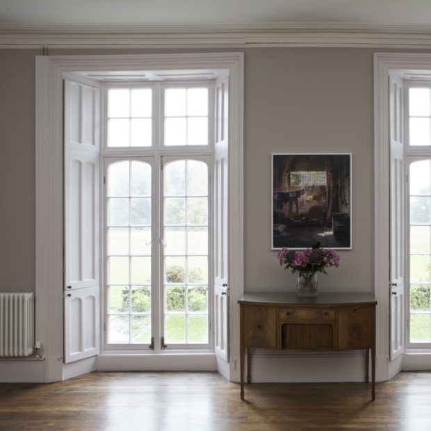
It wouldn’t be a top paint colours of the decade feature without Elephant’s Breath. ‘At the beginning of the decade interior enthusiasts had already begun to turn their backs on creamy warm neutrals and fallen madly in love with grey tones instead,’ says Joa Studholme, Farrow & Ball Colour Curator.
‘However, many were still wary of the cooler feel often so evident in blue greys. Elephant’s Breath was the answer – both the colour and the name took the world by storm as it was the perfect mid tone warm based grey that would give your home a contemporary feel without it feeling too gritty cold or industrial.’
2. Aquamarine Light by Little Greene
Heather Young, Executive Editor at Ideal Home, says: ‘I’m a big fan of a pale Scandi-inspired aquamarine shade, which is halfway between mint and a very delicate, soft sage. I’ve used it in my living room and in my bedroom as it feels fresh and bright, but also incredibly calming.’
3. Chic Shadow by Dulux
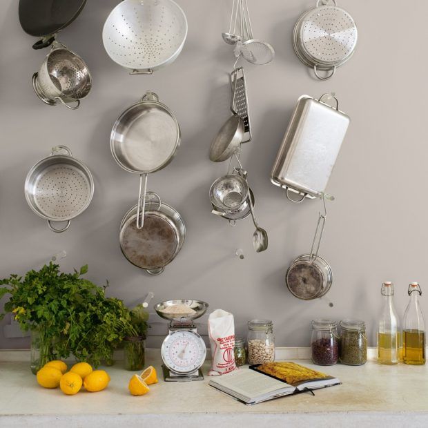
Chic Shadow is a versatile grey that would look at home in any room, from the kitchen to the lounge. ‘We painted our living room in Chic Shadow from Dulux, and its the perfect mid-grey to pair our bright pink and navy blue velvet sofas with,’ says Ideal Home’s features and homes editor Holly Walsh.
4. Burlington Arcade by Mylands
‘Described by Mylands as ‘a robust shade influenced by this historic shopping arcade in Central London’. ‘I’ve used Burlington Arcade to decorate my downstairs cloakroom idea,’ says Ideal Home editor-in-chief Amy Cutmore. ‘Two years on, I’m still madly in love with it. It’s a strong colour; utterly timeless, and brings cosiness and vibrancy to what could seem a cold and clinical space.’
5. Railings 31 by Farrow & Ball
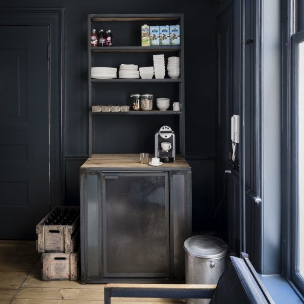
‘As grey became more and more popular people became braver with depth of colour,’ says Joa. ‘Many moved over to the ‘dark side’ using Railings, a, colour that had previously only been used on exteriors, in halls and small cloakroom.’
‘Everyone became less concerned about space and more concerned with mood and creating drama. A complex colour that is neither black nor blue ‘Railings’ is respectful of traditional proportions but is particularly useful to create dynamic spaces in contemporary homes.’
6. Stiffkey Blue 281 by Farrow & Ball
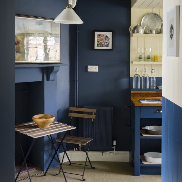
Farrow & Ball’s Joa Studholme says: ‘As the use of stronger colours on walls became more acceptable, there was an understandable desire to find an alternative to charcoal greys. Stiffkey Blue took on that mantle – a sophisticated dark blue which somehow manages to feel dramatic when used in isolation and fresh when combined with a simple white.’
‘Despite its drama, which comes from its unrivalled depth of colour, this is a family friendly colour that proved to be instantly popular.’
7. Setting Plaster 231 by Farrow & Ball
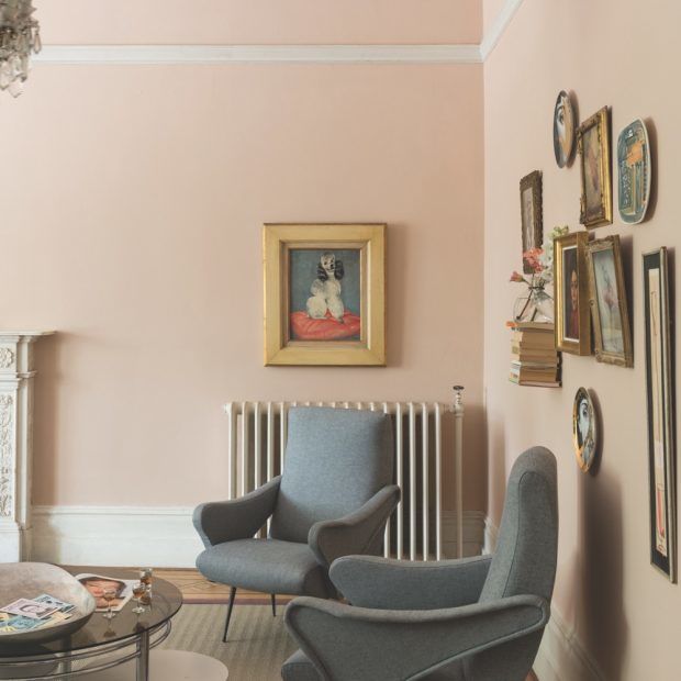
‘There came a time in the middle of the last decade when we all felt we wanted our homes to give us a hug,’ says Joa. ‘Setting Plaster has the most soothing effect, so did just that – wrapping you in a comforting glow that is warm and welcoming.’
‘This plaster colour never feels overtly pink, but has a seductive quality resulting in spaces that are soft and gentle but still full of impact. Pink was no longer banished to the bedroom; it was welcoming in any room.’ Making pink living room ideas more popular than ever.
8. De Nimes 299 by Farrow & Ball
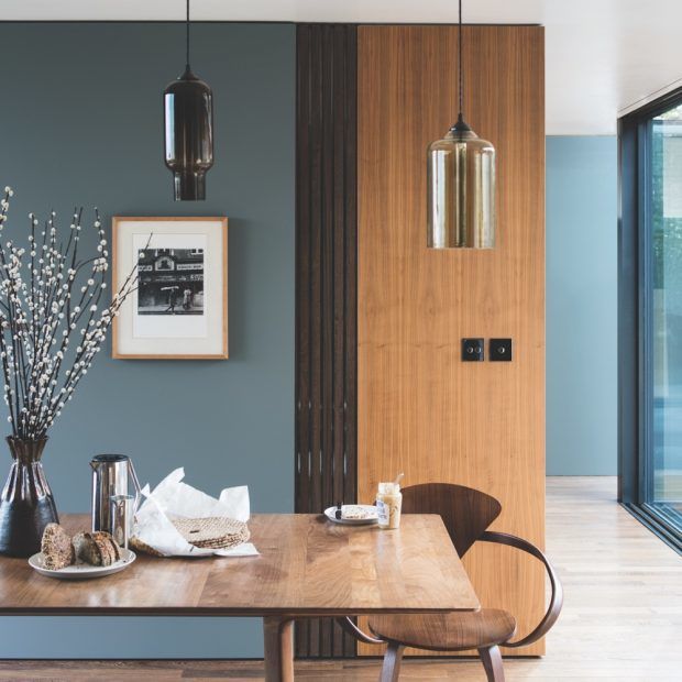
‘When the world felt like it was in a bit of turmoil there was a seismic shift in the way we were using colour in the home,’ explains Joa. ‘We wanted to use colours that comforted us and felt nostalgic – colours that not only enrich our homes but also our souls.’
‘De Nimes like the workwear fabric it is named after, straddled a barrier, it is ultimately fashionable but always feels grounded. A complex blue, with a distinct air of nostalgia, it is perfect for those who were wary of moving into a world of colour because it still has a comforting underlying grey tone.’
9. Heartwood by Dulux
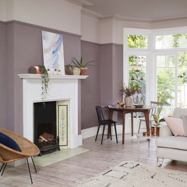
Marianne Shillingford explains, ‘Heartwood is a really popular colour that proves we are not a nation of scaredy cats when it comes to using stronger shades. The colour of unfired clay, it’s so popular because it has the magical quality of changing colour as the sun moves across the sky giving it an organic quality that looks subtly amazing without dominating a room.’
10. Sap Green by Farrow & Ball
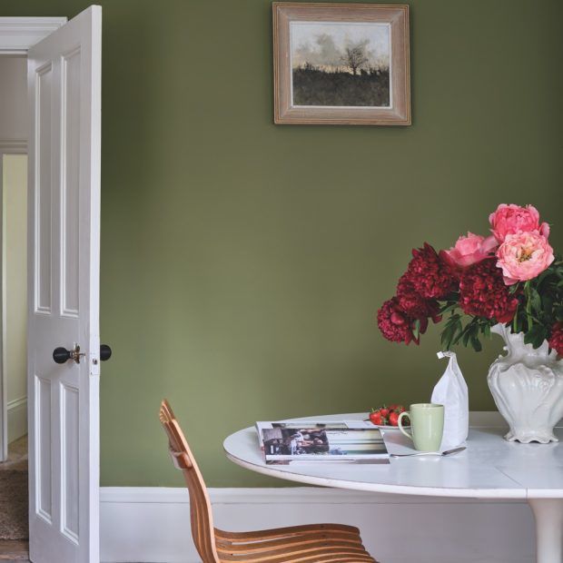
Farrow & Ball’s colour curator Joa Studholme says, ‘At the end of the decade, as we became more environmentally aware, green became the go-to colour. Sap Green is a sober, olive green that adds modern day glamour to any room while retaining a strong connection with nature.’
‘It has an unmistakably organic feel that brings a little of the outside world into your home and works perfectly with the natural materials and pot plants that we love to live with.’ Green living room ideas shot up in popularity as a result of wanting to connect indoors to out.
11. Old White by Annie Sloan
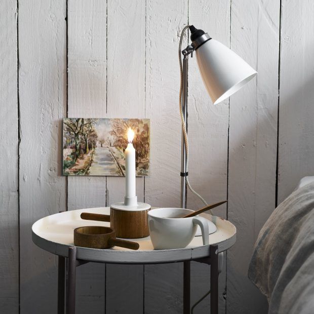
‘It’s no surprise that Old White tops our bestsellers,’ says paint and colour expert Annie Sloan of this best white paint choice. ‘This is the quintessential Chalk Paint choice – suggesting organic chalk, gesso, and European antiquity. It’s a white with personality and history.’
‘It’s also the ideal colour for adjusting the rest of the Chalk Paint palette, so every furniture painter has a tin to hand – either to knock back statement shades slightly, to create a brand-new spectrum of bespoke hues, or to colour match to an existing piece.’


![A Tranquil Jungle House That Incorporates Japanese Ethos [Video]](https://asean2.ainewslabs.com/images/22/08/b-2ennetkmmnn_t.jpg)


