
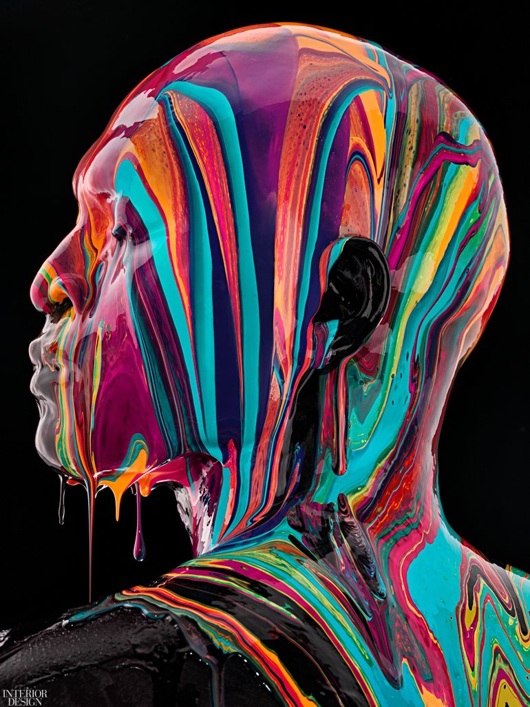
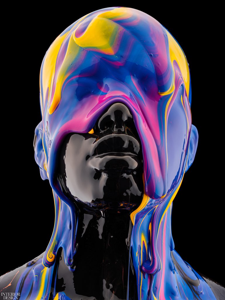
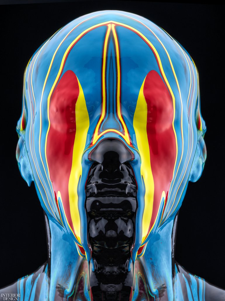
Its powerful and graphic fine art photography, now on view at the Avant Gallery at Hudson Yards in New York and the Brickell City Centre Miami, features real subjects with paint poured over their heads. It’s a bold blending of primary and secondary colors with a beautiful marbling effect for striking compositions that explore the value of truth, unity, and free-thinking in our current socio-political landscape. We let him explain.
Interior Design: How did the idea for “Black is a Color” come about?
Tim Tadder: At the height of the BLM movement and post-George Floyd murder, I had spoken about the assault on freedoms, but I haven’t created anything that spoke to how I felt about systemic racism and social injustice, or the way society perceives race as a binary stem.
I wanted to explore a non-literal and unconventional way to share with people a different point of view. A view that boldly illustrates a slice of what is missed by a binary approach to race. “Black is a Color” exemplifies the strong desire for unity during an unprecedented time in our nation.
ID: How does it depart from your earlier work and/or continue themes?
TT: It is an unintentional trilogy to my “Nothing to See” & “United States of Purple” series by incorporating bald subjects as highly conceptual pieces of my work. This has become the framework behind my artistry.
From that standpoint, I always look at bald subjects as representative of humankind. I want to strip it down to what we share in common, which is to the absolute most simplistic form, our bodies. The subjects in the art represent humanity, not just the subject in the image. Hair is often one of the first identifiers of a person, it’s a differentiator. When we strip down to a hairless form, we talk about what we share at the core, which is the body itself. We all share this mannequin-like form.
ID: What is the meaning of the name?
TT: When primary colors are mixed at equal parts, black is ultimately the precipitating color. When we think about race we think of “black or white.” We have a stereotypical notion of black or white. However, individuals are not simply black or white, individuals are more complex than that. As a society, we are missing that infinite display of color. This collection is representative of the infinite complexity of an individual.
We are infinitely complex in our racial DNA, but when we binarily assign race, we are truly missing the individual. An individual is not “black or white,” they are a mix of infinitely complex human beings. Color is just a mix of infinitely complex DNA. Our society has done great harm by simply labeling individuals as black or white.
During the process, an imperial display of tones appears in the swirling to mirror powerful structure and emotion from the subjects. From inception to execution, “Black is a Color” proved to be a pivotal project at a defining moment in our nation.
ID: What does it represent conceptually?
TT: This collection demands that we look past skin tone, and into beautiful, infinitely complex humans. We experimented with a lot of different paint viscosities and dilution techniques which created some serendipitously beautiful colors that enhanced the project. We always started with a triad of colors that were mixed together that created a powerful marbling-like effect. The colors I utilized are highly methodical and deliberate.
ID: What do you hope to impart to the viewer?
TT: The inspiration for this series was conceived at a crucial time for the nation to unite, I hope that this collection encourages empathy, unity, and a non-binary view of race. “Black is a Color” challenges one to see past profiling and foresee the beauty that is capable of elevating the human experience.
As aforementioned, I’m trying to share with the viewer that they should reconsider their perception of race and ultimately, race shouldn’t be viewed in binary terms. We should have a more cerebral and open perception when we consider individuals.


![A Tranquil Jungle House That Incorporates Japanese Ethos [Video]](https://asean2.ainewslabs.com/images/22/08/b-2ennetkmmnn_t.jpg)


