
It’s well known that your emotional state is inextricably linked to your environment, so it’s hardly a surprise that after the trying year we’ve had in 2020, everyone has the urge to conjure up calm as we enter into 2021. Accordingly, designers and color experts are predicting a return to warm, neutral palettes, embracing gray and beige as well as pale and subtle off-white hues. Here are a few of the shades that you’ll be sure to see making the rounds in 2021.
Soft, Muted Colors
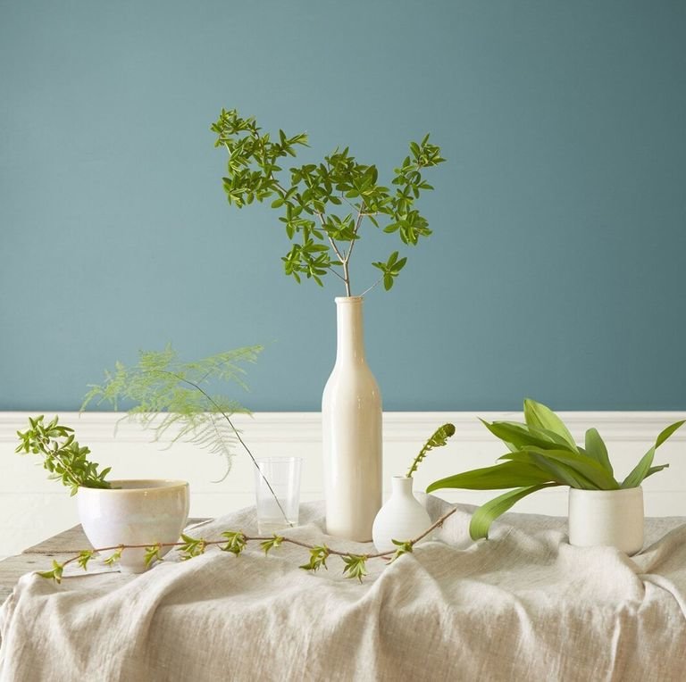
Sharon Graubard, the founder and creative director of MintModa, a trend-forecasting service, believes that home design is now more about comfort and less about perfection. “Staying home allows us to observe how light changes throughout the day,” she says. “Paint colors tend to fluctuate, and shades like Aegean Teal [shown here], a slightly grayed-out blue that is Benjamin Moore’s 2021 Color of the Year, can appear soft and muted. I’m also loving washed terra-cotta tones including Benjamin Moore’s Potters Clay, which absorbs and reflects light.”
Neutrals Paired with Bright Colors
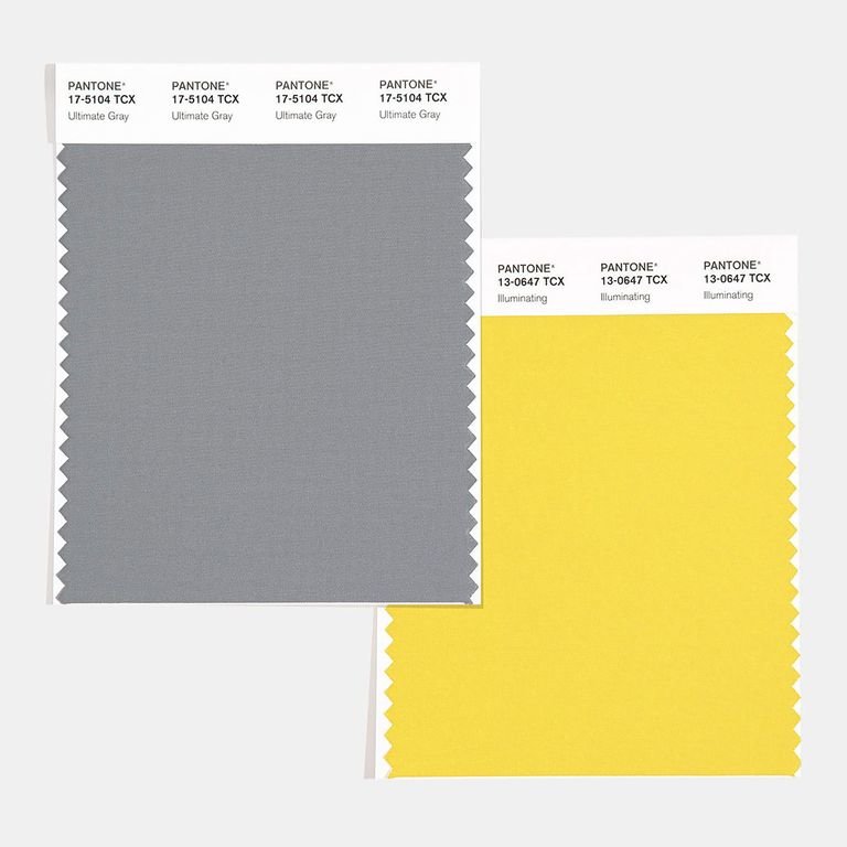
Leatrice Eiseman, the director of the Eiseman Center for Color Information & Training, acknowledges the trend toward neutrals paired with something bright, like Pantone’s 2021 Colors of the Year-Illuminating, juxtaposed with Ultimate Gray. “So many people have used gray in living rooms the past few seasons that it’s time for some sprightly mood boosters that accent beautifully against the more sedate hue,” she says.
Classic Neutrals
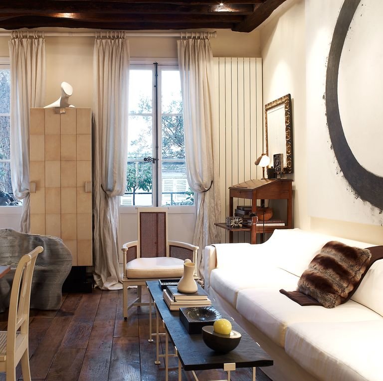
ELLE Decor A-List interior designer Juan Montoya has a fondness for a time-honored neutrals like Matchstick from Farrow & Ball. He also favors the brand’s chic greens such as Verdigris Green and Sap Green (shown at top).
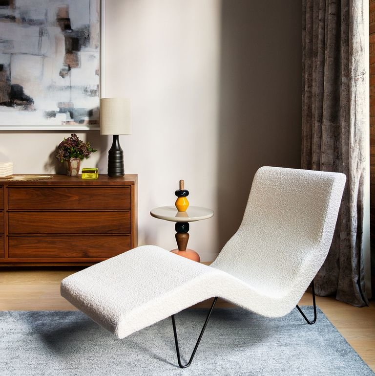
Moody Neutrals
“I’m not sure it’s a trend, but I’m personally gravitating toward more neutrals than I have in a long time, and feel like clients are, too,” says New York designer Bella Mancini, who is leaning toward moodier living room walls that highlight Farrow & Ball’s Old White and Clunch.
Pale Ocher Is the New Neutral
Neutral grays are typically used as an all-purpose shade to balance any color they are paired with. “Pale ochers-like Sherwin-Williams’s They Call It Mellow-that are cool, not too yellow, ‘like the walls in a Vermeer painting,’ ” are an alternative that Graubard predicts will become prevalent in the home. “These colors are cheerful without being intrusive and are neutral enough to harmonize with surrounding materials like poured concrete or stained wood floors,” she says.


![A Tranquil Jungle House That Incorporates Japanese Ethos [Video]](https://asean2.ainewslabs.com/images/22/08/b-2ennetkmmnn_t.jpg)


