
Color has the power to completely transform the feel of a space. The right palette can energize a lackluster room or convey a sense of calm in a busy home. And for those of us who have spent the past several months at home, a fresh start might be just what you need. If you're looking to hit refresh with a new splash of color, take your cues from the color experts at Sherwin-Williams, who just released their 2021 paint color predictions.
The paint company selected 40 trendy colors, broken up into four palettes, under a theme called "Rhythm of Color." Sue Wadden, director of color marketing at Sherwin-Williams, said in a press release that this theme examines "where we've been to help inform where we're going and to help us create that central hub that is so vital to our everyday living and working now." Each palette draws inspiration from design trends and pop culture and features a unique mix of soft neutrals and vibrant accent colors.
Here are some of the top paint colors you can expect to see in 2021.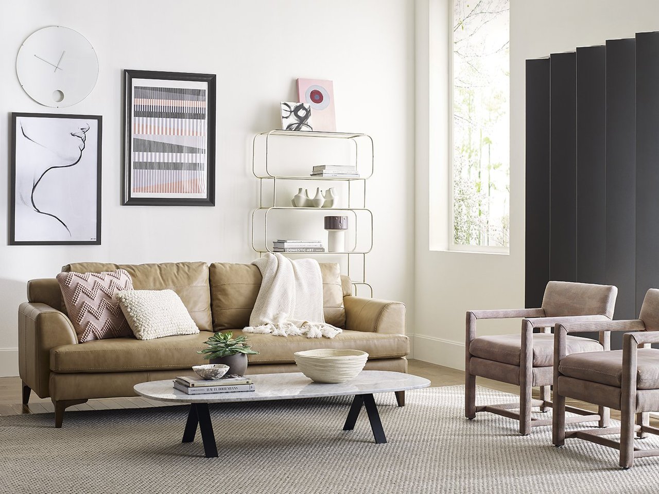
Warm, Nature-Inspired Neutrals
Sherwin-Williams' Sanctuary palette emphasizes wellness and rest with warm, plucked-from-nature colors. Muted neutrals, including Pure White SW 7005 and Modern Gray SW 7632, provide a calming canvas for layering natural textures and minimalistic decor. A verdant green called Oakmoss SW 6180 and the rich red of Canyon Clay SW 6054 add depth and vibrancy to the mostly neutral palette.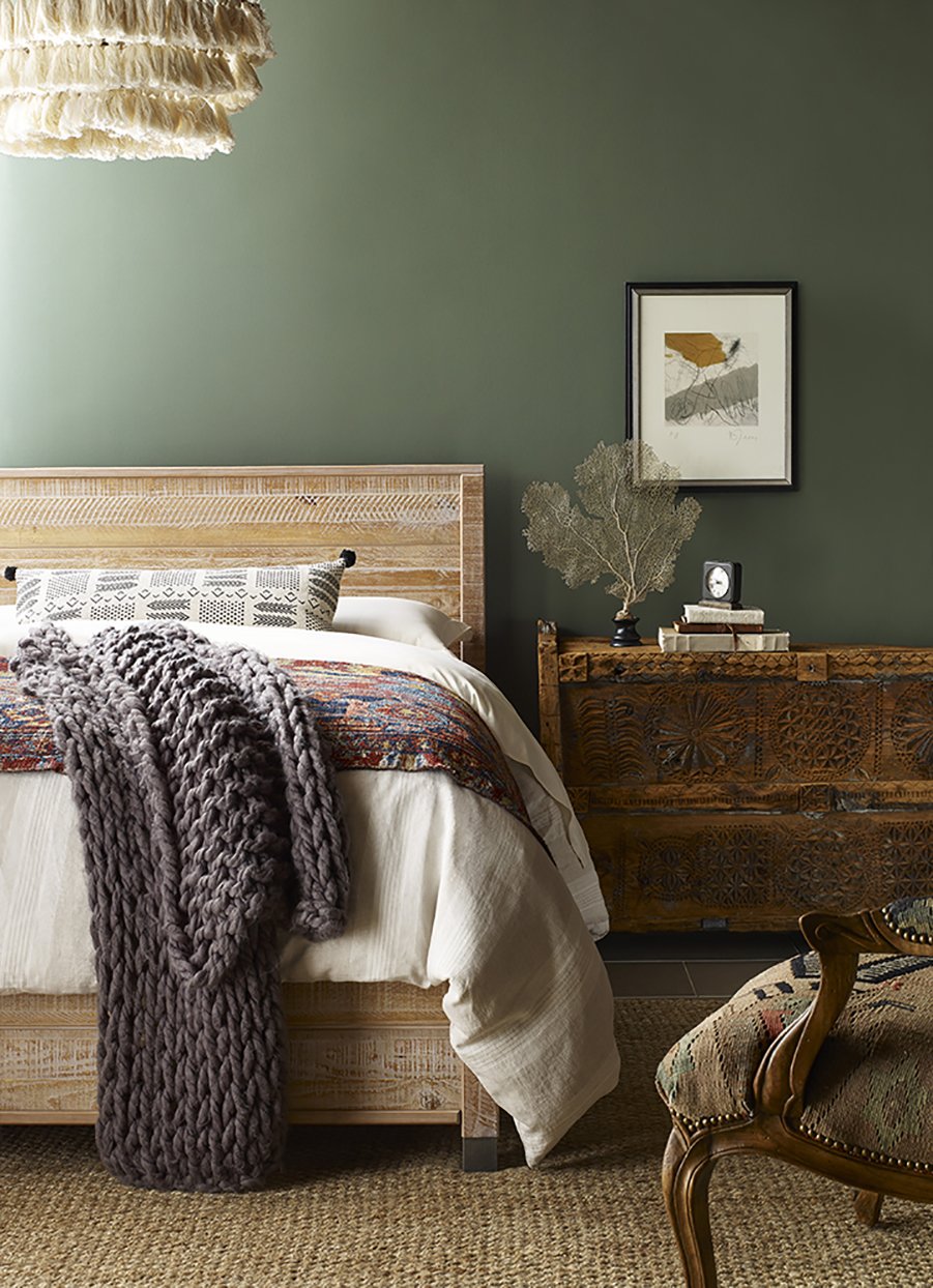
Rich Earth Tones
The Encounter collection also pulls colors from nature with earth tones meant to evoke a modern bohemian aesthetic. The palette juxtaposes muted blues like Blustery Sky SW 9140 with saturated organic shades such as Reddened Earth SW 6053 and Rosemary SW 6187. Other hues, including a mustard yellow color called Tarnished Trumpet SW 9026 and the taupe tone Hardware SW 6172, remind of timeworn antiques and speak to vintage style.
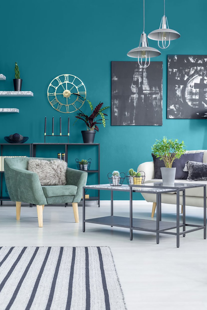
Fresh Modern Hues
Inspired by smart home technology, Continuum features bright, punchy colors and cool neutrals. The palette's electric hues, such as Limón Fresco SW 9030 and Novel Lilac SW 6836, offer striking accents, which can easily be tempered with inky tones such as Cyberspace SW 7076. For a bold dose of color, the deep teal tone of Great Falls SW 6495 makes an unexpected splash in contemporary spaces.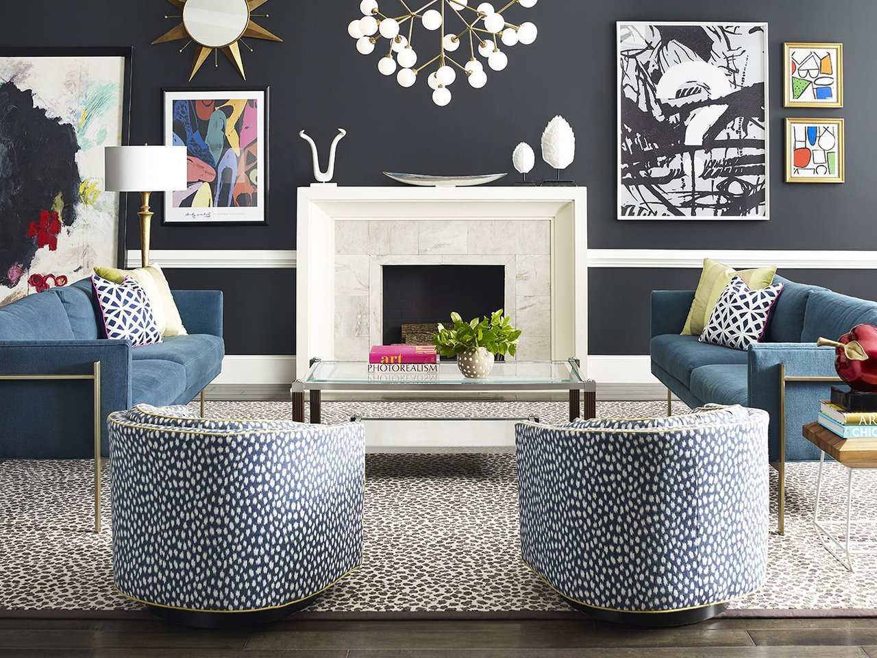
Happy Jewel Tones
Creativity and personality define the Tapestry palette, which is made up of brilliant pinks, blues, and greens. It embraces a modern maximalist look, pairing playful tones like Jaipur Pink SW 6577 and Perfect Periwinkle SW 9065 with the sophisticated Tricorn Black SW 6258. The vibrant jewel tones are united with their joy-producing effect.


![A Tranquil Jungle House That Incorporates Japanese Ethos [Video]](https://asean2.ainewslabs.com/images/22/08/b-2ennetkmmnn_t.jpg)


