Moving doesn't faze Michelle Adams. For most of her life, the creative consultant and founder of design website The Maryn moved every year or two, until she left New York for Michigan with the idea of finally putting down roots in an ornate 1800s Victorian. The settling in lasted only five years before she started getting the itch for a new project. "I was craving a design challenge, a newer home with cleaner lines and more open space," she says. "Oh, and something with even floors." 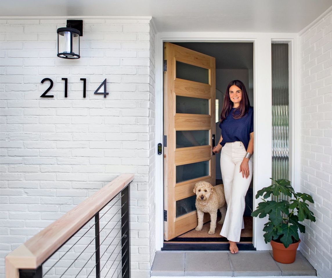
Enter this 1950s one-story in Ann Arbor. There was nothing overly exciting about it, but it had what Michelle describes as good energy and, she adds, "the fact that it wasn't an architectural gem gave me the freedom to make it what I wanted." 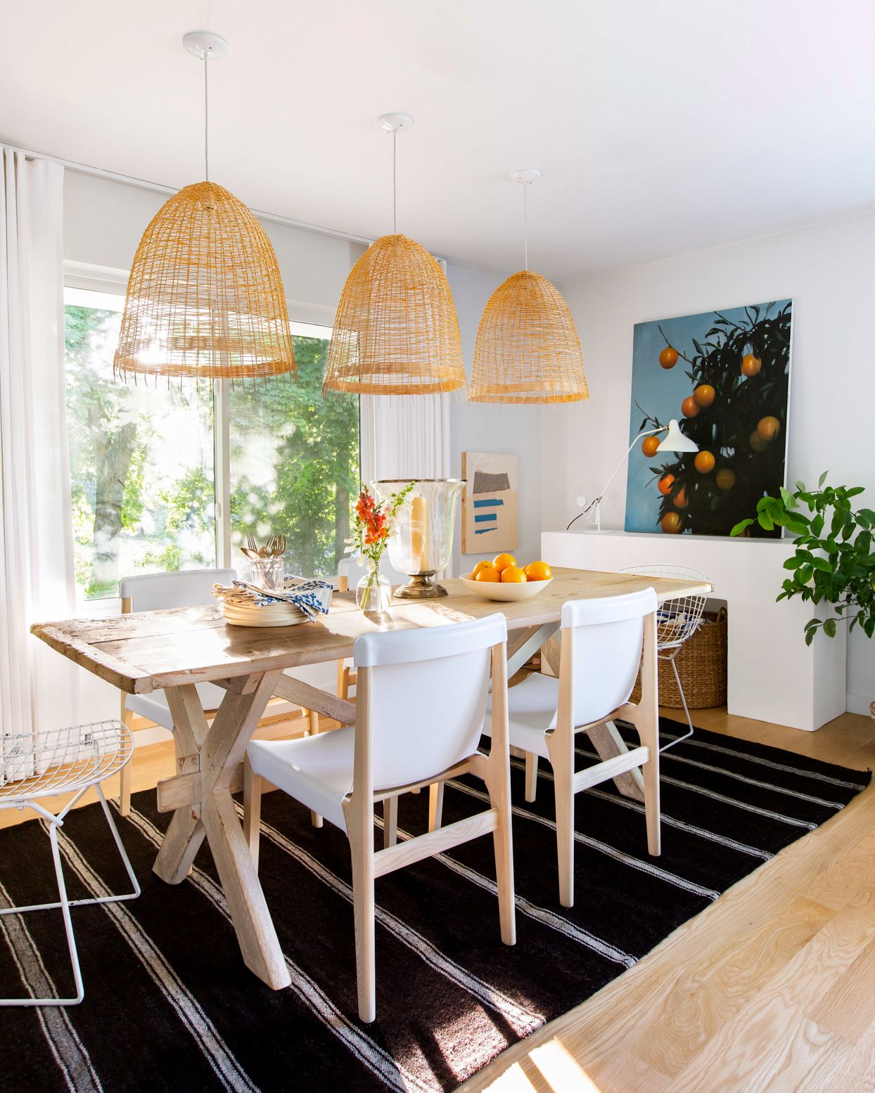
As she renovated and decorated the new space, Michelle found her eclectic personal style shifting from layered maximalism to a more minimalist version, responding to smaller square footage and a change in her own mindset.
"I was sort of at this point where I wanted to cut the noise, cut the stuff, and just live in peace with my favorite things, which can be hard when you love design," she says. "But it's a fun challenge to figure out how to use what you've got and display it in a completely different way."
In the dining area, a large plaster console is a minimalist focal point. "It almost looks like a mantel," she says. "When a layout is open concept, large pieces help establish each room as a separate space." Mismatched dining chairs don't look cluttered when there's a consistent characteristic. White ties these together. The open weave of oversize pendants prevents the lighting from overwhelming the room.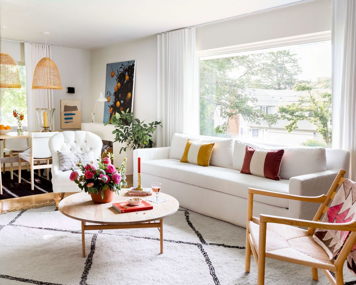
Now, outfitted with a pared-down mixture of Scandinavian modern, French antiques, and tons of artwork, the house feels both collected and unfussy, the well-edited oasis she craved. "Art is the enduring link in any home I live in," Michelle says. It enlivens the neutral foundation.
Michelle favors mixing styles so rooms don't look too thematic. "All modern furniture would have felt like a time capsule," she says. She pulls the look together by repeating finishes: crisp white on the modern sofa and traditional tufted chair, blond wood on the Scandinavian coffee table and armchair.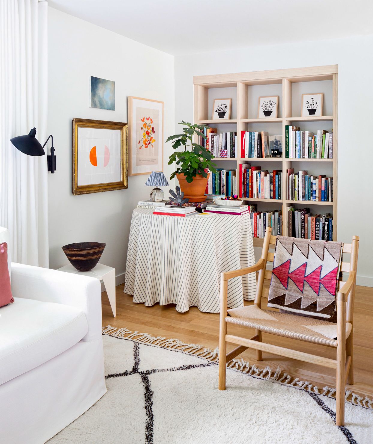
Michelle recessed the semicustom bookcase from California Closets into the wall so it doesn't take up valuable floor space. A Native American saddle blanket ups the color and comfort of this ladder-back armchair.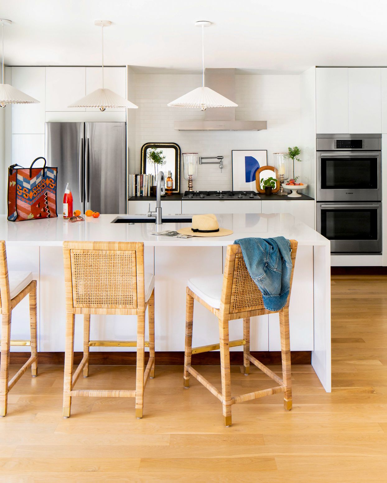
To keep the kitchen from appearing too sleek and sterile, Michelle placed woven-back stools at the counter and included plants, a colorful print, and mirrors. Not only do those decorative touches make it look more lived-in, they break up the white walls, peninsula, and lacquered cabinets.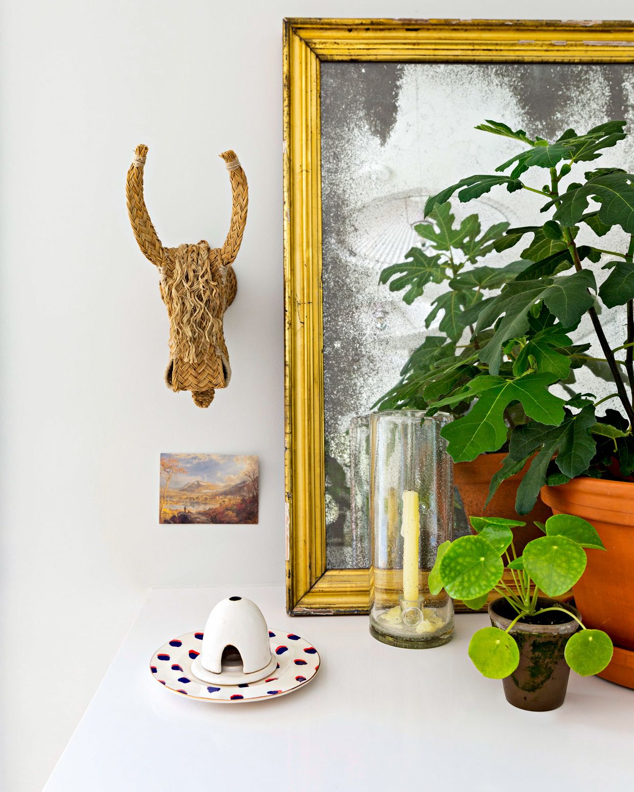
A group of treasures on the kitchen peninsula reminds Michelle of past travels. The woven skull is from Spain; she found the antique mirror at a Paris flea market.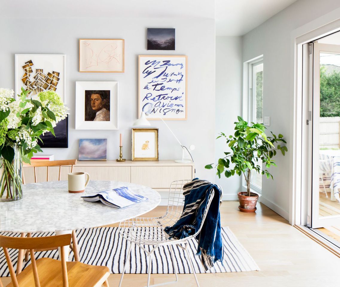
A nod to the more-is-more style of her previous home, Michelle hung a gallery wall by starting with the largest artwork then surrounding it with the others. The colors flow, but the mismatched frames and random spacing give the arrangement an organic look.
Michelle studied gallery walls at J.Crew stores to devise this recipe for hanging artwork: Mix photography with a painted portrait, a landscape, and something graphic, like abstract art. Chair-backs follow the contours of the midcentury-style kitchen table Michelle scored off Craigslist.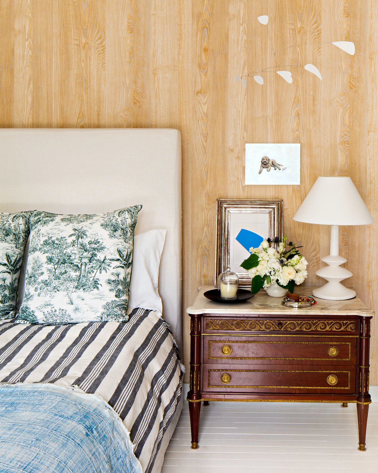
The upholstered headboard was in a guest room in her previous house but it works best in Michelle's own bedroom. Its simple shape doesn't compete with pattern-rich bedding and the ornate French nightstand. Michelle's secret weapon-stripes-makes pairing patterns a no-brainer. "Think of stripes as a neutral; they go with anything."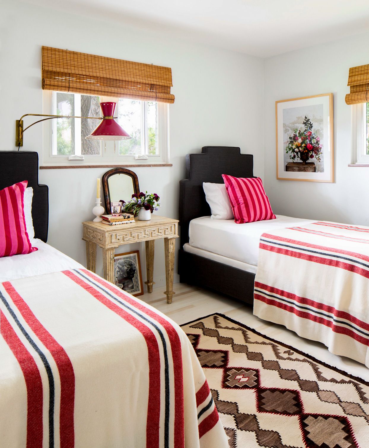
Michelle used twin beds as a solution for this small guest room with windows on two walls. She pulled the color palette from the rug's berry-pink stitching and layered in grown-up textiles, bed frames, and a vintage nightstand for sophistication.
Pieces with history add soul-like the bedside table with legs Michelle's dog, Rufus, chewed up.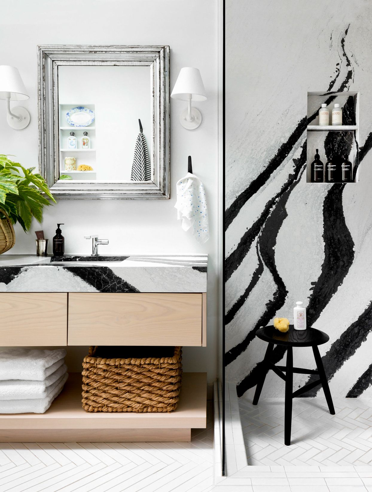
"Juxtaposing something super modern with something older helps ground the modern element," says Michelle of pairing graphic Cambria quartz with an antique mirror frame. The black-and-white palette defined her former house.
And Michelle's cravings keep evolving. As it turns out, she's already onto the next move, house, and style direction.
Michelle's Favorite Decor Sources
Follow Michelle's creative lead with unique, affordable accents from a few of her favorite sources.
Bloomist: Environmentally friendly designs that bring nature indoors while supporting small-batch makers and artisan communities.
Flotsam + Fork: Kitchen and housewares made to stand the test of time from European brands.
GOODEE: An inclusive global marketplace of socially conscious designs.
Love Adorned: Unexpected accessories to finish any room.

Tropical Boho Homes With Beautiful Vignettes & Vistas
Two tropical boho home designs, featuring swimming pools, cozy lighting schemes, interior archways, natural accents, and beautiful decor vignettes.


![A Tranquil Jungle House That Incorporates Japanese Ethos [Video]](https://asean2.ainewslabs.com/images/22/08/b-2ennetkmmnn_t.jpg)


