
When picking paint colors, one of the most common concerns is deciding which hues go together. The color wheel is a simple tool that can help answer that question. Every decorative color combination can be defined by where it resides on the color wheel, a diagram that maps the colors of the rainbow. The wheel makes color relationships easy to see by dividing the spectrum into 12 basic hues: three primary colors, three secondary colors, and six tertiary colors. Once you learn how to use it and its hundreds of color combinations, the color wheel can provide a helpful reference when deciding what colors to try in your home.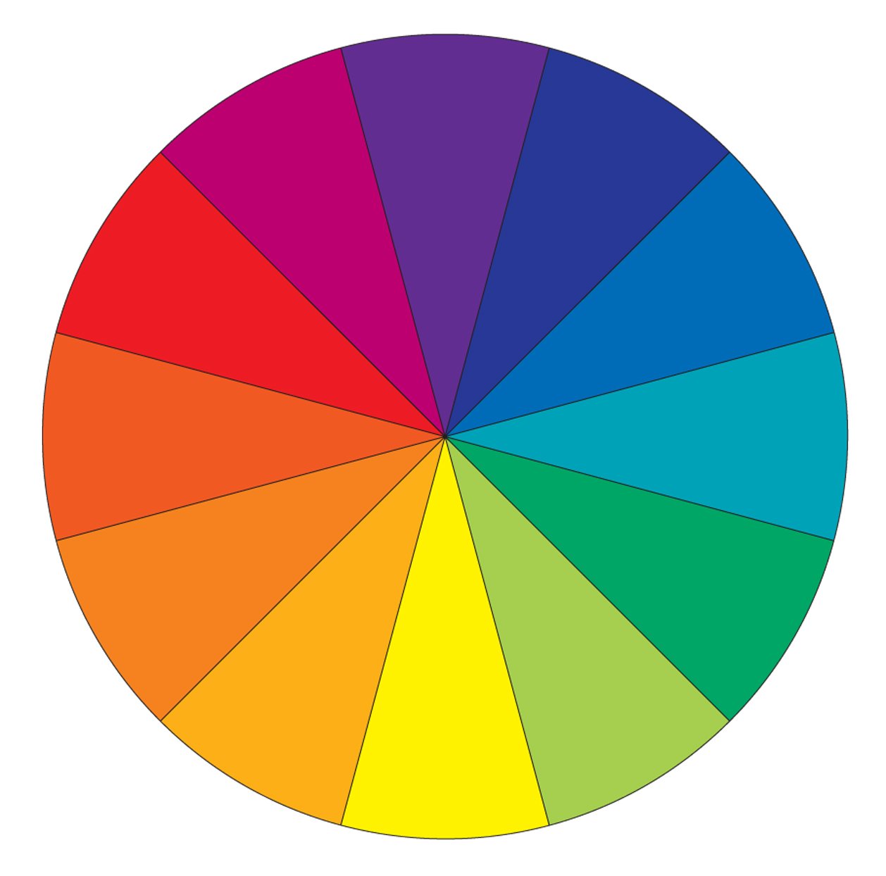
How the Color Wheel Works
Primary colors are red, blue, and yellow. These colors are pure, which means you can't create them from other colors, and all other colors are created from them. Between the equidistant primary color spokes on the color wheel are secondary colors: orange, green, and violet. These hues line up between the primaries on the color wheel because they are formed when equal parts of two primary colors are combined. Tertiary colors are formed by mixing a primary color with a secondary color next to it on the color wheel. With each blending (primary with primary, then primary with secondary), the resulting hues become less vivid.
How to Use the Color Wheel to Build Color Schemes
You can rely on the color wheel's segmentation to help you mix colors and create palettes with varying degrees of contrast. There are four common types of color schemes derived from the color wheel.
1. Monochromatic Scheme
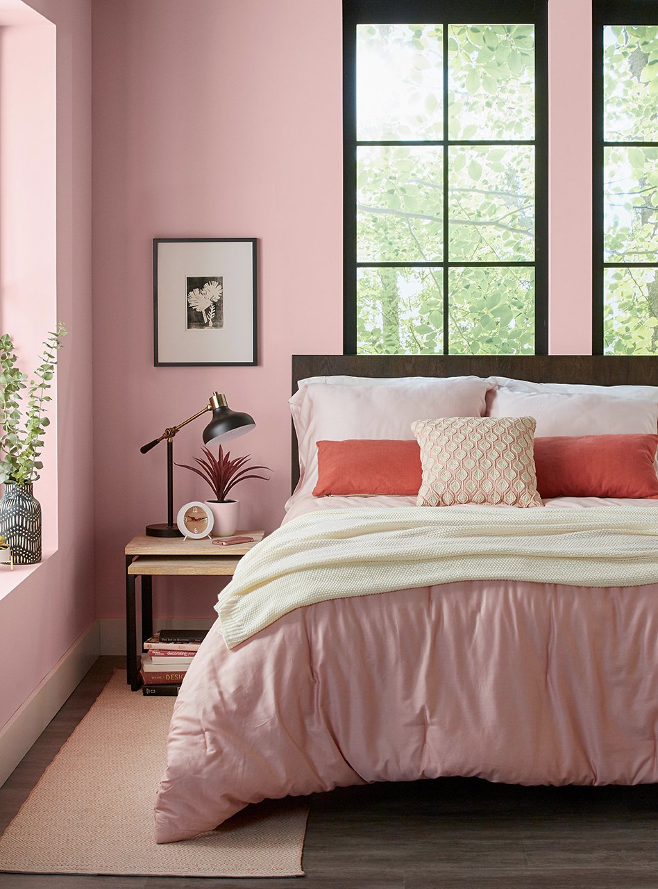
These tone-on-tone combinations use several shades (adding black) and tints (adding white) of a single hue for a subtle palette. Think pale blue, sky blue, and navy. Although the monochromatic look is the easiest color scheme to understand, it's perhaps trickiest to pull off. A room filled with just one color can feel boring or overwhelming, depending on how you handle it. This room, for example, shows a monochromatic palette that succeeds, thanks to a variety of shades and textures. The bedroom color scheme sticks to the pale pink wedge in the color wheel but includes various tints that range from blush to rosy. A livable powder pink canvases the painted walls, which are the largest portion of the room. Brighter pink fabrics in the throw pillows keep the scheme from being dull. Finally, a knit throw and woven rug add textural variety to the narrow color scheme.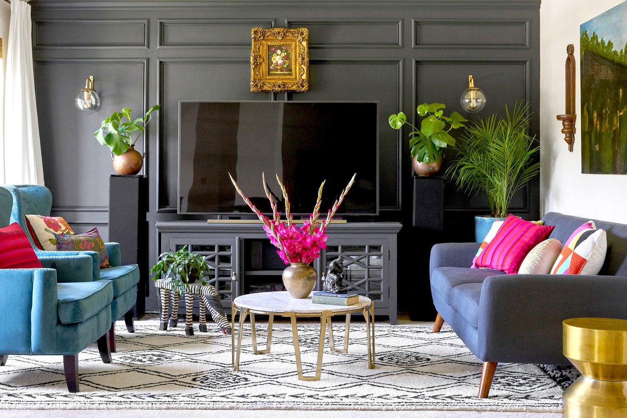
2. Analogous Scheme
For a bit more contrast, an analogous palette includes colors found side by side on the wheel, such as orange, yellow, and green, for a colorful but relaxing feel. Neighboring hues work well in conjunction with each other because they share the same base colors. The key to success for this scheme is to pick one shade as the main, or dominant, color in a room; it's the color you see the most of. Then choose one, two, or three shades to be limited-use accent hues. This living room demonstrates an analogous scheme of blue, purple, and fuchsia. A dusty purple sofa provides the dominant shade, while vibrant fuchsia appears on various throw pillows and in the flower arrangement. Because the pink and blue accents share the same purple undertones, they suit the color scheme. A warm gray wall color rounds out the room.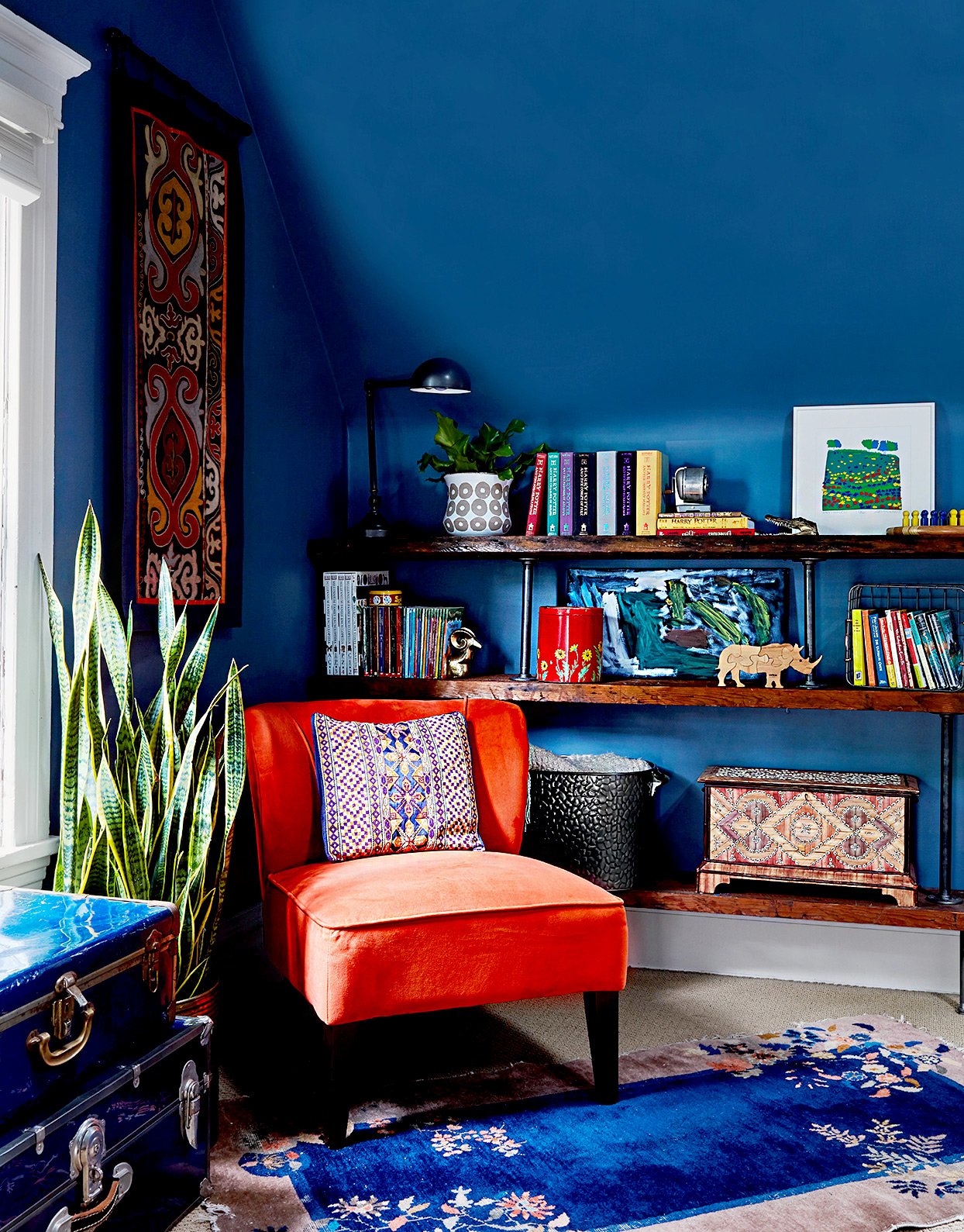
3. Complementary Scheme
Using two hues directly opposite each other on the color wheel, such as blue and orange, is guaranteed to add energy to any room. These complementary colors work well together because they balance each other visually. You can experiment with various shades and tints of these complementing color wedges that find a scheme that appeals to you. In this living room, for example, a bright shade of orange offers warmth and brightness that balances a deep cobalt blue. The key is to not let one color overtake the other. As the wall color, blue appears more prominently, while the orange serves as an accent. The two colors appear on other elements throughout the space for a cohesive look.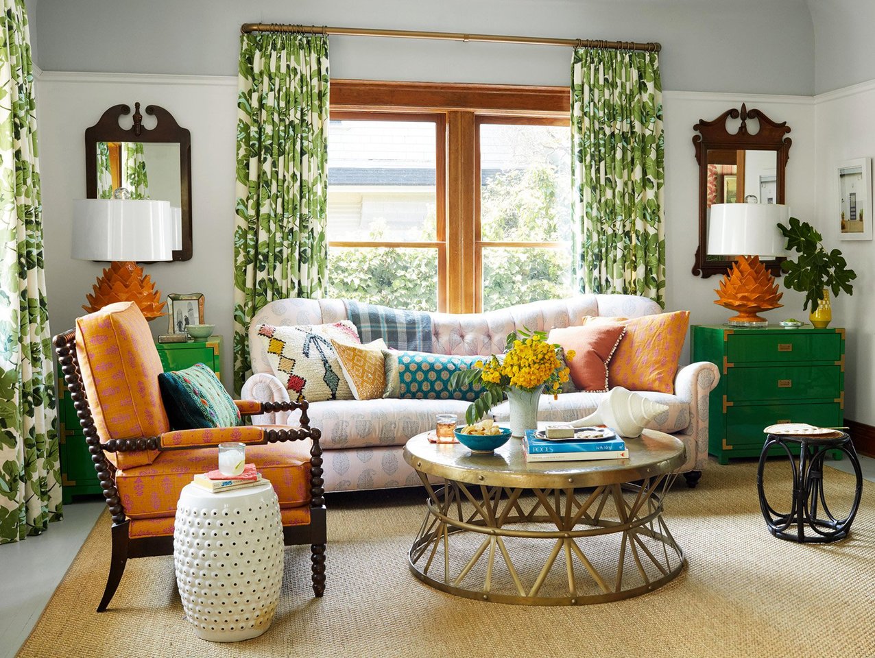
4. Triadic Scheme
A triad creates an adventurous palette by using three hues evenly spaced on the wheel, such as turquoise, fuchsia, and yellow-orange. This combination forms a color palette with vivid contrast and balanced colors. These vibrant schemes work well in living rooms because they tend to offer a happy, energizing vibe. Use your three colors in varying shades and tints to create more contrast or soften the brightness. For instance, this colorful living room employs saturated shades of orange and green, but the third color is merely hinted at in the pastel-upholstered sofa.
As you create schemes using the color wheel, remember that color can also affect emotional responses and create a mood. Greens tend to soothe, for instance, while yellows are uplifting and energetic. Bold reds are passionate and daring, but soft pink (a tint of red) is considered sweet and delicate. Blues are perceived as calming and quiet; oranges are warm and cozy; and purple, a truly complex color, can be seen as sexy or spiritual. Colors are considered warm or cool because of association. In our minds, we typically compare reds, oranges, and yellows with the warmth of the sun and fire. Blues, greens, and violets are cool because of their association with water, sky, and foliage. For a more balanced look, don't limit your palette to all warm colors or all cool colors. Let one dominate and set the overall tone of the room, but be sure to include elements that offer contrast.
Color Terms
Use this glossary of color wheel terms to help inform color decisions throughout your home.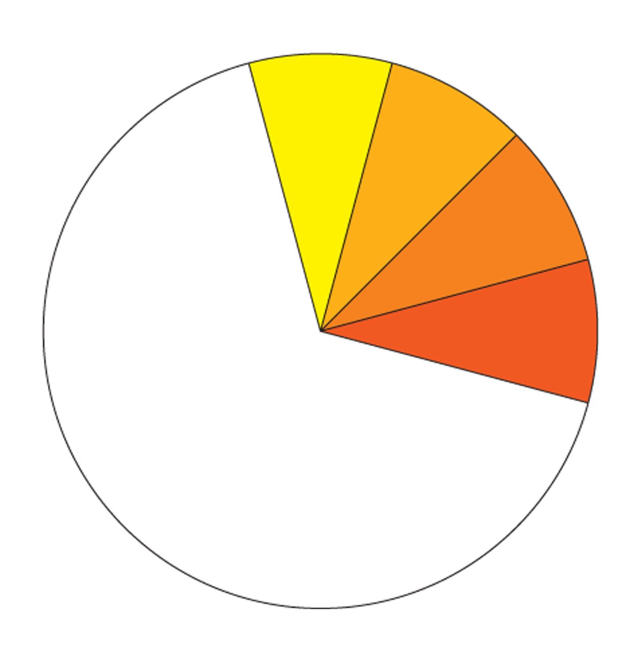
Analogous: Neighbors on the color wheel
Chroma: A color's brightness or dullness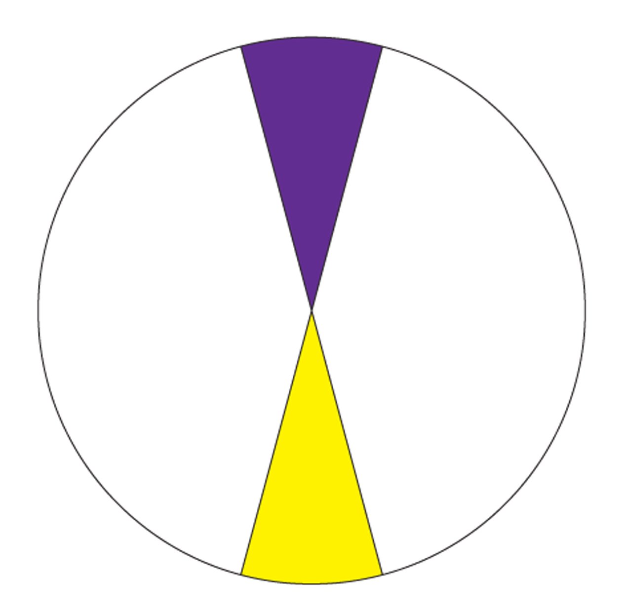
Complementary: Opposites on the color wheel, which appear brighter when they are used together (examples: yellow and purple, red and green, blue and orange)
Neutral: Black, white, brown, and gray
Secondary: A combination of equal parts of two primary colors (secondary colors are green, orange, purple)
Shade: Any color with black added; also refers to slight variations in a color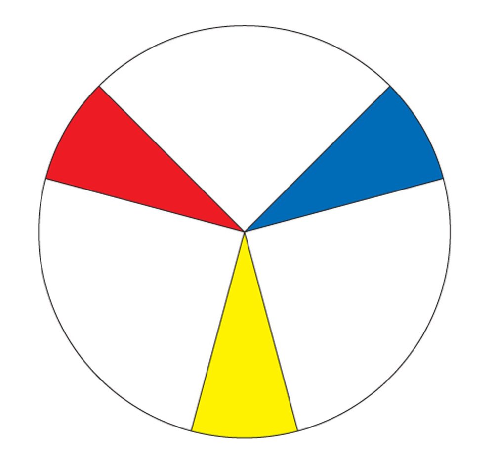
Primary: Pure colors (red, yellow, and blue) that combine to create all other colors on the wheel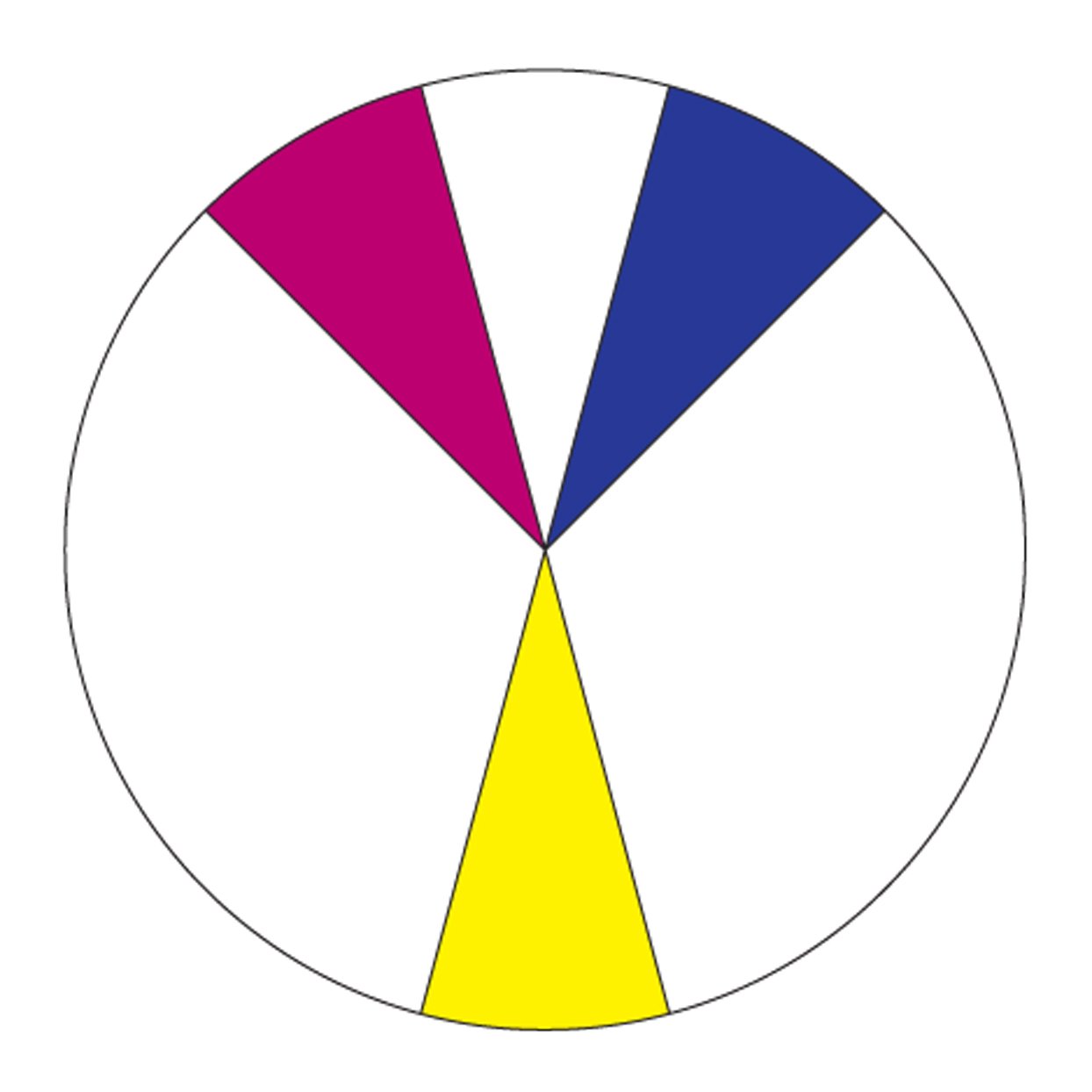
Split Complementary: The grouping of a color with the two hues analogous to its complementary color (yellow with red-violet and blue-violet, for example)
Triad: Any three colors equally spaced on the color wheel, one of which usually takes precedence in a color scheme (yellow-orange, blue-green, and red-violet, for example)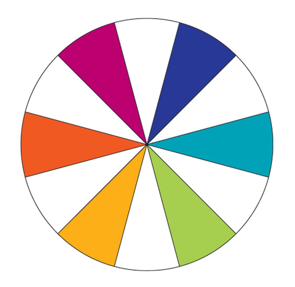
Tertiary: A combination of equal parts of a primary and a secondary color
Tint: Any color with white added
Tone: A color's intensity or its degree of lightness or darkness


![A Tranquil Jungle House That Incorporates Japanese Ethos [Video]](https://asean2.ainewslabs.com/images/22/08/b-2ennetkmmnn_t.jpg)


