
Energizing a room with color takes courage: It can feel safer sticking to neutrals. Boost your confidence by considering interior designer Corey Damen Jenkins' trusted sources for statement color schemes. "History, nature, and fashion are great litmus tests for how to use color," he says. For example, if you've decided green walls will get top billing, a historical color-most paint companies curate a batch-comes with the assurance that it's time-tested. Nature is also rife with dependable colors. "If you like a color combination in nature, chances are you'll like it in your room," he says. And your favorite patterned shirt? It's a safe bet those colors will harmonize in a room too.
In his first book, Design Remix: A New Spin on Traditional Rooms ($45, Barnes & Noble), Jenkins reveals his tips for using bold color, creating powerful pattern play, and adding drama: "The book teaches the building blocks of design."
He says you should think of choosing colors for your home as if you're casting a movie: You need to pick a star and supporting players. For example, in this family room, peacock feathers inspired the palette, with vibrant blue walls getting the spotlight. "Cobalt blue drives the space and electrifies it," he says. Teal, green, tan, and a shot of yellow for contrast complete the ensemble.
Accent colors can support your vision or steal the show. The key, Jenkins says, is to balance rather than compete. Here are more of his best tips for choosing the right colors for your space.
How to Decorate with Color
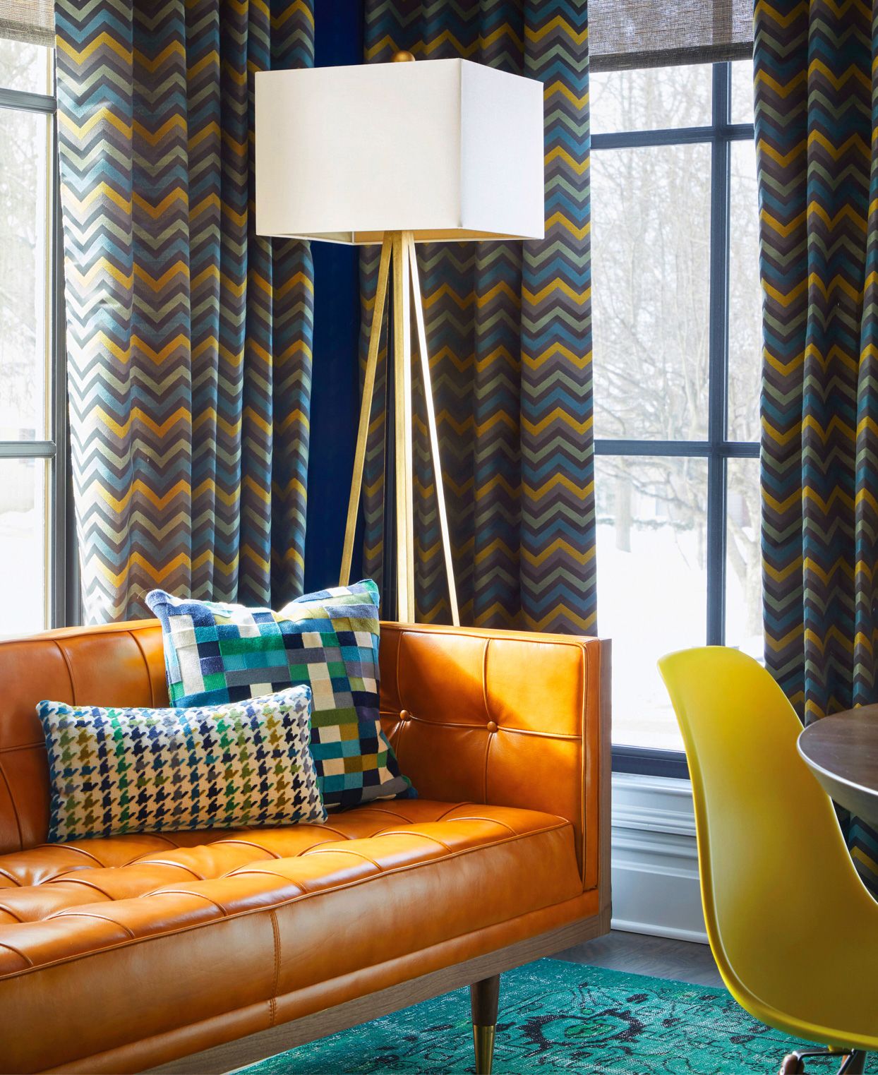
Use Pattern
Don't be afraid to use pattern, especially when paired with a solid wall. Jenkins referenced the bold blue wall color in disparate patterns in this family room. The patterns coexist happily thanks to a visual hierarchy: The largest one fills the most space; as the others shrink in size and scale, they fill less space.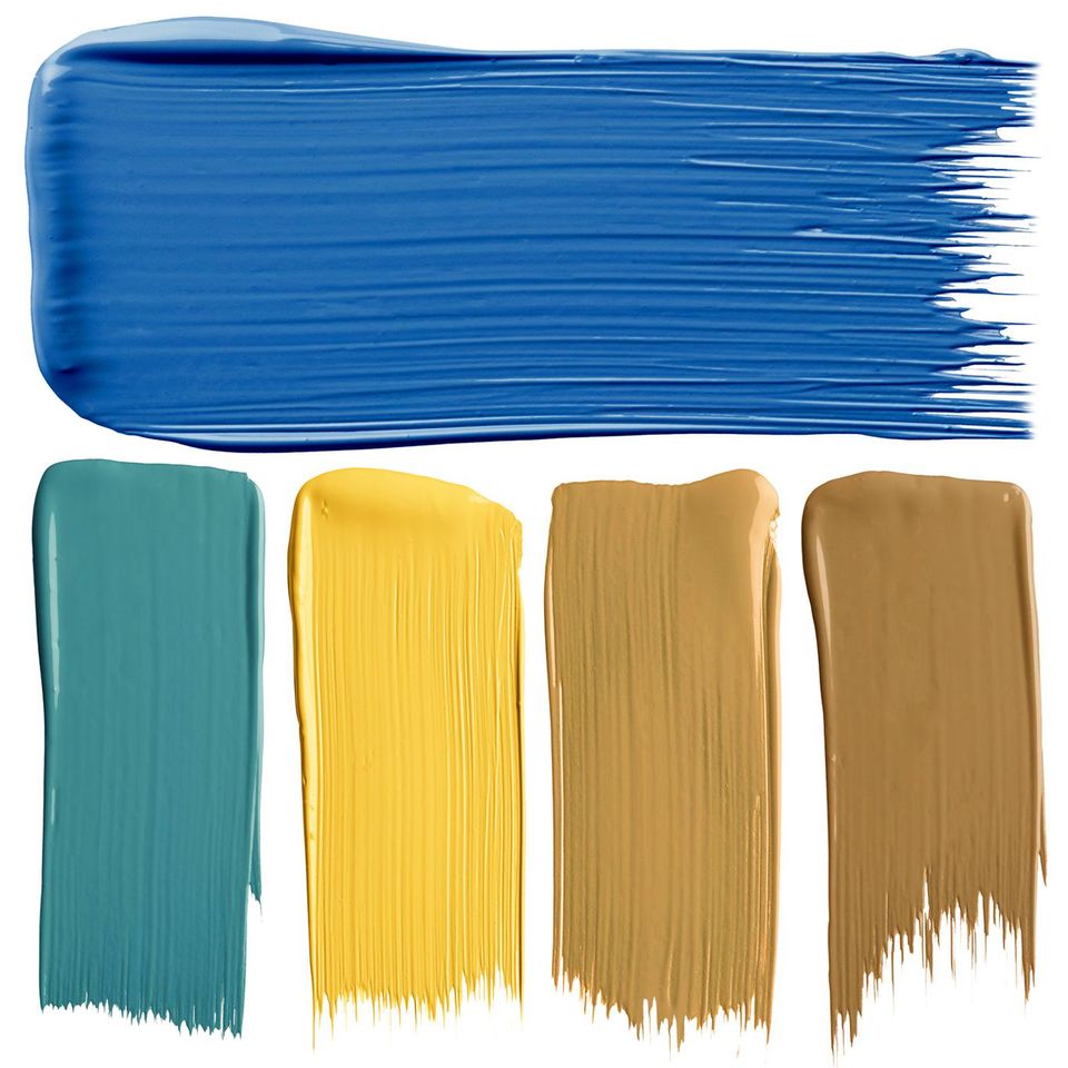
Build a Bridge
Contrasting colors are often a better choice than a monotone design. In this color palette, cobalt blue walls pair well with vibrant yellow because they're both primary colors. Softer tones of each smooth transitions.
Paint colors, clockwise:
Beacon Blue P510-7
Butter Rum PPU4-03
Saffron Strands PPU6-02
Buzz-In P300-6
Bella Vista P470-6
Tie a Thread
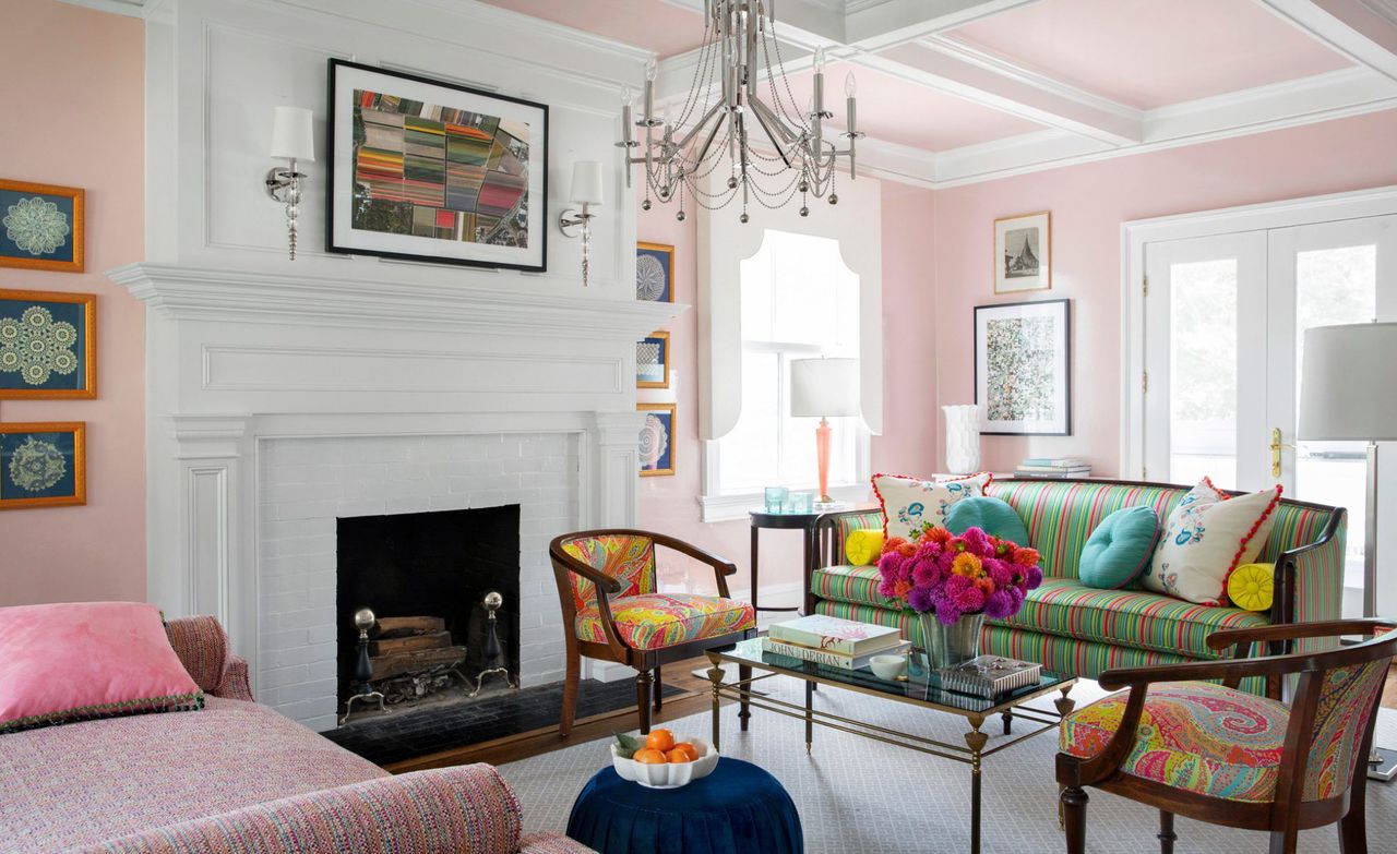
Use multiple shades of a color to give your room some color and tie the look together without overwhelming the area. In this example, raspberry accents in the pillows and upholstery tie the statement pink walls and ceiling to the candy colors pulled from a dress fabric.
Divvy Up
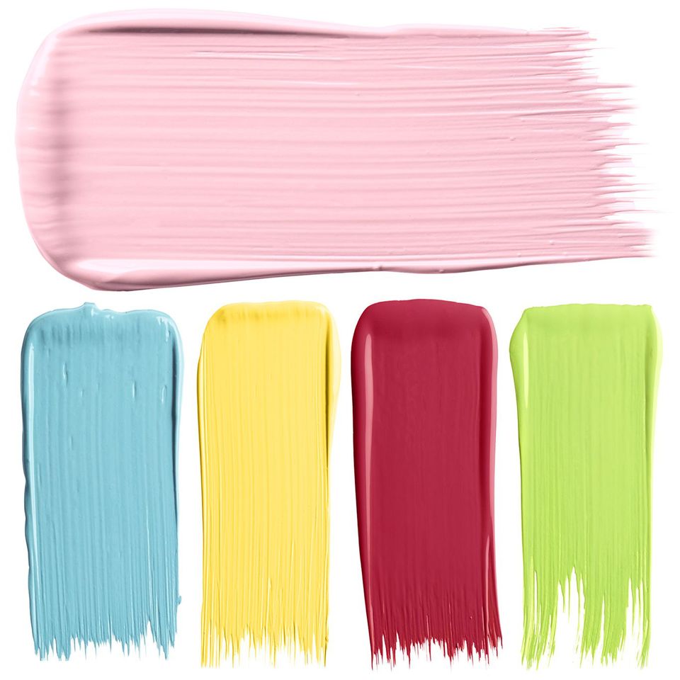
When combining several contrasting colors, choose one main color and use the others sparingly. In this color palette, small doses of turquoise, sunshine yellow, and raspberry punctuate an expanse of equally vibrant bubblegum pink.
Paint colors, clockwise:
Cat’s Meow 1332
Feel the Energy 417
Fuchsine 1343
No-Nonsense 361
How Blue Am I? 752
Creativity is Key
Staying busy keeps creativity afloat for Corey Damen Jenkins. His top motivators: Sketching, a good playlist, and floral arrangements.
He says sketching pencils ($6, Michaels) are one of his most valuable tools, because new ideas come to him as he sketches. "I doodle a lot," he says. "Drawing 3-D renderings and motifs for new collections by hand has produced many et voilà! moments."
He also recommends finding your design soundtrack and jamming out as you work on your space. "A fantastic 1990s R&B/pop playlist bouncing off the walls while I work" is one of the things that inspire his creativity the most.
And if you find yourself in a rut, he recommends heading somewhere that inspires you, like a flower shop, farmer's market, or anywhere outdoors. "I spend hours meandering around the NYC Flower District looking at flowers for unusual color combinations," he says. "Ranunculus and dahlias are favorites."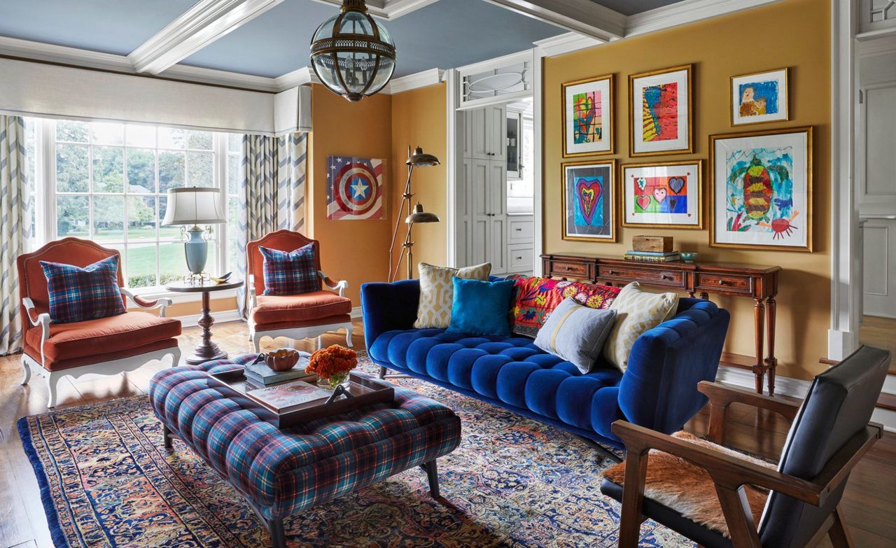
A Balancing Act
Jenkins sometimes gives color costars equal billing, like the blue and orangey spice tones in this family room. Follow his lead and commit to a combo throughout a room.
1. Artwork
Framed children's art takes pride of place in this family room and inspired the blocks of cool and warm colors.
2. Walls
Golden tan (Applesauce Cake by PPG) establishes a cozy backdrop and echoes the gold picture frames.
3. Ceiling
Because it evokes the sky, light blue is a trusted ceiling color. Jenkins guaranteed a hit by choosing a color from a historical collection (Buxton Blue by Benjamin Moore).
4. Sofa
Blue spans the spectrum, from light on the ceiling to dark on the sofa. "When there's variation in tones, it looks more curated," Jenkins says.
5. Throw
"The best design is usually a medley of solid color blocks and layers of texture and pattern." Jenkins layered this suzani over the sofa for its vivid embroidery in colors from the artwork on the wall behind it.
6. Armchairs
Tangerine upholstery channels the vibrancy of the artwork and throw without replicating the colors exactly. "Not everything has to match. These colors are close to each other, but there's a range so it all flows together. It can be perfectly imperfect," Jenkins says.
7. Table Lamp & Curtains
"Committing to color means splashing it on pieces throughout the room," he says. Rather than defaulting to white as a neutral for accents, he carried light blue onto the table lamp and drapery.
8. Rug & Ottoman
Large-scale plaid upholstery and a small-scale pattern rug unite the palette. "Patterns that summarize the majority of colors in a room are the ties that bind and anchor a space," Jenkins says.


![A Tranquil Jungle House That Incorporates Japanese Ethos [Video]](https://asean2.ainewslabs.com/images/22/08/b-2ennetkmmnn_t.jpg)


