
Even if Berman Horn Studio’s Maria Berman didn’t tell you she had a background in fine art and art history, her passion for color and light that hints at the depth of her knowledge. And that expertise is on full display in her own vacation home, which she shares with her husband and architectural partner, Brad Horn. 
Maria Berman and Brad Horn of Berman Horn Studio.
From the outside, this New England cottage blends demurely into the landscape, with its quiet, artfully weathered cedar shingles and moss-green door. But on the inside, a floor-to-ceiling, white-on-white palette gives the home an attention-grabbing glow-it’s truly a work of art, inside and out. Here, Berman shares the color decisions behind the couple’s home away from home, featured in the March/April 2020 issue of Dwell. 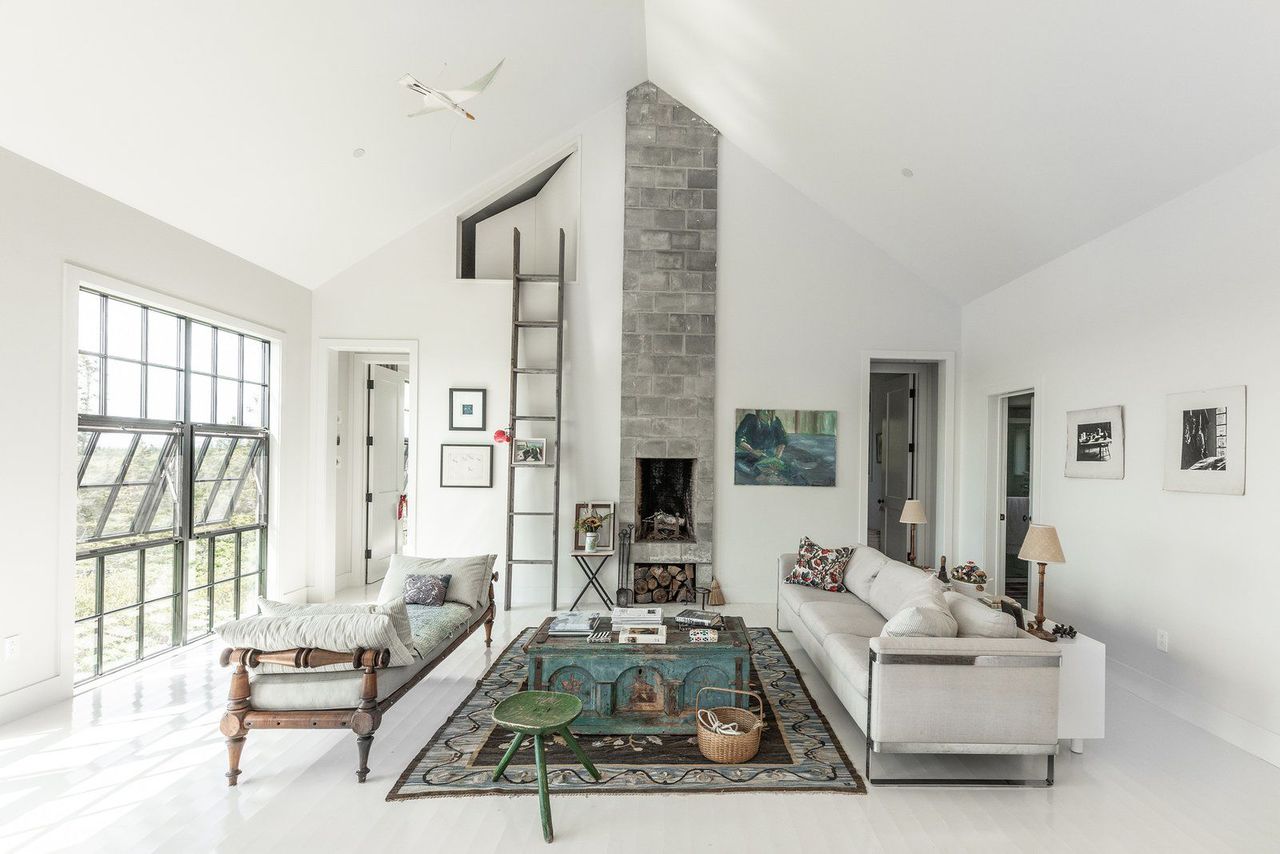
White interiors make the home feel light and airy, even on gray winter days in New England.
How did you choose your colors for this project?
We were really inspired by the natural kind of colors that we saw in the environment. In Maine, the plants are very stunted because the soil is so thin and very acidic-so you have a lot of lichens, you have a lot of rocks, you have a lot of moss, and you have a lot of ferns. We really wanted the outside of the house to speak to that and be a part of the landscape. And that’s where this idea of the outside gray came in-and also the Benjamin Moore Webster Green HC-130 door.
Was it an easy decision to land on the green for your front door?
The front door of a house is always a big decision. There are so many directions to go in. It’s kind of like if you had a first date with a house-the doors are the first impression. But clients often say, "Do I really want to be the person with the yellow door?" It identifies them to their neighbors and their community. In an urban environment, a vibrant, bright door is so easily identifiable within a sea of gray and brown-but the idea of a bright door in the country…it didn’t work. It was too strong. The whole environment just called for this green. 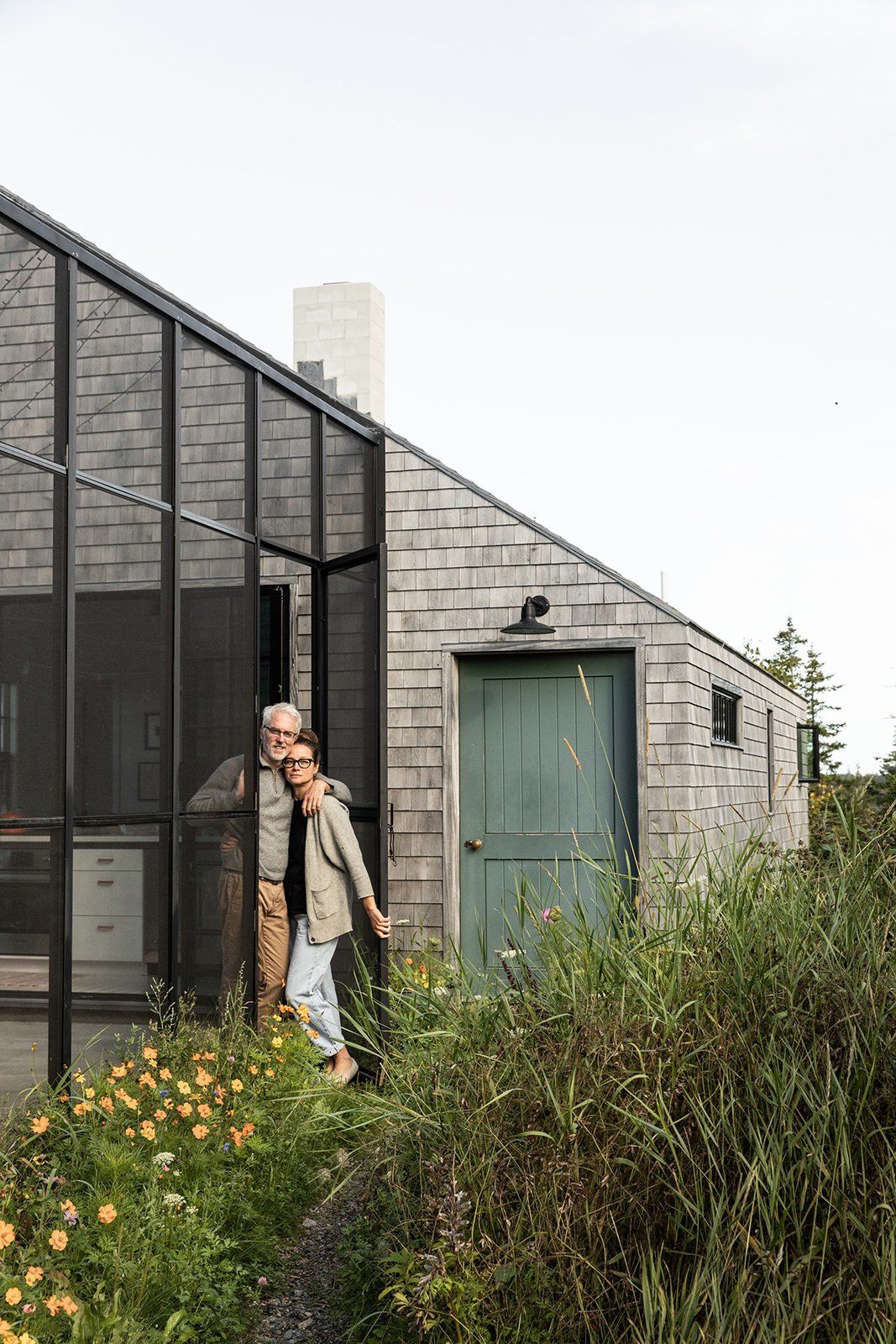
The green door takes its cues from the Maine landscape.
What about the interiors?
We focused on how reflections work. If you have a room that’s painted white, and you have a red brick building across the street from you, your room will look very pink. If you have green fields in front of you, or the blue ocean, they’ll also look very different. We might try the same color in many different locations, and that color will never look the same way twice. So, there was a lot of sampling from Benjamin Moore’s Off White Collection to get to the exact shade that works for the specific surroundings of this house. We went with an off-white called Silver Satin OC-26 for the entire interior. We like to keep walls, ceiling and trim consistent, and in this case the floor is the same.
I also think a lack of color brings out other colors. The paint color is almost an absence, because it allows everything else to speak more loudly. In other projects, you might want a color that has opinions. But here, the paint is quiet and allows everything else-the sky, and the green, and everything else-to have a voice.
When I think about Maine, I think about white clapboard houses… what is it about this place that draws people to white?
In the wintertime, you only have daylight from 8:00 a.m. to 3:00 p.m, more or less. These bright whites are a way to gather in whatever drops of light you can. There’s also a typical reflectivity that comes from coastal culture-boats have those glossy painted surfaces. Glossy painted floors are also a way to deal with the maritime humidity. 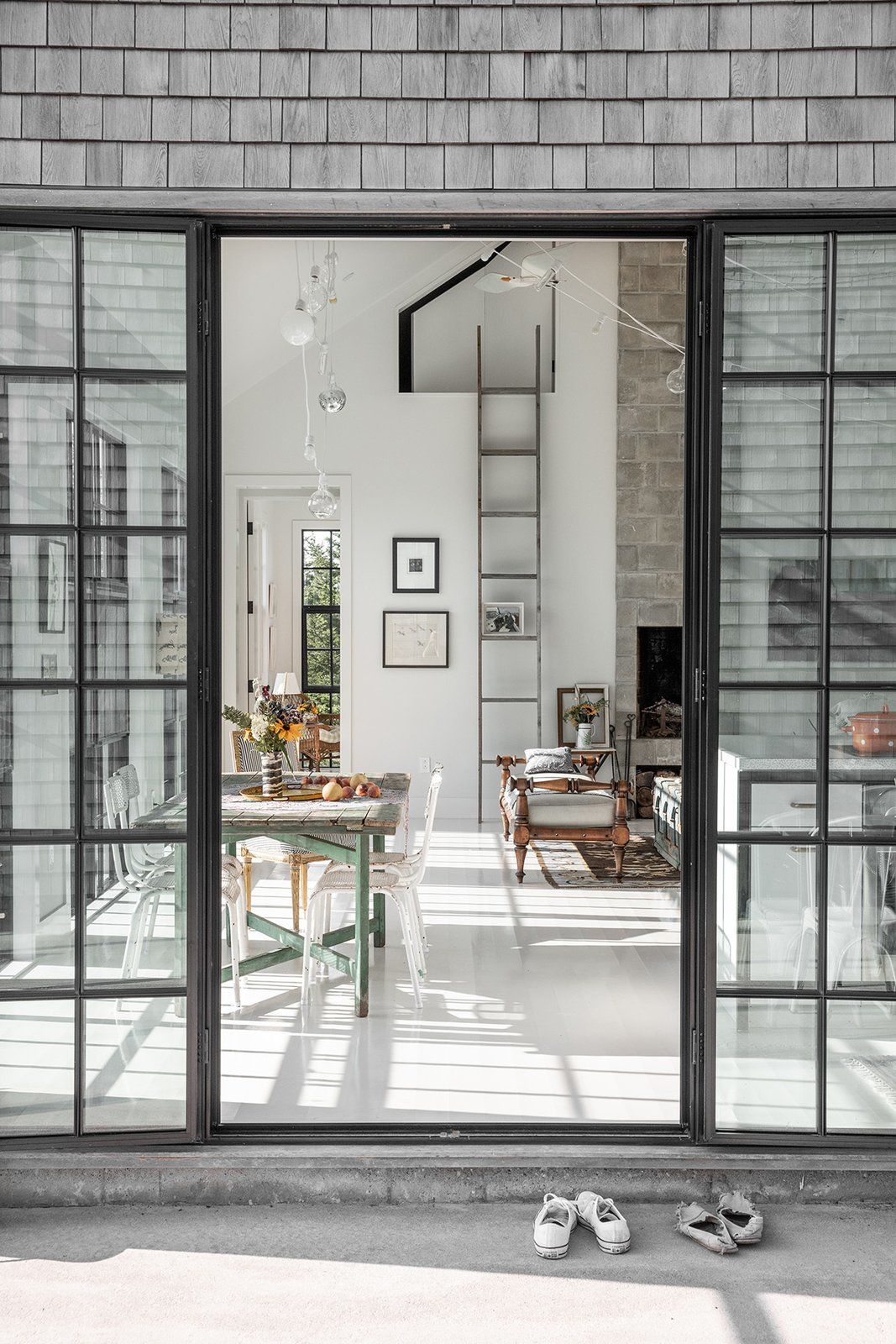
The home’s glossy white floors (painted with deck paint) are low-maintenance and highly reflective.
What’s the biggest challenge of working with a white-on-white design?
You really have to keep the Swiffer active. We have two orange cats. My husband and I looked at each other and were like, "Next time, the cats are white." It really does encourage you to stay tidy though, in a way that’s more pleasurable than wood floors. I love the glossiness of the floors, and seeing the reflection-seeing the light bounce in and around the space. It’s like you’re within this glow of light. We used a Benjamin Moore deck paint, and it’s bulletproof. Nothing sticks to it-you just wipe it clean, and it’s good to go. 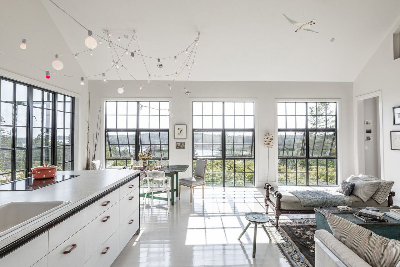
Soft white walls, floors, and ceilings allow the views of nature to pop.
How does a room’s lighting-natural or otherwise-affect your paint color choice?
Oh, so much. We almost always choose our paint colors in natural light. The ideal way to choose is on an overcast day-not dark and gloomy, but in a neutral, gray light. We look at options in artificial light, and in daylight, and find a color that works well with both…though daylight is not the same in any one place.
You’re so passionate and knowledgeable about color and light!
Well, I have a background in fine arts and art history. So, I know paint and color and how it sets a mood. If we think about Vermeer paintings, they have a kind of streaming light. These scenes are like a dream, and they exist in this glow of beautiful light…which I think is what everyone wants, even if they don’t know it.


![A Tranquil Jungle House That Incorporates Japanese Ethos [Video]](https://asean2.ainewslabs.com/images/22/08/b-2ennetkmmnn_t.jpg)


