
When it comes to choosing a color palette for your home, there is one frequently overlooked step that you just shouldn't skip: Considering where on the warm t0 cool spectrum your shades of paint lie. That's right, there's more to just picking a color-there are arm grays and cool grays, warmer blues and cooler...you get the idea. And while this might seem like a minor distinction, those details usually have the most transformative power in design. To help understand and brush up on those color theory basics, we tapped interior designer Michelle Gerson to learn all about warm colors-from expressive, experimental, and bold to soft, neutral, and traditional-what actually sets them apart from their cooler counterparts, when to use them, how to decorate with them, and more. Let's start with the basics...
Understanding Tones

While we're quick to associate fiery colors with warmth (like yellow and red) and other icier ones with coolness (blue and purple), most can actually have undertones of both or the opposite, especially neutrals. Let's take white, for example. "I consider white to be both a warm and a cool color-it just depends on which tone of white you pick," Gerson says. "One of my favorite warm whites to use is Wimborne White by Farrow & Ball. It has a warm creamy factor to it without being yellow. It’s also softer than a stark cooler white, like Benjamin Moore’s 'Super White,' which I also love to use," she explains. It really just depends on what vibe you're trying to generate, what your lighting is like, and ultimately, personal preference.
Spotting the Difference
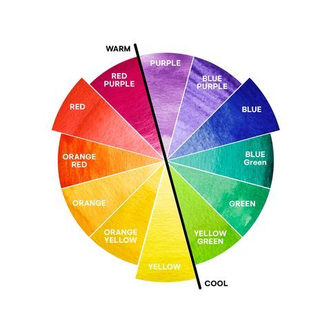
So, how can the layperson tell if a neutral color is warm or cool? It's all about the undertones. "If it’s a cool color, it will come off more bluish-gray while warmer colors come off more peach and taupe," explains Gerson. It helps if you think about it seasonally, too: fall and summer climates lend themselves to naturally warmer tones while winter and spring conjure up cooler landscapes.
"Cooler colors are just crispier in feel when you look at them," says Gerson. Generally, warm neutrals won't necessarily make a space feel either larger or smaller. Surely, a darker tone can sometimes make a small space feel extra cozy, but that doesn't mean the tone will always change the perceived size of a space. "To me, color changes the mood not the size of a room," Gerson clarifies.
Bold Warm Colors
Think About Where You Are
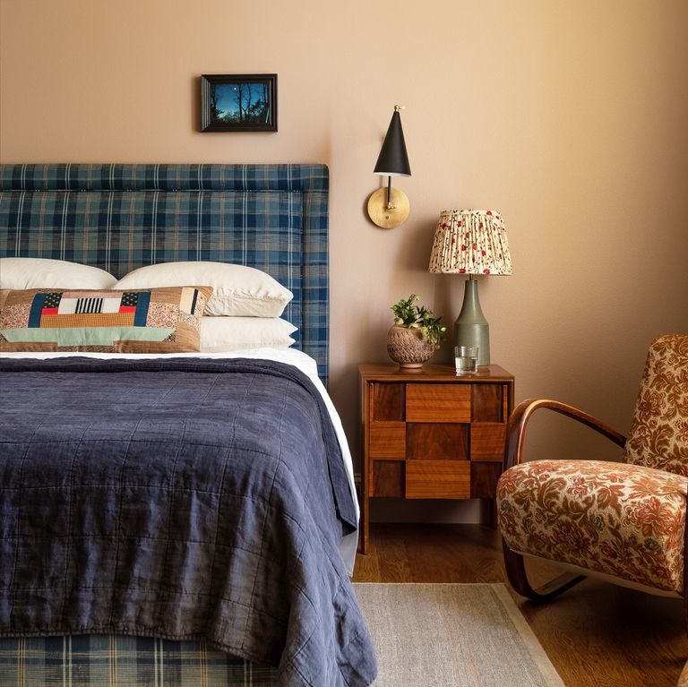
One way to help you decide is by considering the way you'll be using a room and the mood you want to set. "In a bedroom, I would use a warm white like Benjamin Moore's Atrium White or Chantilly Lace," Gerson suggests. "Atrium White has a little bit of a peach tone, while Chantilly Lace has a much warmer tone, so it’s not a stark white." As such, it may be better in a room where you want to create a nice and calming, relaxing vibe, like a bedroom, or a formal powder room with dim lighting.
Meanwhile, she says, "in a home’s common spaces, I like to go with cooler whites such as Benjamin Moore's Super White or Decorator White, which has a gray tone to it." Moral of the story: Just because you're set on white doesn't mean you're finished. The next step is to think about the undertones, the items you'll be decorating with, your exposures, etc. "I just think it’s nicer to use a warmer tone in a colder place because it does create a feeling of coziness. Also, cooler whites look better in city apartments and beach houses because it’s so pure. It just feels clean and crisp. It brings the light up in the room."
Neutral Warm Colors
Contrasting Warm and Cool Tones
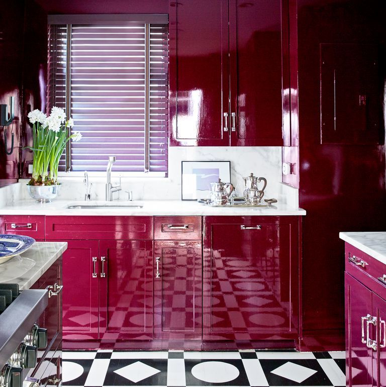
Just because you've settled on a warmer tone for the walls doesn't mean you can't decorate with cooler-toned decors, like off-white walls with black and gray decor. In fact, Gerson says that contrast is usually what creates such unique interiors. "To me, a contrast piques interest." That said, it's often wise to keep those contrasts between different color families (a cool white next to a warm white will make the warm one look dingy). Gerson's favorite warm neutral is Pink Ground by Farrow & Ball, a blush tone that can function as a neutral and lend its versatility to so many different types of environments and styles. "I used Pink Ground in my office with black carpeting with cool gray doors," she says (more on that color combo here).


![A Tranquil Jungle House That Incorporates Japanese Ethos [Video]](https://asean2.ainewslabs.com/images/22/08/b-2ennetkmmnn_t.jpg)


