
We all know that black and white makes a classic combo but our grey and white living room ideas feel a little more easygoing. It’s a flattering look for any age of property and it suits a myriad of styles, and is a slightly more design-y take on our ever popular grey living room ideas.
As the top two neutrals, white and grey make the perfect backdrop on which to introduce your favourite accent colour. They team equally well with warm-toned woods and stone for a natural feel or with cool metals and glass for a more elegant finish.
Grey and white offers plenty of options: you could go monochrome or pair with a standout accent to really pop; you could select icy cool or warm shades in soothing pales or cocooning darks; you could layer relaxing tonals or heighten the drama with deeply contrasting duos...
Whatever vibe you choose, grey and white are happy to oblige.
Get creative with tonal effects
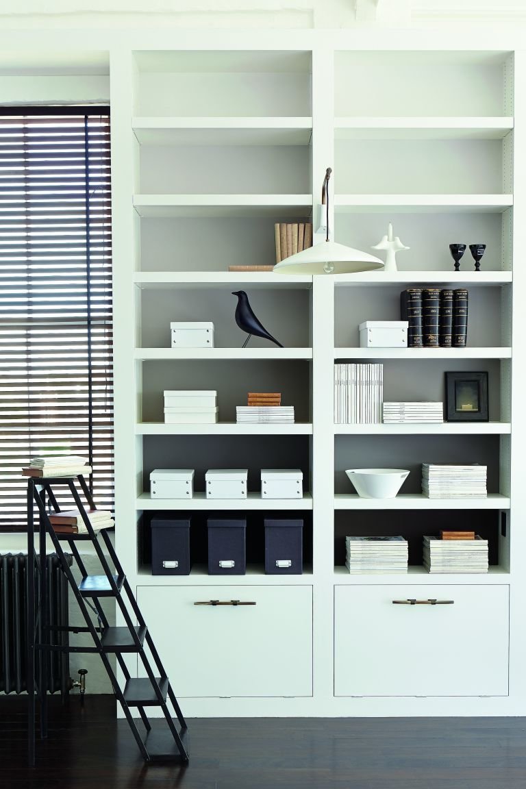
For a space-enhancing, airy effect, use your deepest grey on floorboards or skirting and step up the shades for the walls to white for the cornice and ceiling. This ombre effect is taken to heart on this shelving, where graduating greys create an elegant design feature.
“This is a really artistic way to elevate a functional area,” says Ruth Mottershead, creative director at Little Greene. “The greys and off white shades here are all based on the same pigment – red oxide – and they produce a calming, welcoming finish, from Rubine Ashes with its hint of pink to Down which is an off white with a slightly red base.”
Soften the contrast
Adding some mid shades of grey and white in between your two most starkly opposing shades will create a more laid-back feel, as in this Victorian terrace extension by interior designer Ciara Ephson of Fentiman Design. Dark hardware and white ceilings are bridged with warm white walls and tone-on-tone furnishings.
“Here I paired Mylands Ludgate Circus with Maugham White,” she says, “I’ve used a lot of Ludgate Circus recently – it’s a really versatile mid-tone neutral that looks great in so many different settings.”
Be inspired by a statement piece

All colour schemes need a starting point, whether it’s an artwork, rug, view or wallpaper. Here a monochrome Fornasetti-inspired sideboard is the centrepiece of the scheme and its colours are repeated around the space, in the rug and wall colour.
Get the undertones right for your light
There is a whole spectrum of greys and whites out there, but do experiment to ensure you get the shades right.
“I tend to choose greys with a green or taupe base so they feel warm and welcoming, such as Farrow & Ball’s Purbeck Stone, which I used on the walls here, with Wimborne White,” explains interior designer Fiona Parke of Johnston Parke Interiors who designed this living room. “My go-to grey is Farrow & Ball’s Ammonite – I find it suits nearly every space, modern and old, and it isn’t too dark or too pale. It’s very calming and works well with All White.”
Dare to go dark up above
Why let the walls have all the fun? For design drama, try a deep grey ceiling teamed with paler walls. Although lighter colours make a ceiling look higher, dark ceilings can feel cosy rather than claustrophobic.
And while you’re breaking a few design rules, don’t think you need to stick to a matt finish on the ceiling either. Try an eggshell or satin finish for a reflective sheen that that will help to brighten the room, just make sure you correct any surface flaws first.
For a cohesive finish, echo the grey in furnishings somewhere else in the room, as in this living room by Arteriors where the charcoal grey of the ceiling is repeated in the furniture and window frames.
Cosy up with a Scandinavian vibe
Layered tones of grey and white are the perfect base to create a dreamy Scandi style interior.
“Calm colours softened with a selection of tactile textures such as natural sheepskin, linens, candles and plants – all warmed with timber elements, will inspire that much sought- after Nordic simplicity,” advises Sandie Wallman, founder of Nordic House.
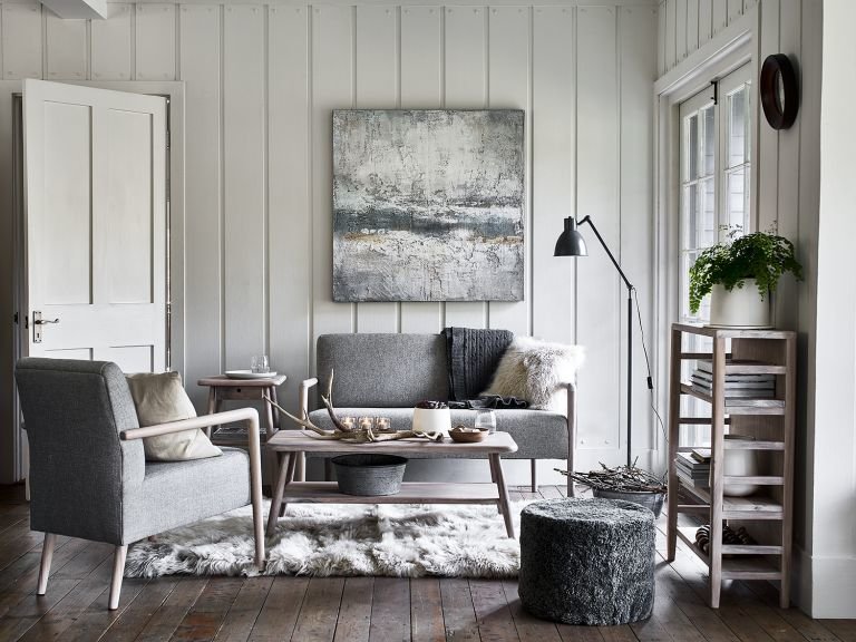
Colour block for definition
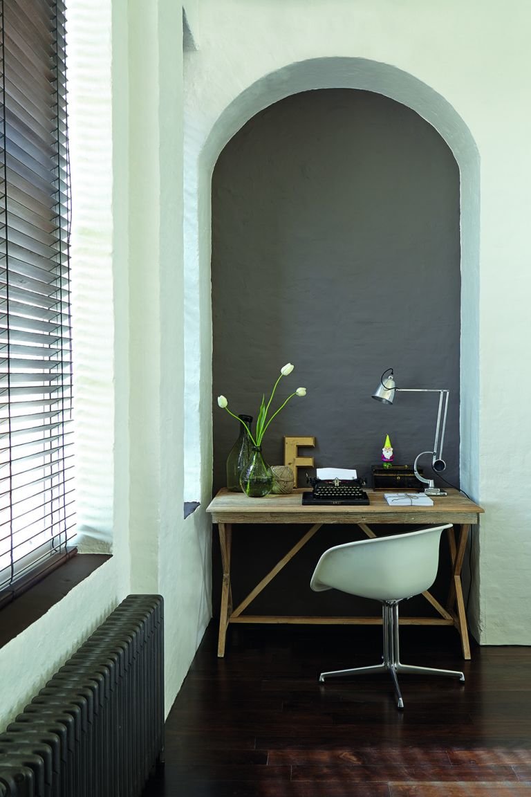
Just as a rug can be used to demarcate a seating area, you can repurpose a quiet area of the living room as a space to work from home with the use of colour. “Consider Knightsbridge in an alcove or colour blocked against walls in Down, as here,” advises Ruth Mottershead, creative director at Little Greene.
“Both these shades have warm undertones so combine really well and make the space in a small living room inviting and focused. This pairing is versatile and easy on the eye, so is easy to incorporate into an overall scheme.”
Keep it simple
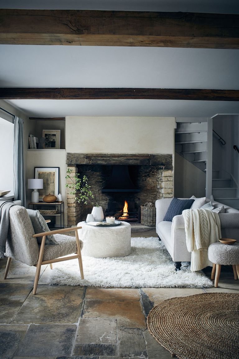
For an enduring aesthetic, stick to a refined palette of white with its many subtle shades and variations. “I love the perfect simplicity and versatility of white,” says The White Company founder Chrissie Rucker.
“It’s classic, yet modern and, just like a little black dress, it’s wonderfully timeless too. When decorating with white, I would always choose soft, soothing whites, off whites and some neutrals like grey. It’s a great canvas to build on when the walls throughout the house are painted either a warm white or very pale grey. Here we have used a mixture of neutral tones with natural materials and finishes to create texture and lovely character, introducing timber, stone, sisal and touches of greenery to bring hints of the outside world in.”
Feel free to team up
The perfect canvas to start a room – grey and white are easygoing neutrals so there aren’t many colours that won’t work with them. From olive and peach to teal and heather, accent away to your heart’s content! Here white walls, greige sofas and a grey and white terrazzo floor are combined with richly toned accents – an earthy red rug, maroon coloured chair and dark wooden tables – to deliver some warmth and energy to the scheme.
Update the classic coastal look
Switch out blue and white with charcoals and warm whites for a fresh take on ocean-inspired living. In this mountainside retreat designed by Studio McGee, timber and rattan elements warm this laid-back interior.
“The wooden floor brings the space to life in the most natural way,” says designer Shea McGee. “Rustic elements and textural chairs are complemented with a soothing landscape artwork, with its earth tones that bring out all the elements and textures in this space.”
Keep it in the family
White and grey come in a whole host of shades and it’s important to ensure they sit well together and suit the light in your living room. So be sure to test out your pairings so you can see how their undertones complement each other. Using paints from the same colour family makes life easier, as with Zoffany’s range.
“Our collection includes tints of Zoffany’s most versatile neutrals, so you can use the same colour but achieve different depths to expand on within the room,” explains Peter Gomez lead designer at Zoffany. “This enables you to create dynamic schemes within one colour group, for example, using quarter, half and double tints on walls and woodwork.”
Here walls and trim are in Architect’s White, which is a cool white with underlying silver tones, and the ceiling is in a lighter tint.
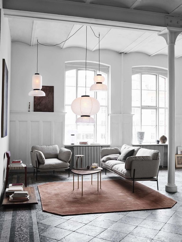
Use a picture or pattern to unite the tones
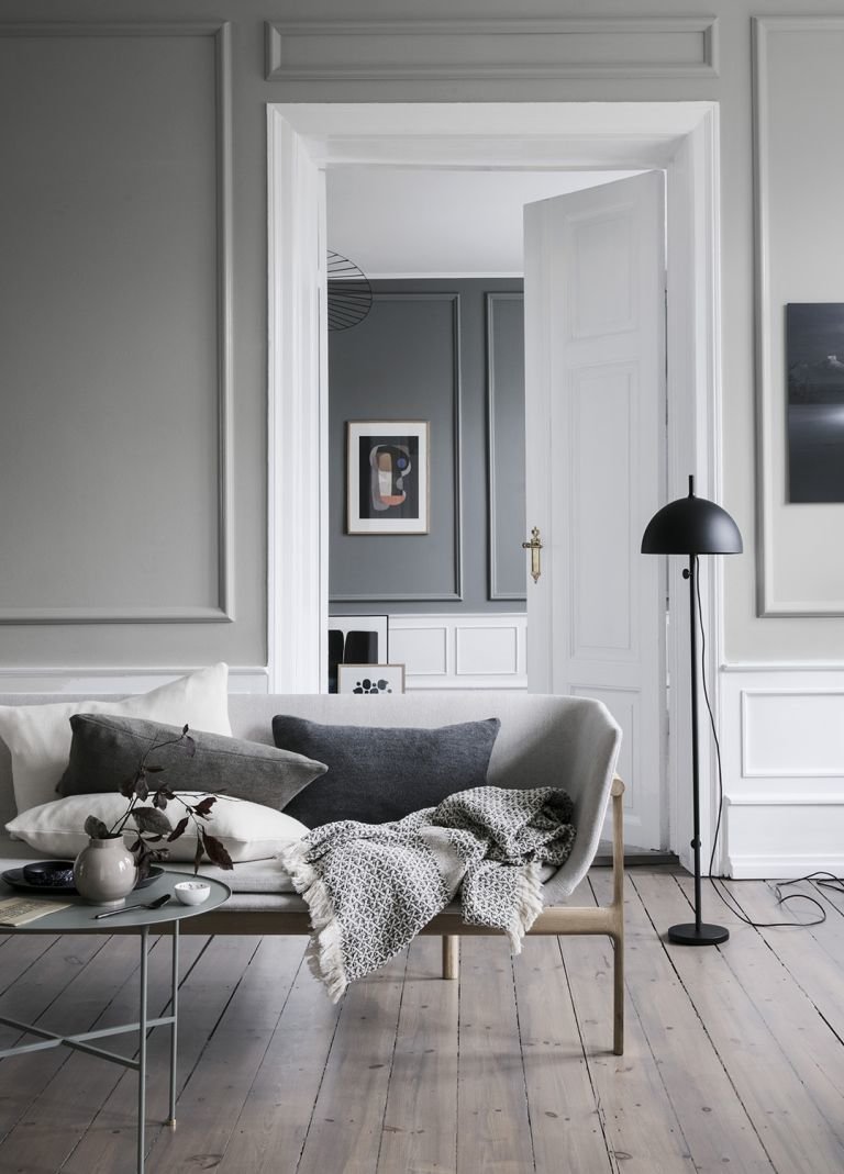
Choose an artwork or photo you love with grey and white tones to pull together the shades in your scheme, or commission an artist to create something bespoke for you. In this cool and modern living room, the paintings pick up on the grey tones used throughout the space, and are also reflected in the pattern of the woven throw.
Add vibrance with rich natural shades
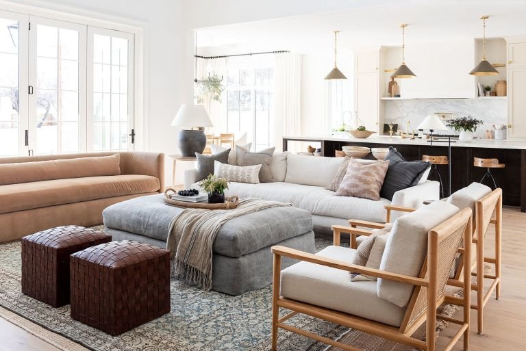
Mixing warm greys and whites with earthy browns and tans removes any trace of austerity and creates a comfortable and welcoming ambience for your living room. Be sure to use a variety of textures and tones for optimum effect.
In her own family home, interior designer Shea McGee from Studio McGee has combined a variety of organic and neutral shades and added brass highlights to create a chic yet homely feel.
“Creating an atmosphere is all about layers,” she says. “I really like to mix patterns, so every single pattern on the cushions here is different. We designed our Beckett Chairs to have a wooden frame and then this beautiful caned back. And my vintage rug is placed over a Girona woven jute rug so that together they create this warm, creamy look that ties everything together.”
What to think about when using grey living room wallpaper
When planning your scheme, it’s often easier to choose the wallpaper first, before picking out complementary paint colours. It can be used to tie together multiple colours within a scheme and needn’t be purely for walls – shelving backs, wall panels and even ceilings can look great clad in wallpaper. As well as offering a myriad of patterns from delicate to daring, you can bring your walls to life by choosing wallpaper with added sparkle, sheen or texture. For cosiness and welcome, choose a warm grey or if you’re after a more modern edge, opt for cool tones. Grey has many undertones so always place a sample in your room and observe how the colour changes throughout the day and against your other furnishings to ensure you’re happy with it.
What to think about when decorating a grey and pink living room
There’s nothing like a dose of pink for an uplifting burst of colour in a grey scheme. There’s plenty of colour variation, from fun pastels or neon brights to more sophisticated plaster pinks and dusky roses. Both light and dark greys make the perfect partners for pink – If you want a high contrast look, opt for dark greys, and for a softer scheme err towards the lighter shades.
Use doses of pink sparingly as too much can be saccharine, and to soften the contrasts layer a few similar shades of pink in your details. This combo pairs well with white, wood, gold and silver finishes, as well as navy or green.
Which colour curtains go with grey walls?
For a space-enhancing effect, team a grey window wall with similarly toned curtains, hanging the pole near to the ceiling to maximise their length for heightened elegance and to make the window appear larger. As grey is a neutral colour and windows are natural focal points, you may opt to use patterned or textured fabric - perhaps with some shimmer or metallic tones – to really frame the view, or to highlight them with a piped border or panel in your chosen accent colour. Fabric designs can incorporate other colours that are echoed around the space, giving a cohesive feel to the scheme.
Another option is to go a couple of shades darker if you have pale grey walls to add depth to the room; likewise going a couple of shades lighter works particularly well with strong greys so that the space doesn’t feel too enclosed. “If you’ve chosen a dark grey all over, ensure the room is ambiently lit and finished with velvet fabrics in rich tones,” advises Helen Shaw, director at Benjamin Moore UK. “Also consider a pattern to break up the dark colour and add to the luxe feel.”


![A Tranquil Jungle House That Incorporates Japanese Ethos [Video]](https://asean2.ainewslabs.com/images/22/08/b-2ennetkmmnn_t.jpg)


