
Various shades of verdant green seem to be popping up everywhere, including at the top of the list for most on-trend color. Why? Because it's just so versatile.
In the world of color science, green plays well with everyone, says Sue Wadden, director of color marketing for Sherwin-Williams. "All people relate to it," she says. "All cultures have strong associations with green." And after years of all white and shades of gray, we are collectively craving color. "We've been neutral for so long-and loved it," says Wadden. "It was a palate cleanser." But as we tire of grays and seek something more soothing while still fresh and modern, green has become a go-to.
In addition to popping up on our favorite designer Instagram feeds, the color has recently been recognized by paint experts and designers as a top trending hue. Two shades of green, a vivid chartreuse and a soft sage green, were named 2020 colors of the year by Etsy and Behr, respectively. Green was also identified as the most on-trend color in 1stdibs's annual interior designer trends survey, which polled more than 700 interior designers around the globe.
From retro minty green to dramatic dark forest green, the color looks at home in kitchens, bathrooms, living areas, and bedrooms, as well as on walls, tile, and all sorts of decor. Plus, the plucked-from-nature hue goes with just about everything, whether your existing color scheme includes neutrals, pinks, gold, brass, black, silver. "I don't know if there's a bad color combination," says Wadden.
Want to get a back-to-nature feel in your home? Here are seven modern ways to use green in every room.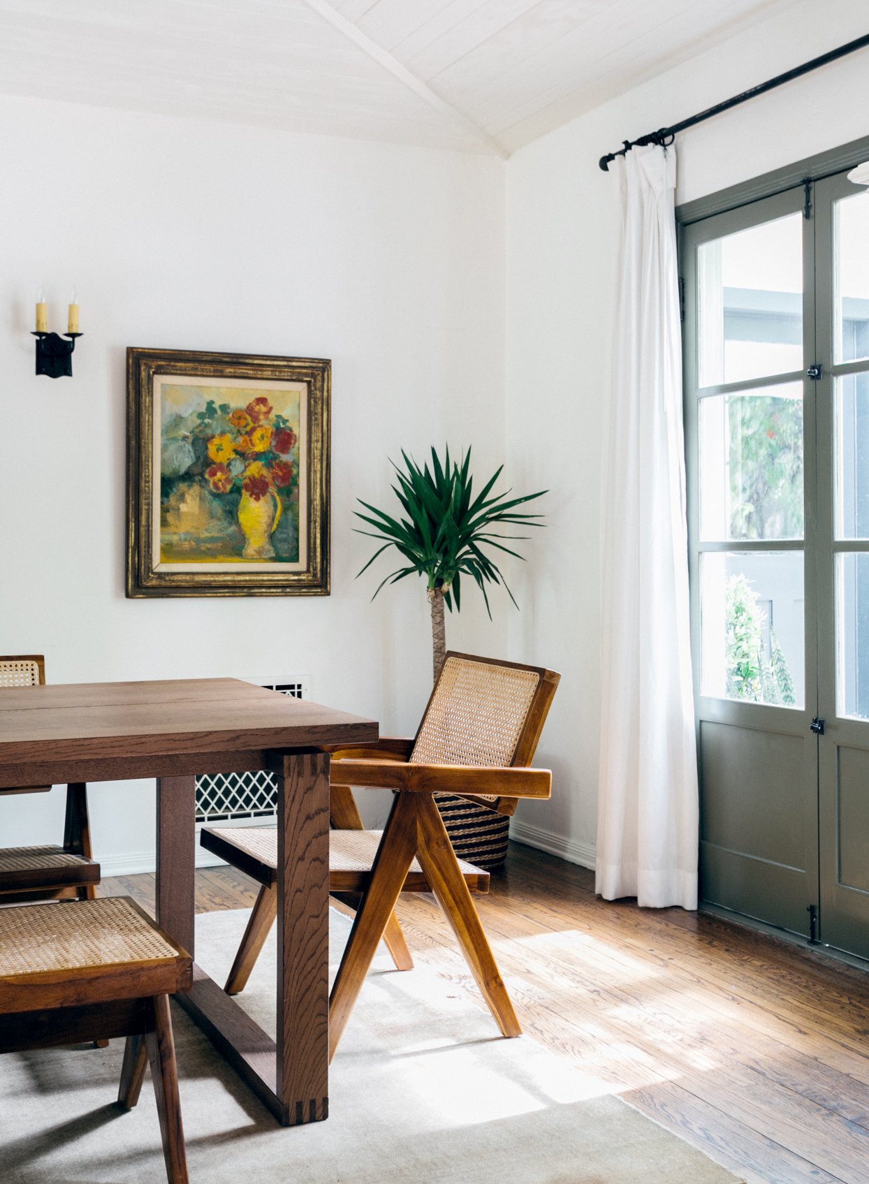
1. Use Green as a Neutral on Trim
In soft, muted shades, green can act as a grounding neutral that provides a refreshing alternative to more traditional browns and grays. When applied in select areas, such as doors and trim, the color breathes life into all-white rooms without overwhelming. This California home, which was staged by Kirsten Blazek of home staging and design company A1000xBetter and photographed by Virtually Here Studios, uses a dusty olive paint color (Adaptive Shade by Sherwin-Williams) on the trim and baseboards to add subtle visual interest to the neutral spaces. The nature-inspired shade of green works equally well on exterior trim or siding, as it blends seamlessly with natural surroundings.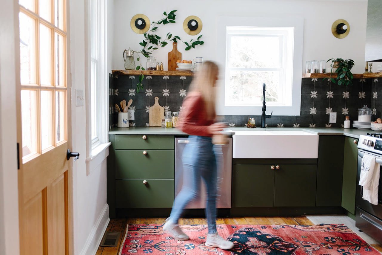
2. Apply Dark Green to Kitchen Cabinets
A welcome departure from popular white-on-white kitchens, dark green kitchen cabinetry brings depth and personality to cooking spaces. To balance the saturated shade, try pairing painted lower cabinets with airy open shelving, as demonstrated here in a kitchen by Claudia Beiler of The Chris and Claude Co., based in Lancaster, Pennsylvania. "Green, in all its varying shades and nuances, has been a powerful source of inspiration for us in our creative journey," Claudia says of the space she and partner Chris designed. "We feel that green speaks of new life and healthy living." The deep green shade is Fig Tree by Behr.
3. Paint Every Surface Gray-Green for a Moody Vibe
Shades of green with gray undertones have a moodier ambiance that works well in bedrooms, says Beiler. For this children's room, she selected Sherwin-Williams' Rainwashed as a sophisticated, gender-neutral color that will age well. "Part of the power of this image is that we used it on the ceilings, walls, and all the trim to create a dramatically restful feel," she says.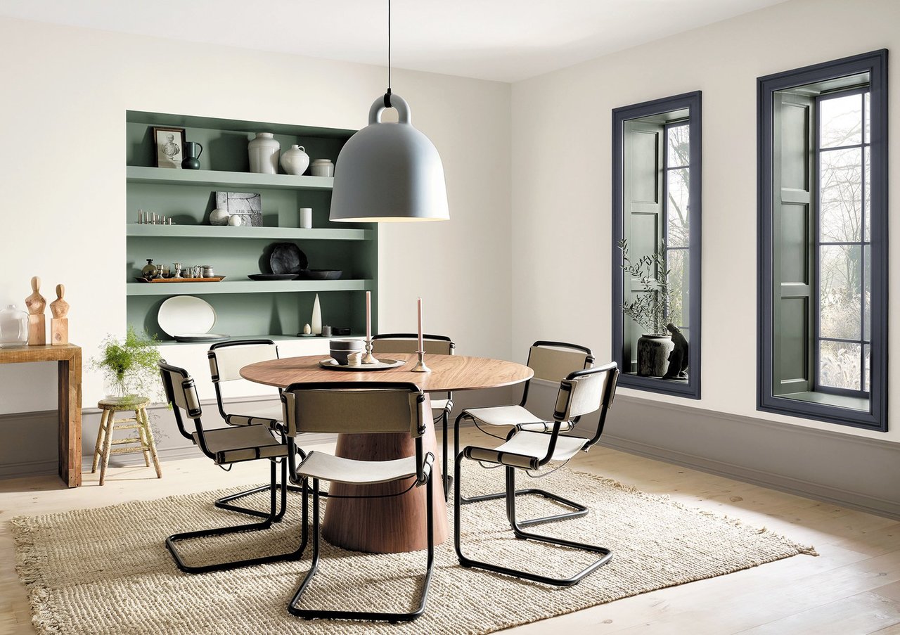
4. Choose Garden-Inspired Greens as Accent Colors
Take cues from your favorite houseplants or garden varieties for easygoing, liveable shades of green. Wadden gravitates to succulent-inspired shades such as Acacia Haze by Sherwin-Williams. "It's not hunter green—this is not 1994—but a modern version of it," she says. With undertones of stone-gray, the color pairs well with natural materials, such as wood, linen, or jute, to reinterpret the "bringing the outside in" trend in a more subdued way. Here, the color is used to subtly highlight built-in shelving without distracting from the sophisticated look and feel of the dining room.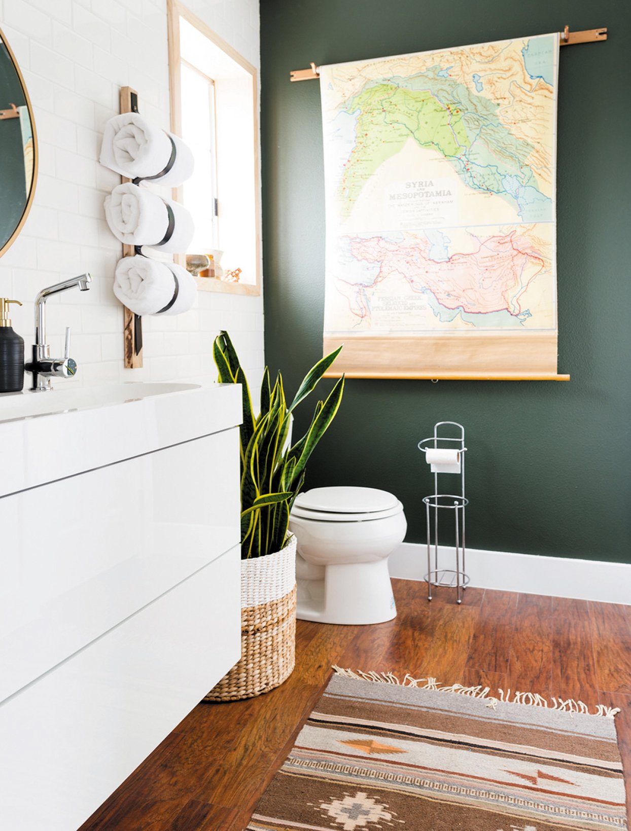
5. Enliven a Small Space with a Deep Green
"We always say in design: when you want to add life to a room that's feeling too stark, add a plant," says Wadden. "We are predisposed to have that love affair with green." This trick works with paint colors, too, as with this rich green accent wall in an otherwise white bathroom by Vintage Revivals. The shade picks up colors found in a vintage map and snake plant, while a reflective sheen keeps the saturated green from feeling too dark.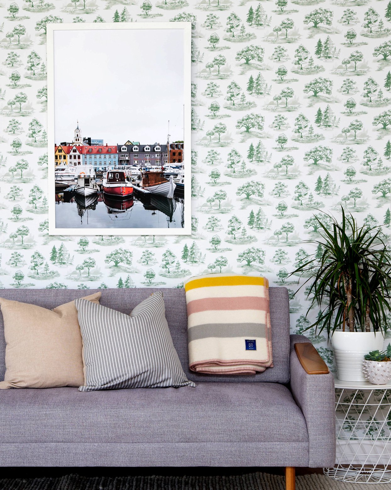
6. Reimagine a Classic Pattern in a Modern Color
Beyond paint, wallpaper provides an opportunity to apply the trendy color in a striking pattern. This tree toile wallpaper by Chasing Paper, for example, reimagines a vintage-inspired pattern in a fresh green hue. "It could go in so many different spaces," says the company's founder Elizabeth Rees. "It's so versatile; it can be dressed up or dressed down." In this living room, it reads almost more as texture than color.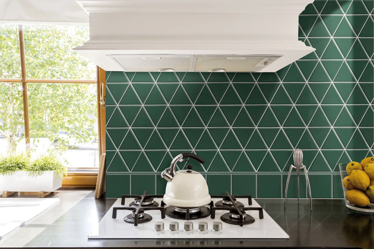
7. Try Forest Green to Freshen Up Familiar Patterns
The right color can put a fresh spin on classic designs. This retro-inspired backsplash tile, for example, repeats a familiar pattern but in a modern green color that feels current. "We've seen blue. We've seen pink. And now, we're seeing green," says Erika Egede-Nissen, director of marketing at Walker Zanger. Unlike the forest greens popular in the '90s, she notes, it's now "a deep, rich green that is really coming back into design."


![A Tranquil Jungle House That Incorporates Japanese Ethos [Video]](https://asean2.ainewslabs.com/images/22/08/b-2ennetkmmnn_t.jpg)


