
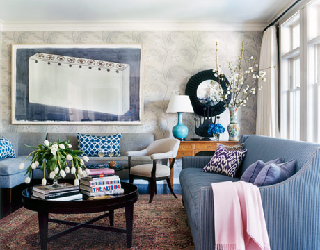
Soft purples and gray-blues in the living room of a Los Angeles house temper the deep indigo of a huge Los Carpinteros painting. "The painting would have overpowered the room if I hadn't used colors from the other end of the blue spectrum," says designer Kristen Panitch. Sofas are covered in Mali Stripe and Kinsale, both by Jasper. The bold pattern and neutral colors of Cole & Son's Mimosa wallpaper adds "a sense of daring and quiet at the same time." Christopher Spitzmiller ceramic lamp. Mirror from Blackman Cruz.
KRISTEN PANITCH: Actually, it's a 1950s ranch house, in a Brentwood neighborhood of mostly rather humble one-story ranches. But when we renovated, we added Craftsman details, but streamlined, more simplified and refined.
Who lives here?
Steve and Nancy Lovett. He's a talent manager in L.A., and she's a homemaker who stays busy taking care of their four children. The youngest is 6 and the oldest is 10--that's why we had to add a second floor to the house.
There's a lot of blue in this house.
It's hands-down my favorite color. I'm passionate about blue. And yes, there is a lot of it here.
What is it about blue that makes you so gung ho?
It's the most versatile color out there. It's subtle, it's strong. It's warm, it's cool. Blue just feels good. It says a lot in a quiet sort of way. Blue never shouts. I almost always start with a blue, and then I build a room around it. There's a ton of layering here. I'm a firm believer that you need to layer your blues.
Why?
All the variations and tones give a room depth and textural detail. For me, blue is a neutral--you can use it in the same way you use grays or beiges. Layering blues creates almost a monochromatic feel. You don't walk into this living room and say, wow, there's a lot of color in here, and yet if you break it down, there is. If you're going to combine blues, though, at least one needs to be a grayer blue. You need a quiet blue to ground the room.
I see you've done that in the living room, with that tweedy gray sofa.
We knew the Los Carpinteros painting had to go in the living room, because it was the only space big enough to accommodate it. You don't want a strong piece of art to dictate the whole room, so to neutralize its strength, I used blues at the other end of the spectrum of that deep indigo background.
Which blue did you start with in the room?
The rug was my starting point. It has this really beautiful paleish blue in it that I wanted to pull out. Then I added navy to give the room personality. And purple--purple is the perfect complement.
How do you keep a room from looking like it's gone overboard with the blues?
You need to stay in the same family. This whole house is in sort of the taupey-gray blue family. That turquoise lamp in the living room might seem to contradict what I'm saying, but it's a pure blue. All the blues in the room are pure. If you want to do a muddied blue room, then you need to stay within that muddied family.
Is blue ever tricky to work with?
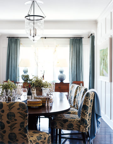
It can get too medicinal if it has too much green. And if there's not enough yellow, or too much red, it gets too cold and sterile. Blue has a chameleon quality. It changes depending on what it's surrounded by. You know how black can sometimes look brown or blue depending on its context? Same for blue. I'll have arguments with people about certain blues. 'It's blue.' 'No, it's green.' 'No, it's blue.' It's a matter of what's standing next to it. That wall color in the dining room is the ultimate chameleon blue. It's lighter in the morning, and then toward evening, it deepens and feels moodier.
What color is it?
It's called Blackened, funnily enough, and it's by Farrow & Ball.
Do you have a favorite blue?
I'd have to say navy. It feels sort of East Coast to me, and I love that. I've been told I have an East Coast sensibility. That rings true, even though I'm from Santa Monica and very happily a California girl. I've got stacks of navy blue sweaters. When my daughter was a baby, I'd put her in navy all the time. I didn't think twice about it, even though my own mother protested!


![A Tranquil Jungle House That Incorporates Japanese Ethos [Video]](https://asean2.ainewslabs.com/images/22/08/b-2ennetkmmnn_t.jpg)


