
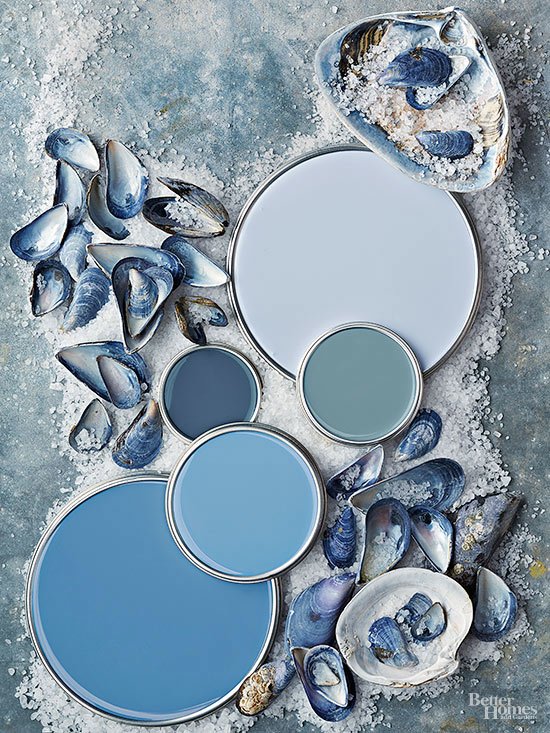
Blues
Shades of blue with a little gray boost a beachy vibe. "A range of blue-gray shades reflects a comfortable, easy lifestyle, whether you're lakeside or landlocked," says Nate Berkus, New York City-based interior designer, TV personality, author, and host of American Dream Builders on NBC. "Camel, natural linens, and seagrass all work really well with this palette, and it pairs beautifully with dark wood finishes and classic black and white," Nate says. Not so hot? "I'd steer clear of honey finishes, earth tones, and warm oranges or reds."
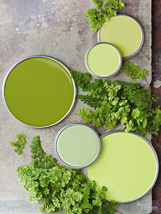
Greens
If you're looking for a green with a little zip, give fern greens a whirl. "These greens are energetic. They work well in homes with families because they match the vibrancy of active kids," says Jill Goldberg, a Boston interior designer. To select a fern green that isn't acidic, look for paint colors with gray undertones. "They add longevity to a color and keep it current," Jill says.
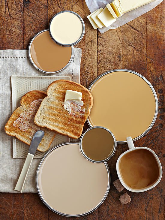
Neutrals
Creamy neutrals bring layers of warmth to decor, plus they're versatile. "Everything goes with camel brown. It's like decorating with the little black dress. This palette can feel modern or classic. It's very flexible," says Janet Lee, color adviser and stylist, whose small-space decor book, Living in a Nutshell, is now out in paperback. And don't think neutrals have to be boring. "Neutral color doesn't mean neutral personality," Janet says. Varying shades in the same family creates pizzazz -- especially in a small space. “Put oyster and butter with shades of caramel, and the look is so sophisticated," she says.
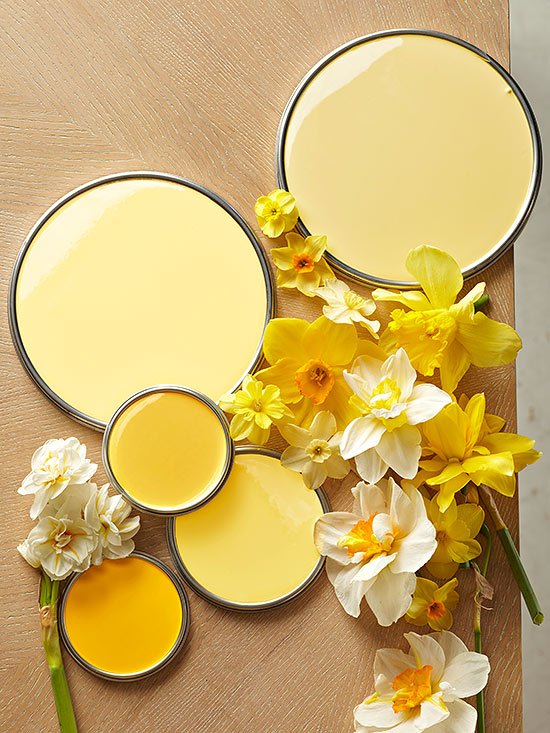
Yellows
These happy daffodil hues are a sure mood-booster. "I'm hooked on the joyous, youthful, and adventurous atmosphere yellow affords a room," says Will Taylor, the creative force behind the Bright.Bazaar blog and book Bright Bazaar: Embracing Color for Make-You-Smile Style. Will says yellow is a sociable color that works best with other hues. In a broad color scheme, "a peppering of accents -- a vase, throw, or cushion -- will make a room soar," he says. To pick an allover yellow for walls, "Opt for a creamy shade that contains white," he says. "And choose paint that has a chalky finish."
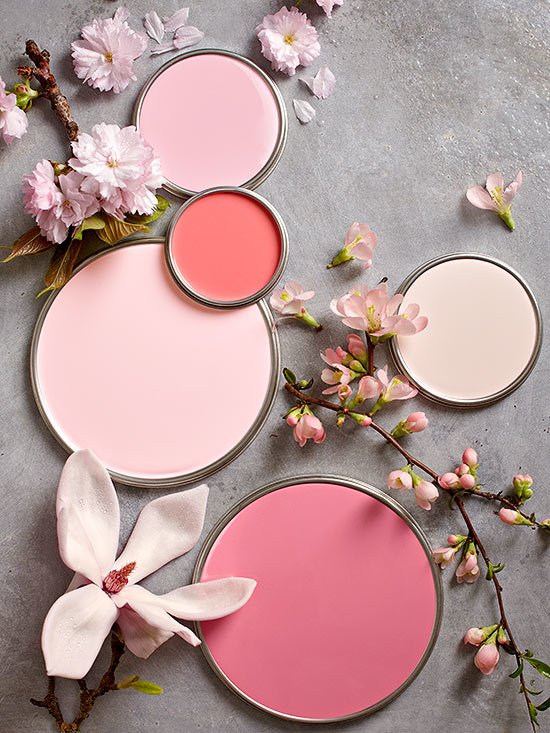
Pinks
Petal pinks are bright pick-me-ups, but they can also be surprisingly sophisticated and livable. To suit grown-up tastes, skip the confectionary pinks like bubble gum and cotton candy. "Choose a pink that is found in nature, like the pink in a sunset," says Shazalynn Cavin-Winfrey, a designer in Washington, D.C. And what pinks are hot right now? "What I'm seeing is less of a blue-gray pink and more of a coral pink. It's a natural evolution from orange," she says.
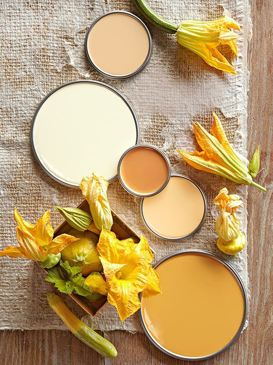
Oranges
If tangerine has too much zing, give these softer golden oranges a whirl. "These yellow-oranges create moods in a room. Lemony orange is happy. Reddish orange is welcoming. Brownish orange is more serious," says Asler Valero, a New York City interior designer and color palette creator for California Paints. To use orange as an enveloping room color, Asler prefers the creamier shades that border yellow. "These lighter colors are refined, classic, and livable," he says. But don't let orange stray too far and wash out. "Avoid light yellow," he says. "It disappears. The best shades are vivid and earthy and influenced by browns."
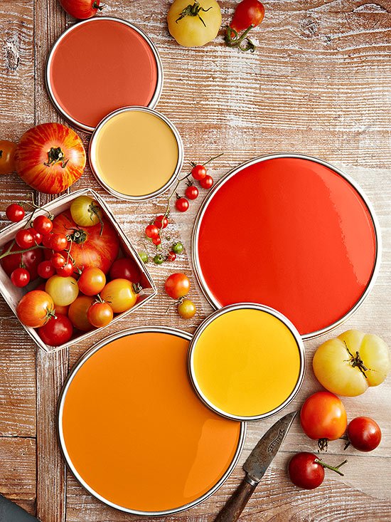
Reds
Inspired by the summer staple, these tomato reds and oranges are daring picks that pay off. "You have to have a little bit of a fearless streak to use these colors. But their strength can make a room feel anchored and elegant," says designer Molly Luetkemeyer. "When you do a strong move on the wall, you've thrown down the gauntlet. The other pieces in the room need to have the same level of intensity," she says. Try this trick when choosing colors. Get a sample of the hue you like plus three variations: one lighter, one more gray, and one more brown (look at the adjacent strips on the display for these). "A color with a little bit of 'mud' in it will be more sophisticated," Molly says.
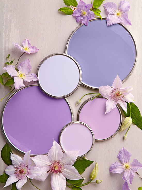
Purples
Purple doesn't need to mean childish -- a grown-up look is all about picking the right hues. "People think the color is childish or overbearing, but if you stay in the whispery purples, there's a sense of restraint about the color that's really appealing," says Anne Coyle, a Chicago interior designer known for her color sense. But keep in mind that lavender is not a soloist; it needs harmony. "Avoid using it in a kitchen or bathroom," she says. With limited complements of pattern, texture, and color, "it gets old really quick."


![A Tranquil Jungle House That Incorporates Japanese Ethos [Video]](https://asean2.ainewslabs.com/images/22/08/b-2ennetkmmnn_t.jpg)


