
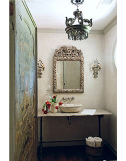
You look at the living room and think 'blue,' but then you look closer and say, 'Wait a minute...just where is the color?'
There's that blue-painted cabinet, some blue in the carpet, blue glass boxes on the table, but not much more. You don't need much blue for a whole room to seem blue.
Are blues hard to get right?
Really hard. We agonize over them. They change with the context, because other colors affect them dramatically. Natural wood warms them up, silver cools them down, white brightens them.
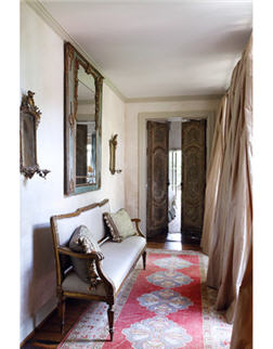
Light seems to bounce and flow everywhere — silvery chandeliers, luminous fabrics. I can't take my eyes off those sexy curtains.
They're ball gowns! We use that fabric a lot. It's duchesse satin, and it's got real weight and an iridescence that's very understated, and it just hangs beautifully. We have it lined, and the whole point is for it to look like a ball gown that's slightly rumpled — one you had a really good time in. Curtains should never be stiff. They've got to look like they've been opened and closed and touched. These are slightly too long, but not draggy and contrived. Nobody's going to trip over them. It's just enough to hold them out and rumple them up a little bit.
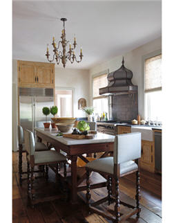
I notice you don't have shades on any of the chandeliers. Do you prefer to leave the bulbs exposed?
Yes, in most cases. Shades distract from a chandelier's sculptural quality. You don't have to stick on shades to make it appealing.
Many houses I've seen in Houston feel very done, with every hair in place. What gives this one its confident nonchalance?
That's another of my mom's signatures — the place seems un-done. It's not a paint-by-numbers thing. The character of the whole house comes from the character of each piece. Each one has to speak to you. It's like a jewel with a history — you might not know what that past really is, but you could make up a good one! We do a lot of shopping in France and Italy, and our client has a real passion for European antiques.
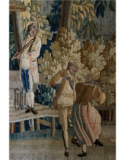
But you're pairing antiques with new partners, right? Sort of like the French couple in that tapestry, dancing what could almost be a Texas two-step.
There you go! We want an interior to look like it's evolved, like you've collected over the years, your tastes have changed, and you've melded it all together.
Some of these pieces individually are what might be classed as rather grand, and yet the way you've put them together…
…has a casualness. Right. If you arrange these bergères and fauteuils very formally, you don't want to sit in them. We don't want anything to seem staged and unusable. I guess you can tell we have a chair thing! They all have such distinct personalities.


![A Tranquil Jungle House That Incorporates Japanese Ethos [Video]](https://asean2.ainewslabs.com/images/22/08/b-2ennetkmmnn_t.jpg)


