
If you have noticed your affection towards certain colors change over recent months- you are not alone. The pandemic has seen a shift in our home decor choices, as we notably move towards warm earthy shades and brighter colours.
While we may recognize the craving to inject these trendy tones in our interiors, we may question where this desire stems from. Thankfully for us, leading international color psychologist and author of The Little Book of Colour, Karen Haller, has the answers.
Bright color trend for 2021
'Last year, amid the lockdown, I spoke to a lot of people, and I watched and observed patterns of behavior surrounding color psychology. I saw desires for color split in two,' Karen Haller shared.
'One side of the split are the people who want to live in an abundance of color because they are trying to bring more emotion, optimism, joy, and happiness into their homes,' Karen announced. 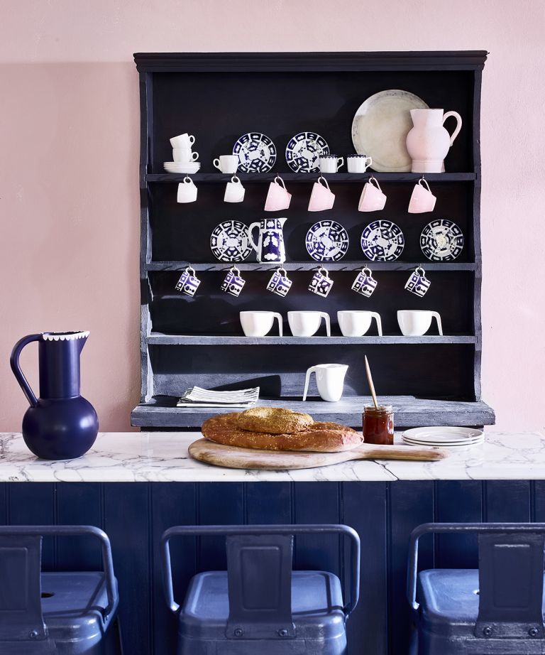
The expert continued, explaining how we may notice ourselves using 'almost too much color' because we 'aren't getting the stimulation that we usually feel when we go outside.'
'When we want to feel stimulated, we can turn to color because it's very bright and saturated. These shades offer emotional stimulation because color is emotion. This emotion is what color psychology is- it's the connection that we have with color, and it influences how we think, how we feel, and how we behave.'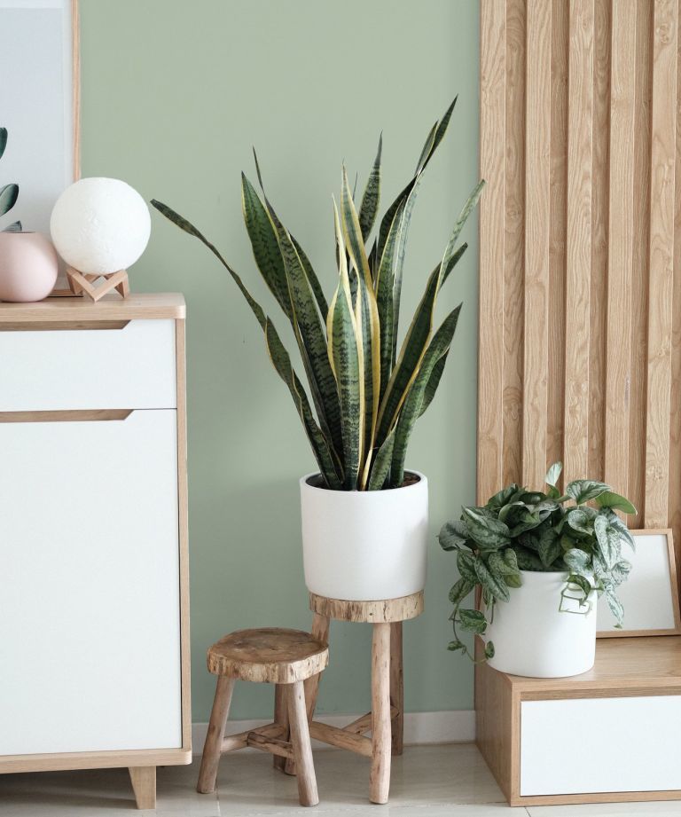
Karen’s observations regarding bright colors are further emphasized by Rob Whitaker, Creative Director at Claybrook Studio, who highlighted the desire for blushing pastels and intense natural shades, such as deep blues and greens.
'Over lockdown, Kate Blush was by far the most popular shade purchased from our paint palette,' he explains.
'It's a lovely soft blush pink with a hint of apricot. Working equally well in contrast to stronger tones like deep blues and greens, it's also a calming stand-alone hue, perfect for clients spending more time at home. It's unique in that it works in every room. It's not every color that feels right in bathrooms as well as sitting rooms, but this one seems to hit the mark.'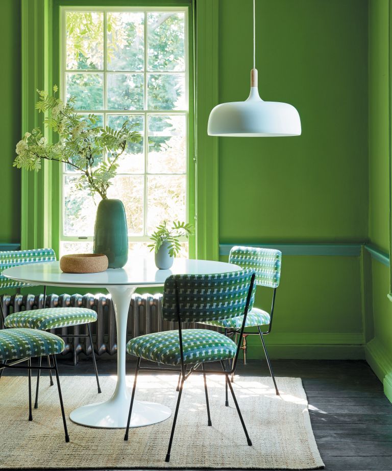
Furthermore, Ruth Mottershead, Creative Director Little Greene also emphasized:
'More than ever, it's been really important to create a space that feels relaxing, comforting, and calm. Alongside the move towards warmer natural stone colors such as 'Travertine' and 'Clay,' green in all its hues has remained really popular for us, from bold, deep greens to earthy and more muted tones, we find ourselves craving colors that make us feel closer to the natural world.
Because greens come in varying undertones and depths, they offer lots of flexibility to create very different atmospheres within a space.'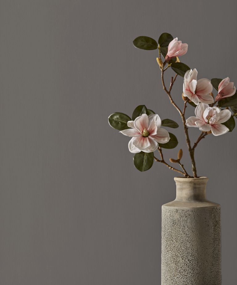
However, gray is still far from falling out favour. According to Karen, the other 'side of the split' is the stony neutral.
Despite the evident growing affection towards brighter colors, gray offers a different appeal that people have enjoyed over recent months.
'Gray represents the need to block everything out and to pull the duvet over yourself. Some people use the color to hibernate and shut the world out. It offers the feeling of safety and an opportunity to hide from the world,' Karen shared.
If you're suddenly feeling a desire to inject some gray into your home, see our gray bedroom ideas - 25 stylish grey bedroom spaces from stone to steel.


![A Tranquil Jungle House That Incorporates Japanese Ethos [Video]](https://asean2.ainewslabs.com/images/22/08/b-2ennetkmmnn_t.jpg)


