
The most fun interior collection of 2021, or perhaps, our entire lifetime, has launched, and we're all very excited.
Aperol, the brand behind everybody's favorite Italian aperitif, has released Aperol A Casa Capsule, a home decor collection, complete with a neon Spritz sign, velvet cushion, and ceramic table lamp, that are all connected by one overriding theme - they are all orange.
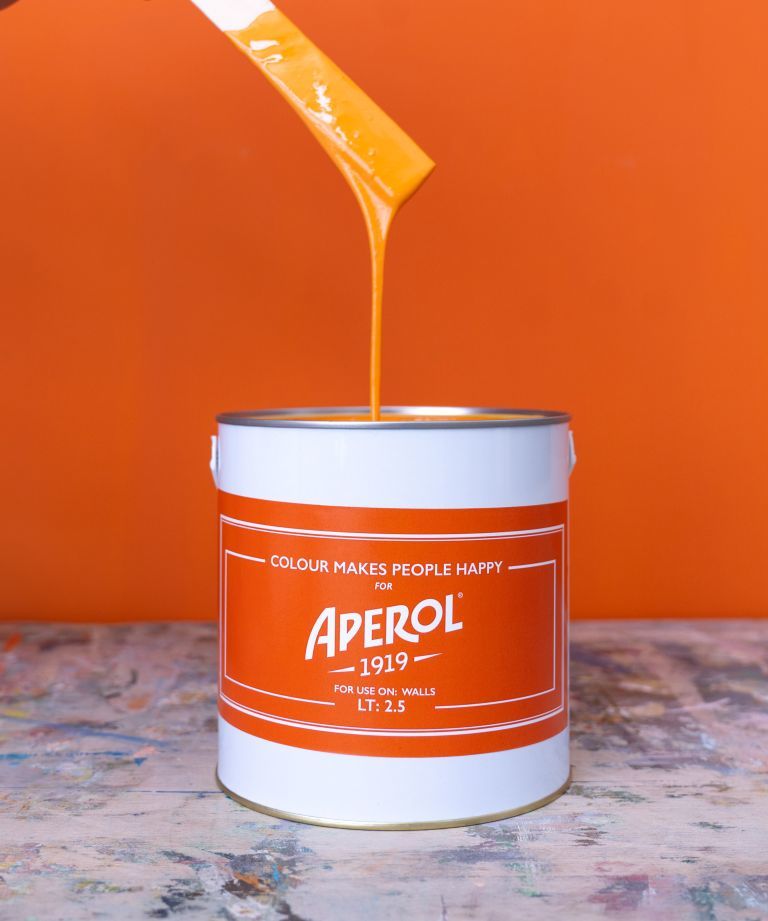
The collection also includes a limited edition orange paint, made in collaboration with Colour Makes People Happy, which brings the color-glazed houses of Burano to our living rooms. This paint is a bold, bright orange that has the potential to become the color of summer 2021.
Tin of Aperol orange colored paint
Before we all get a little too excited and spread Aperol orange across our walls, we caught up with some of our favorite designers who revealed whether this color should remain limited to our liquor cabinet. 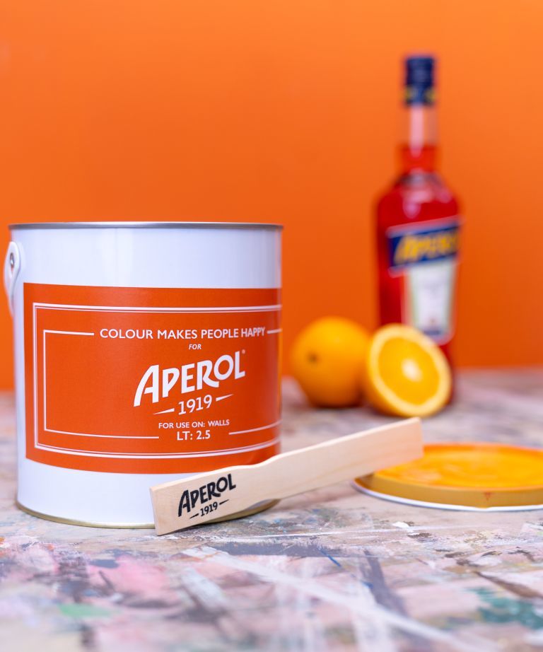
Eva Sonaike
Nobody knows color quite like Eva Sonaike. The Creative Director and Founder of Eva Sonaike Interiors has built her celebrated design company through her use of bright colors, which she merges with striking patterns to bring the beauty of African Luxury to her clients.
'It's an uplifting color, exactly what we need right now,' Eva says of the statement shade.
'As it is such a strong color, it could look overpowering if applied to an entire room. I would use this on a feature wall to make a bold statement. It is also crucial to choose the matching accessories and soft furnishings carefully. I would pair with more neutral shades to complement the color.'
'In terms of furnishings, I would opt for mid-century pieces, as they work very well with this bold hue, Eva added.' 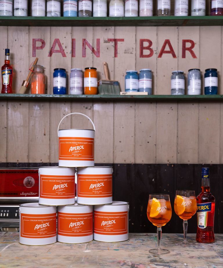
Minnie Kemp
It appears Minnie Kemp loves Aperol Spritz' almost as much as she loves working with color, as the expert designer at Firmdale Hotels shared:
'The tinkle of ice, cushy spritz, vibrant, zesty orange, ah Aperol. Usually enjoyed al fresco, who needs a sunset when the table is already luminescent with the famous shade of orange. But what is this I hear? Aperol is introducing a new interior range? The first thing that springs to mind is pure unbridled fun!'
'Oh yes! I have a vision – an open plan kitchen and drawing room with the woodwork, skirting board, and cornice painted in the New Aperol paint matt finish, an electric bolt that is sure to fill you with joy and lift your mood every time you walk in the room. The rest of the walls to be painted in Designers Guild Chiltern Chalk No.158 for a backdrop. Nobody wants Aperol all night long - an aperitif is pure perfection, I think you will agree.'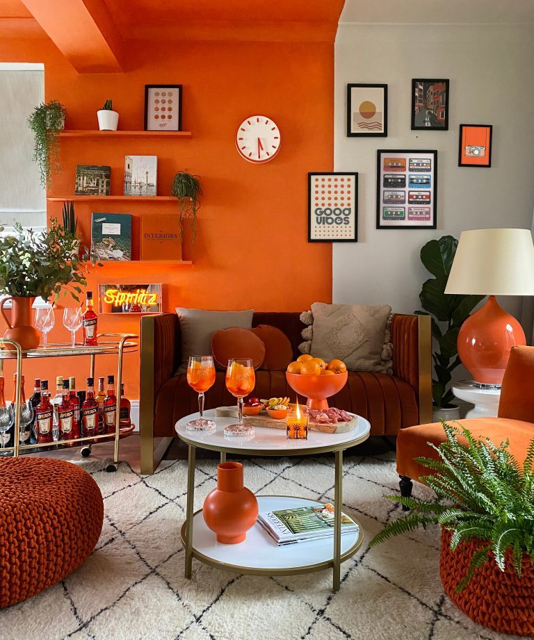
Minnie continued: 'If you're into velvet, have a look at Marvic Safari in Spruce colorway, or Pierre Frey Cheyenne linen in Cactus colorway - a fabulous choice for an armchair, with cushions from Kit Kemp designs for Christopher Farr in Lost & Found and Ozone.'
'I would even paint an old wooden drinks trolley in the new Aperol paint color with antique mirror trays to complete this sophisticated yet fun look.'
Enass Mahmoud
The Creative Director at the London-based interior design company, Decor by Enass, mirrors the words of Eva and Minnie, as she urges us not to overindulge in orange. For, as Minnie previously shared, nobody wants Aperol all night long.
'As a lover of color, this is definitely a shade that you would not be able to miss. With this specific shade of orange, I would recommend using it in small doses - so maybe paint the inside of a cabinet to make the objects stand out, or upcycle an old bedside table to create a new feature piece in your room.' Enass concluded.


![A Tranquil Jungle House That Incorporates Japanese Ethos [Video]](https://asean2.ainewslabs.com/images/22/08/b-2ennetkmmnn_t.jpg)


