When architect Goy Zhenru was introduced to this terrace house in Singapore, it was dark, cloistered, and suffered from many poorly designed spaces: The kitchen was small and narrow, and rooms-while spacious-were awkwardly shaped.
"It was previously renovated to maximize the floor area within the house’s envelope," says Zhenru, founder of Goy Architects. "An additional mezzanine reduced natural light and ventilation into the house, so the former owners would switch on the air conditioner all the time."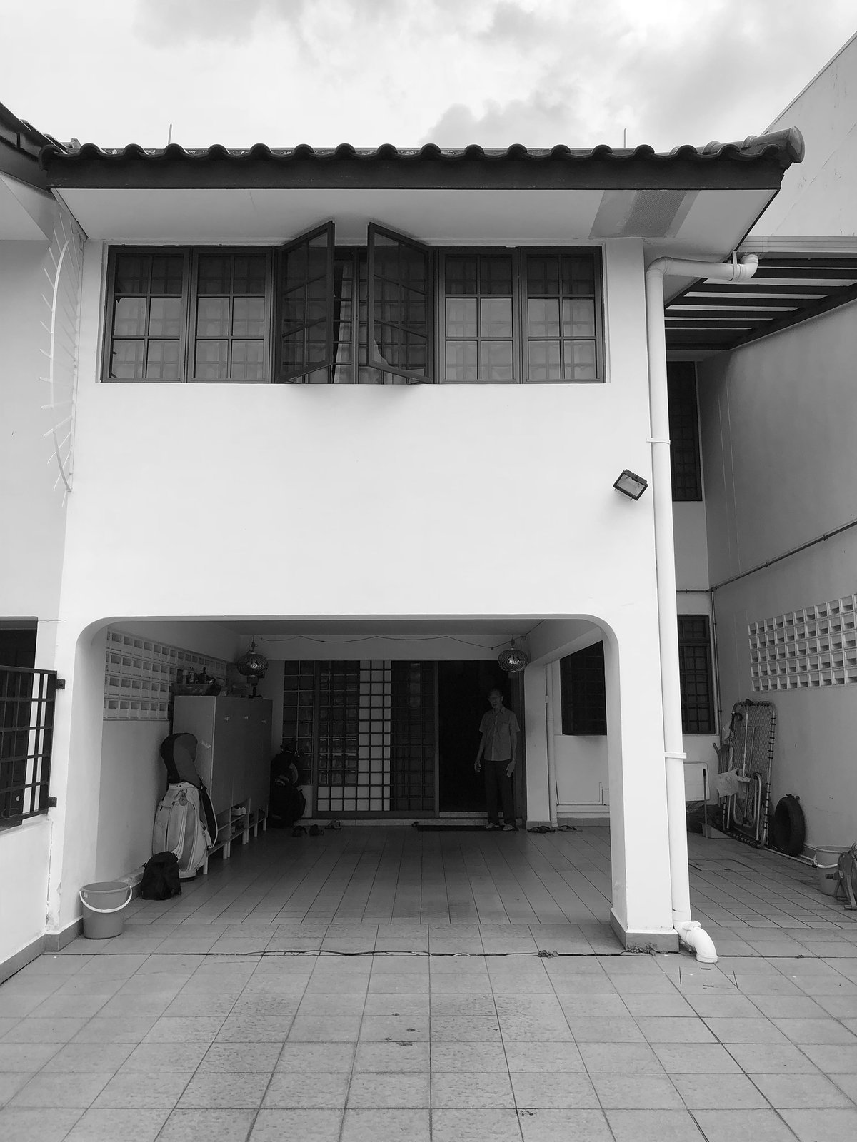
Before: The facade was closed off.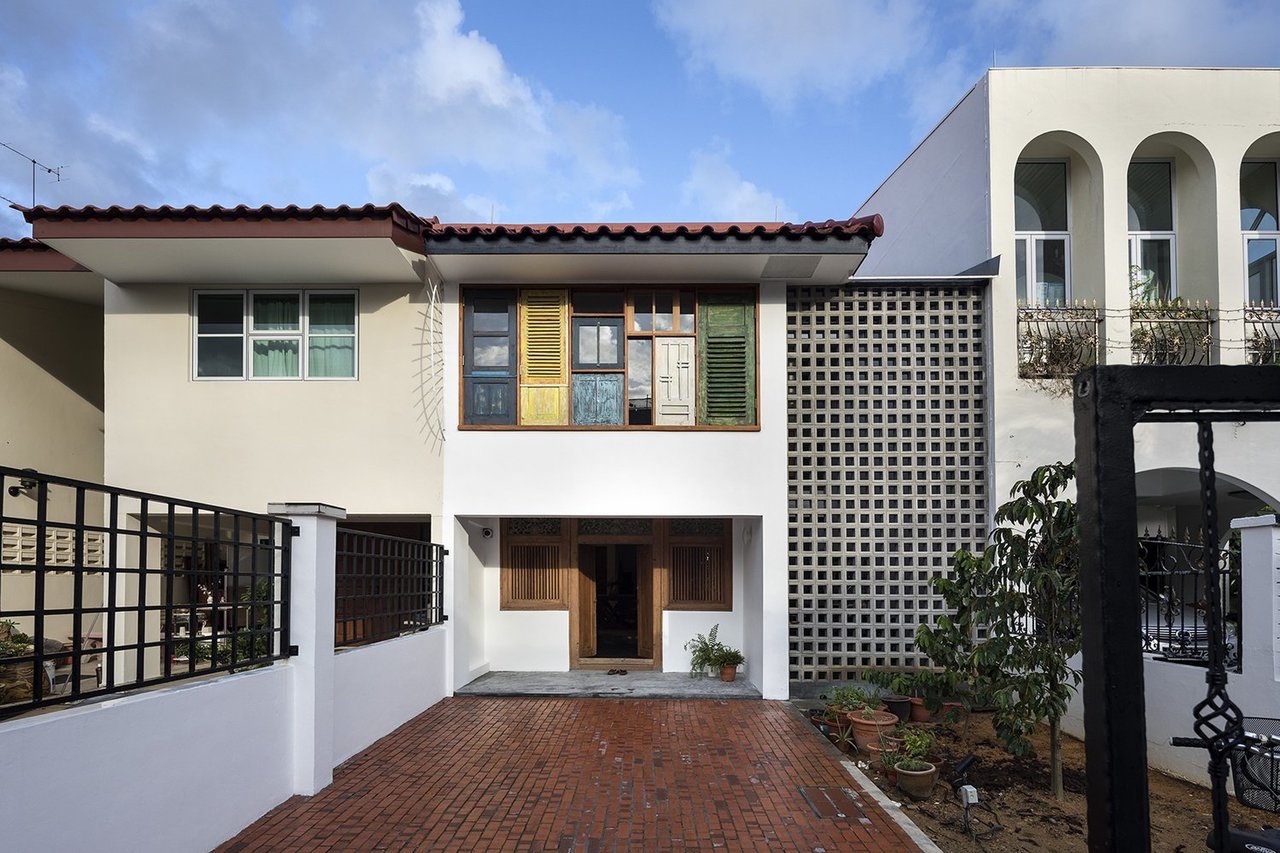
Heng House’s facade was brought forward with a concrete breeze-block screen and a recycled front door and windows.
The current homeowner, Sandra Heng, lives with her parents. On weekends, she holds free Pilates workshops for people with mobility issues caused by injury or old age. Her father volunteers with prison services and meets weekly with former inmates to reconnect them with the local community. Sandra needed a studio for her work, and her father required a space that could accommodate large gatherings or simultaneous intimate groups. 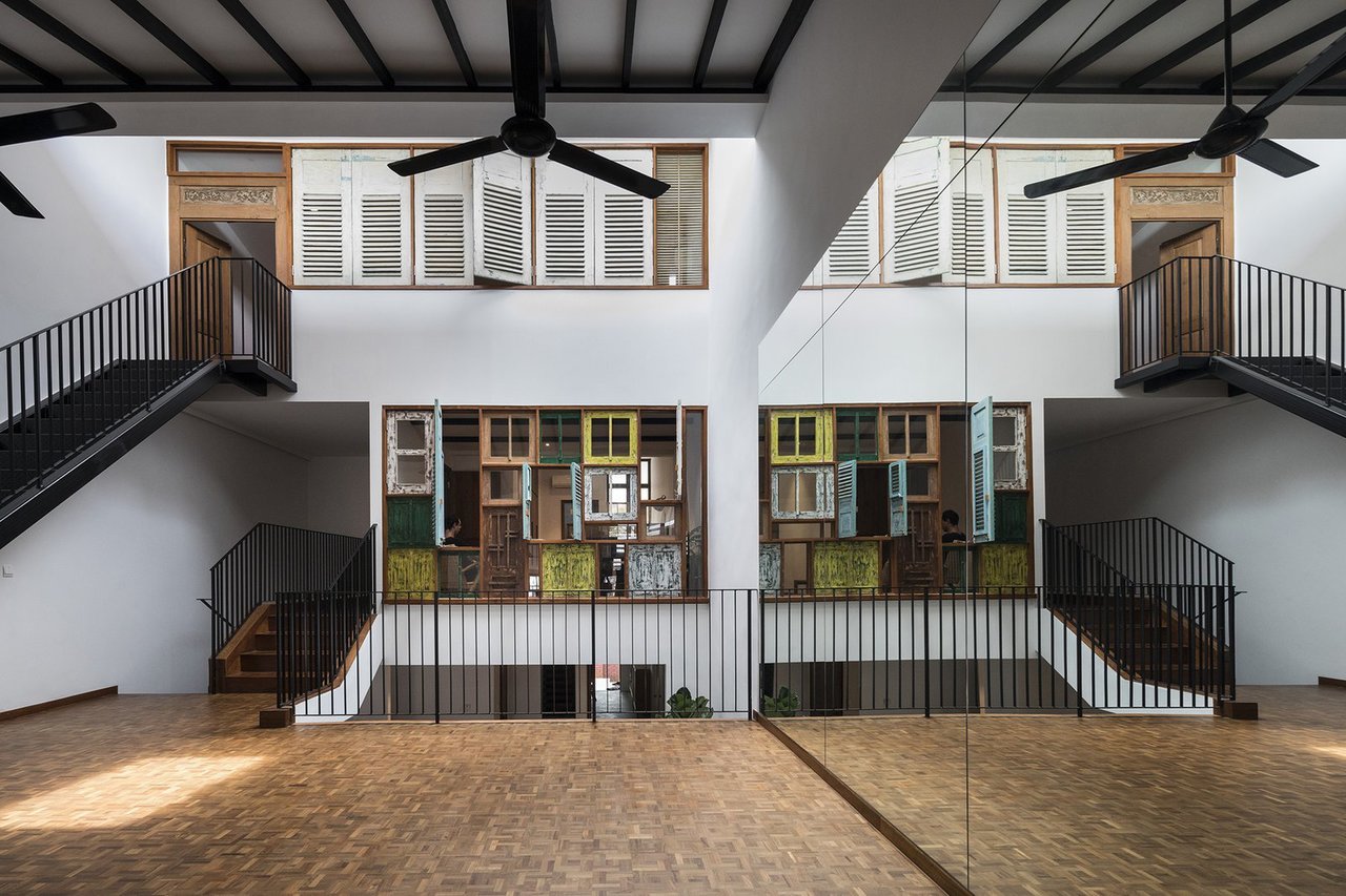
Architect Goy Zhenru took advantage of the house’s original split levels, connecting the different areas across the new courtyard.
To bring a sense of harmony to the home, Zhenru looked to vernacular kampong (or village) houses whose simple, passive cooling techniques would allow occupants to feel comfortable for long periods.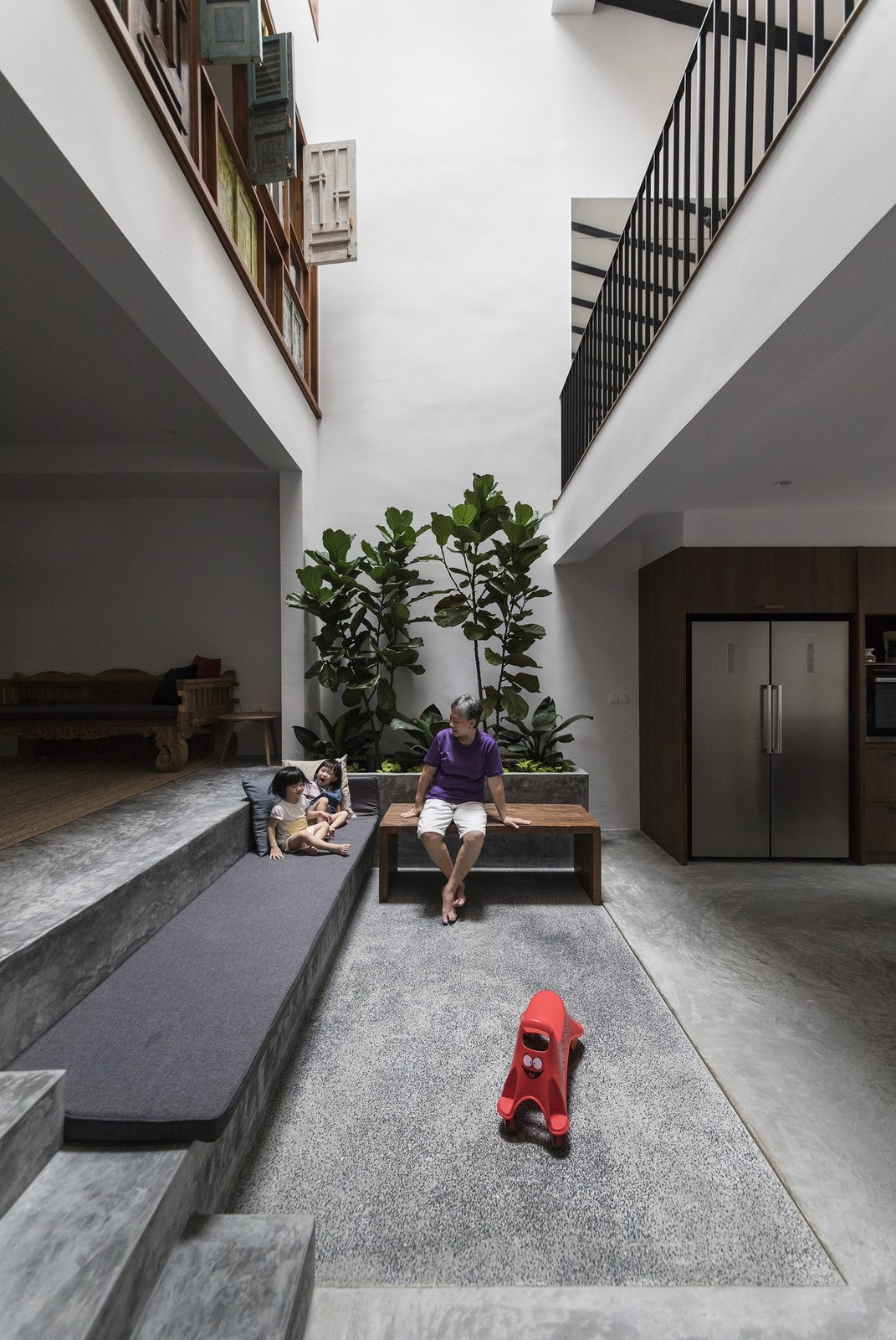
As with the traditional Southeast Asian shophouse, the courtyard functions as the social hub of the home and connector between the different spaces.
A new, central skylight and courtyard open up the interior. Here, planters and built-in seating frame a welcoming indoor garden. Zhenru also restored an existing louver window in the attic, which helps cool the interiors. 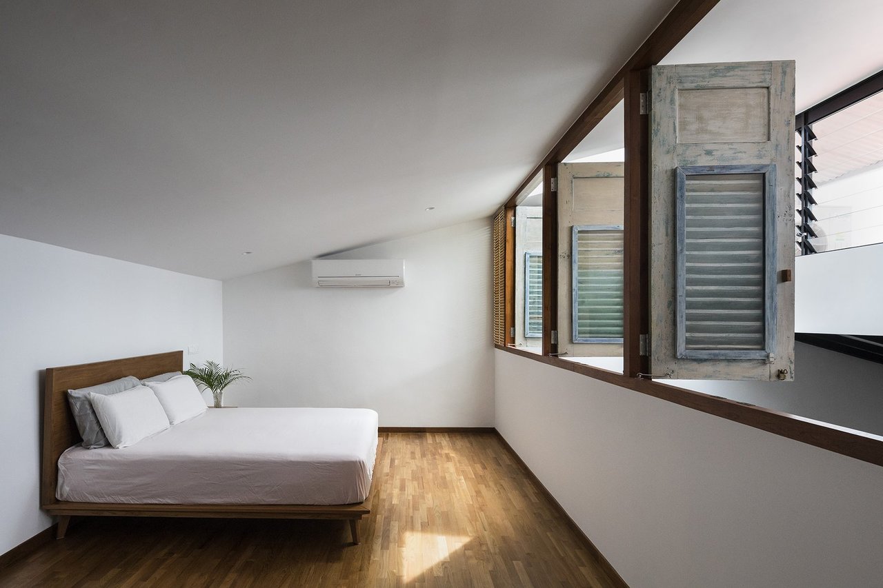
Zhenru opened up formerly concealed attic dormer windows, which usher light into the mezzanine room and down into the courtyard.
"It is beautiful in the afternoon when you see sunlight passing through the house, as it brings a sense of life in," says Zhenru.
The kitchen was shifted to the front of the house, which was an unconventional but highly functional maneuver.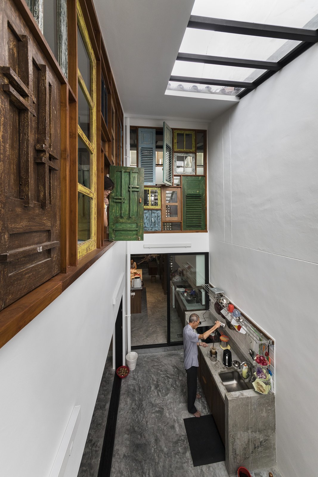
The upcycled timber windows enliven the wet kitchen.
"Sandra iterated that most of their daily interactions involving food and conversation were mostly done in the kitchen," says the architect.
The dutiful daughter wanted it to be connected to the other spaces so that her parents would spend more time interacting with each other and other family members while preparing food or reading a book, instead of watching too much television. 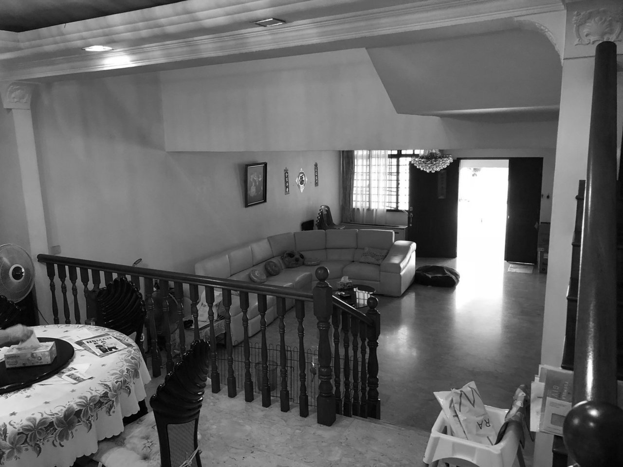
Before: The house’s interiors were cloistered and dark. 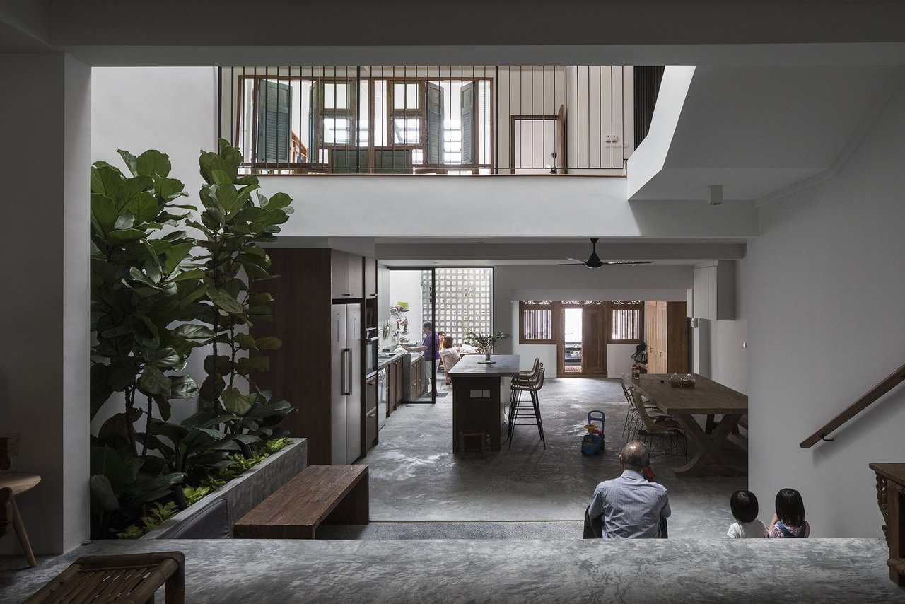
Light enters the long terrace house's plan via a new courtyard, which functions as a casual gathering spot between the kitchen, dining, and living rooms.
Visitors enter the front door to an open-plan area comprising the dining area, and dry and wet kitchens. At the latter, concrete breeze blocks create a privacy screen and filters the harsh, tropical elements. The back facade is equally porous to enhance cross ventilation.
As the house has dual access, Zhenru placed the parents’ quarters at the rear, so they can have an alternative entrance should Sandra be holding a gathering up front. 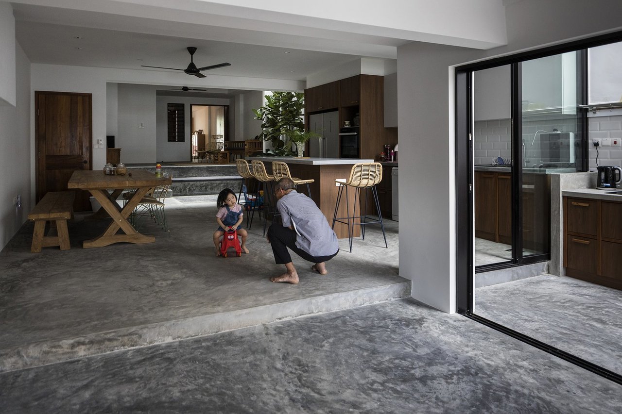
Glass sliding doors separate the wet kitchen from the other spaces, limiting cooking smells while still maintaining a visual connection.
The house’s common areas are subtly segmented into several "micro spaces" through furniture and changes in floor levels. For example, visitors can gather around the large dry kitchen island counter, sit at the courtyard steps, or convene at the wet kitchen’s sitting area. 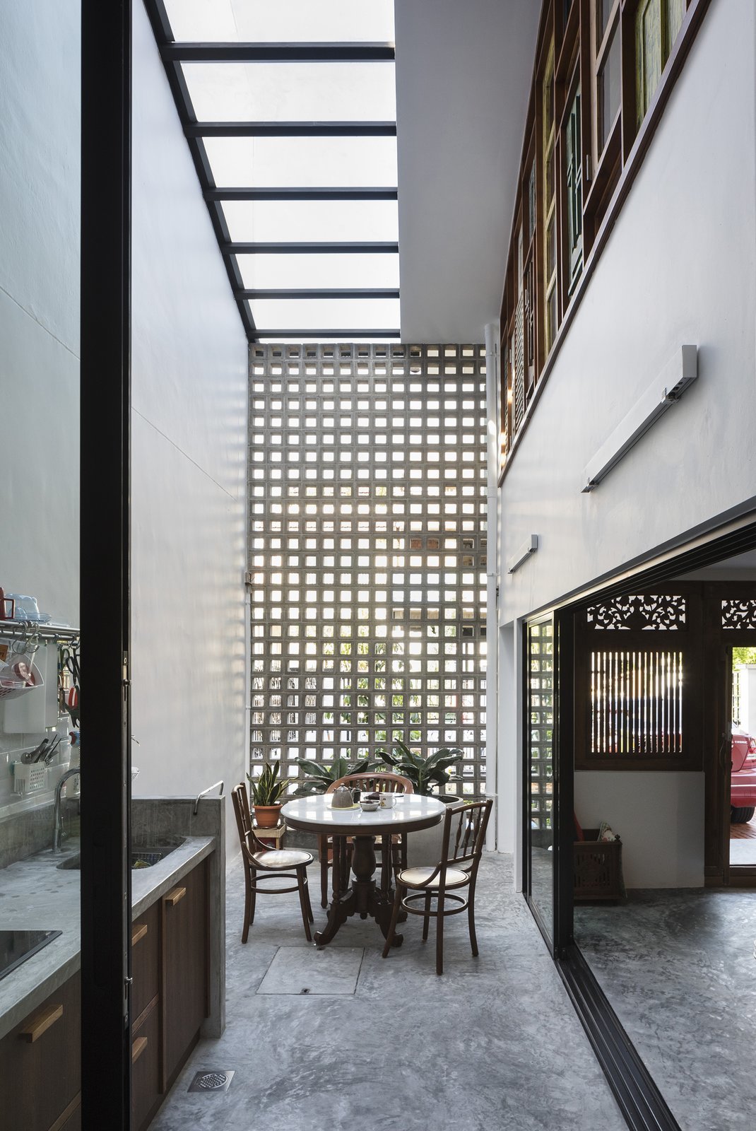
A new semi-outdoor space is created by enclosing the former house’s foyer with a skylight and concrete breeze-block screen. It functions excellently as a wet kitchen, with cooking smells filtering through the screen.
The courtyard is a particularly effective visual and sensory conduit between the first and upper stories. It also offers a clear view of the striking montage of reclaimed teak timber windows at the front facade and the room overlooking the double-height wet kitchen.
"It started when I showed Sandra a reclaimed Javanese door and window set," says Zhenru of the design. "We both loved the intricacies of the timberwork and felt compelled to use them in her new home."
The architect retained and buffed the existing teak timber floors of the upper levels, which complement the reclaimed teak timber elements.
Like the concrete breeze-block screen, the wooden louvers manage light, wind, and views. Added color enlivens and unifies the various elements.
It was not easy sourcing the timber doors and windows from different timber collectors in Yogyakarta, Java. Zhenru also had to track down local carpenters who could put together these delicate, aged elements. 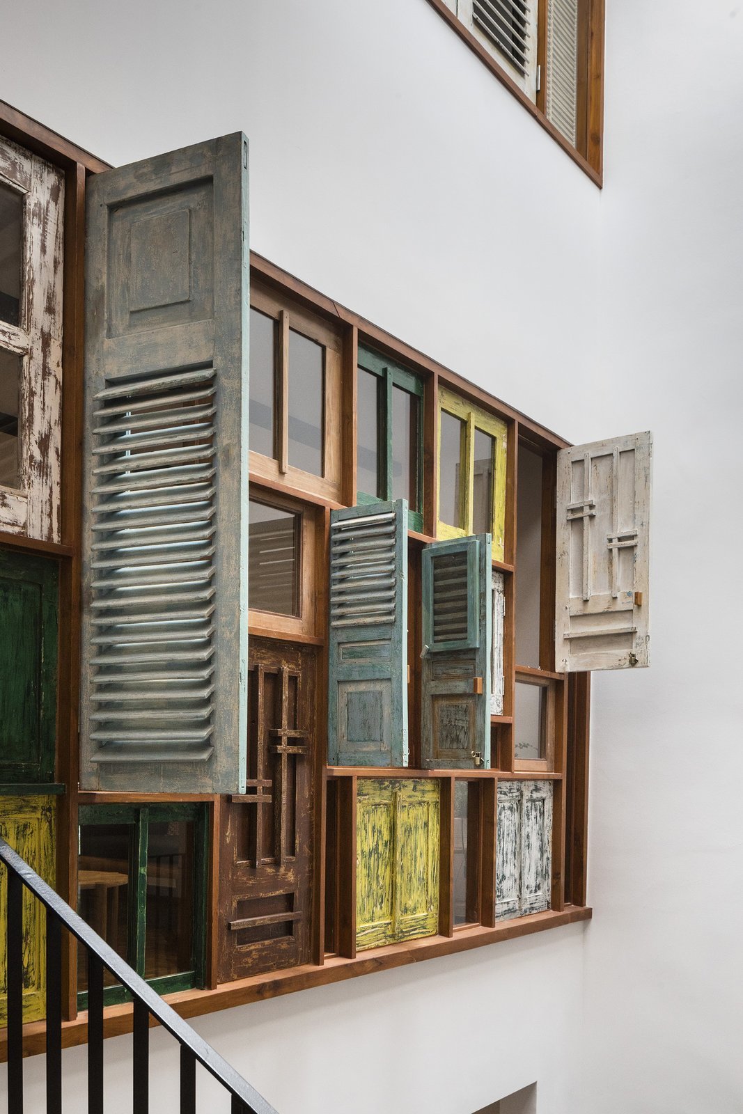
The graphic matrix of windows, with their bright colors, is the only artwork needed in the house.
"It was important that the pieces retained their function and were not purely decorative," she says, who used 3D modeling to work out the puzzle of parts. "The entrance door and window set were reclaimed from a 1950s family house in East Java. It is made of jackfruit tree wood, which was widely used alongside teak," she adds.
Javanese artisans restored the closed lotus bud motif carving on the transom. It symbolizes the innate potential for enlightenment in humans, which aligns with Sandra’s life philosophy and the project’s ecological roots. 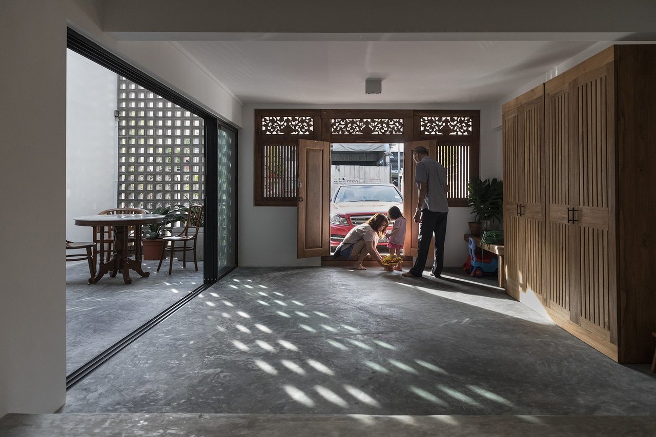
Zhenru consulted with lecturer Andi Putranto from the Department of University Gadjah Mada in Yogyakarta, who specializes in collecting and restoring teak doors and windows from dilapidated houses around Java. The front door and window set was salvaged from a 1950s-built house.
The upcycled aspects of Heng House showcase the feasibility of making good use of what others perceive as waste. This, and the house’s passive methods, is proof that sustainable living does not always have to be high-tech. 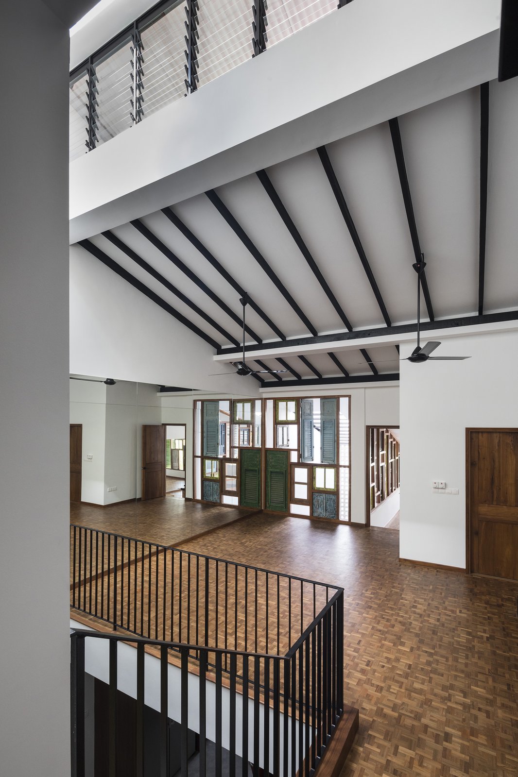
By opening up the ceiling, the architect provided the studio with a sense of loftiness.
The home’s clever redesign proved especially vital during Singapore’s two-month partial lockdown due to COVID-19. "The natural light and breeze gave a sense of well-being compared to air-conditioned spaces, especially when practicing Pilates at my second-story studio," says Sandra. She also found different pockets of space to work in. 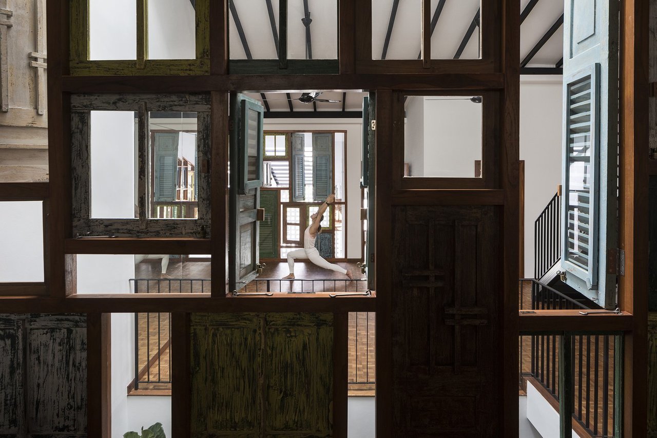
Compared to the former cloistered house, the new scheme enables an open yet layered experience through the different parts of the home. 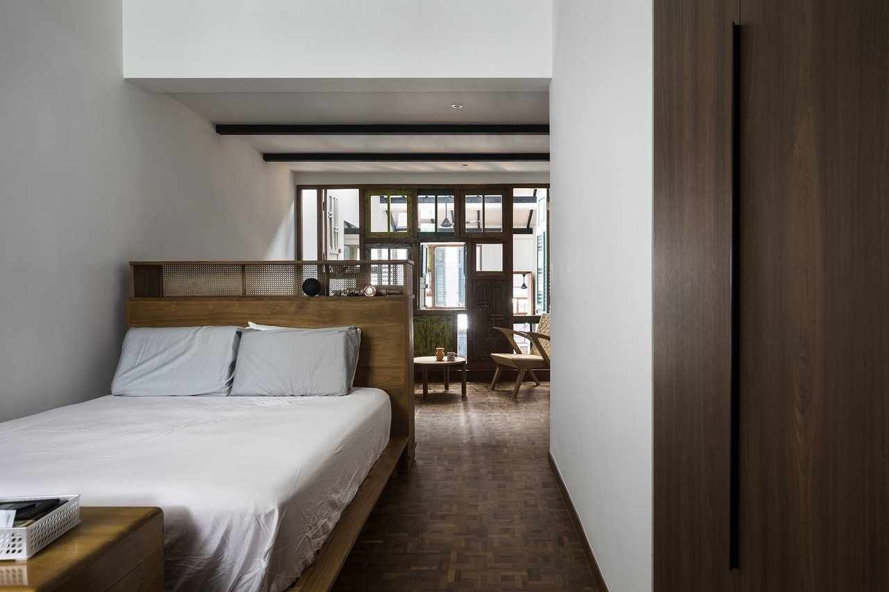
Sandra’s bedroom is well lit from rear windows as well as windows looking into the courtyard.
Meanwhile, her father happily honed his green thumbs. "The pockets of green in the front, middle, and back of the house provided great reprieve from being confined," says Sandra. "My father kept himself busy growing bananas, papayas, and garden herbs. We even started fermenting and composting."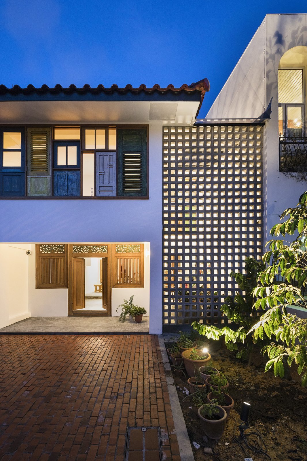
The house’s porous nature is a drastic contrast to its former iteration. The front garden was used for fermenting and composting during the partial COVID-19 lockdown.
Now, the home not only hosts Sandra and her father’s clients, but also visiting family. The adults can whip up a meal in the kitchen while watching the children, who gleefully bustle about the open spaces.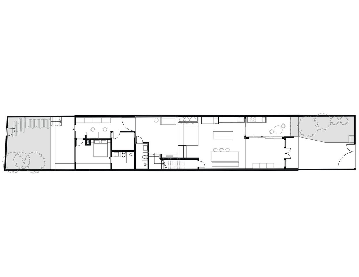
Heng House first floor plan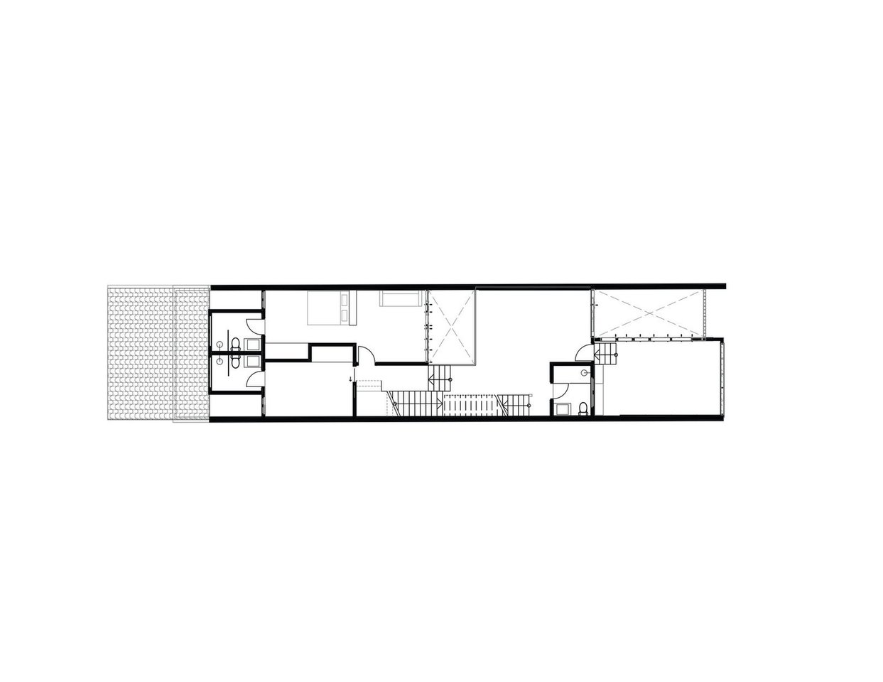
Heng House second floor plan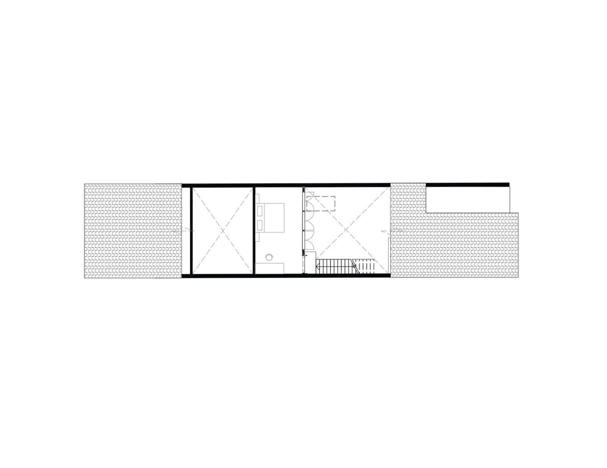
Heng House mezzanine floor plan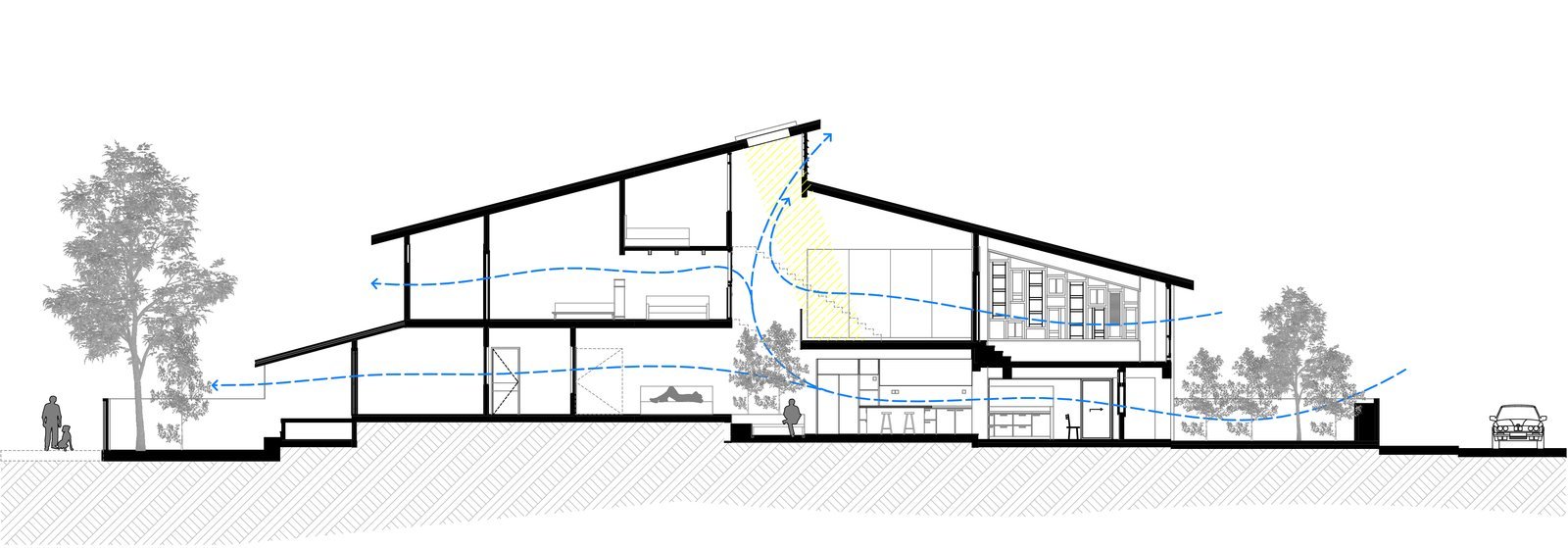
Heng House section

Tropical Boho Homes With Beautiful Vignettes & Vistas
Two tropical boho home designs, featuring swimming pools, cozy lighting schemes, interior archways, natural accents, and beautiful decor vignettes.


![A Tranquil Jungle House That Incorporates Japanese Ethos [Video]](https://asean2.ainewslabs.com/images/22/08/b-2ennetkmmnn_t.jpg)


