
When a young couple bought their first family home in Toronto, they envisioned a space that they could transform to fit the needs of their growing family. They bought a duplex with two small basement units in an expensive neighborhood and initially rented the apartments out to offset the cost of buying. After four years, their family had grown to three children and they decided it was time to create their dream home. "They wanted the idea of play and togetherness to be the center point for the family home," says architect Trevor Wallace, principal of Reflect Architecture.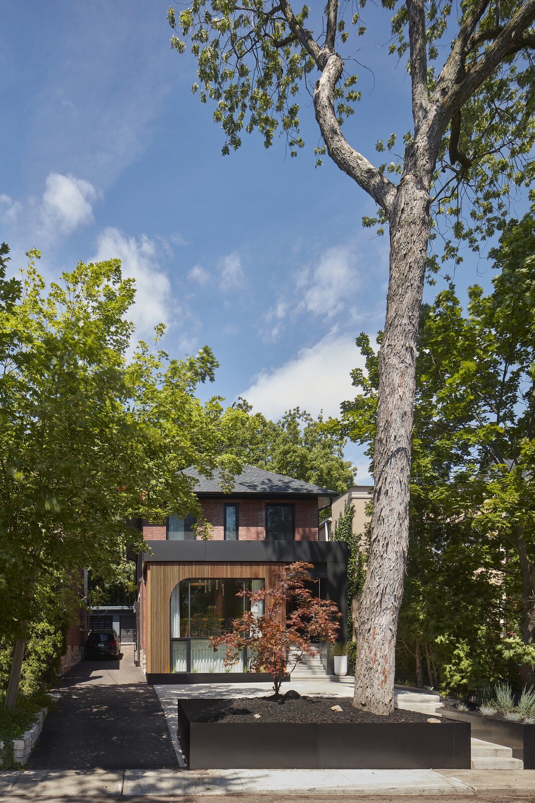
The brick duplex had a previous addition at the front that was modified during the renovation. "The client was keen on a heavy black aesthetic but we were worried it might feel very heavy, especially as it is the community-facing element of the building," says architect Trevor Wallace. "So, we lightened it up and made it feel a bit warmer with the timber screen."
It was decided that the second floor apartment would be left relatively unchanged and rented out for income, while the first floor and basement level would be converted into the family home. As both clients work from home-as a naturopathic doctor and a medical doctor who have transitioned into being entrepreneurs in the health and wellness space-it was essential that the home have spaces for the family to gather and play as well as quieter, more private spaces for working from home.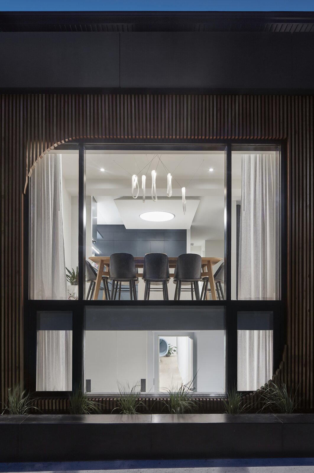
The large, double-height window at the front of the home looks into the dining area and brings light into one of the girls’ bedrooms in the basement. "The dining area is the part of the home that is pressed against the glass because the clients wanted it to be part of their community when people came over," says Wallace. The edges of the otherwise square form of the surrounding timber screen have been rounded off to create a visual softness.
To meet these dual needs of play and work, Wallace moved away from conventional ideas of the home and created a scheme that addressed the very specific needs of the family. "We thought about how the clients would use each space rather than how domestic spaces are typically used," says Wallace. "For example, the idea of a living room didn’t mean much to them. Instead, they come together as a family around the dining table and in the kitchen, so we prioritized these spaces."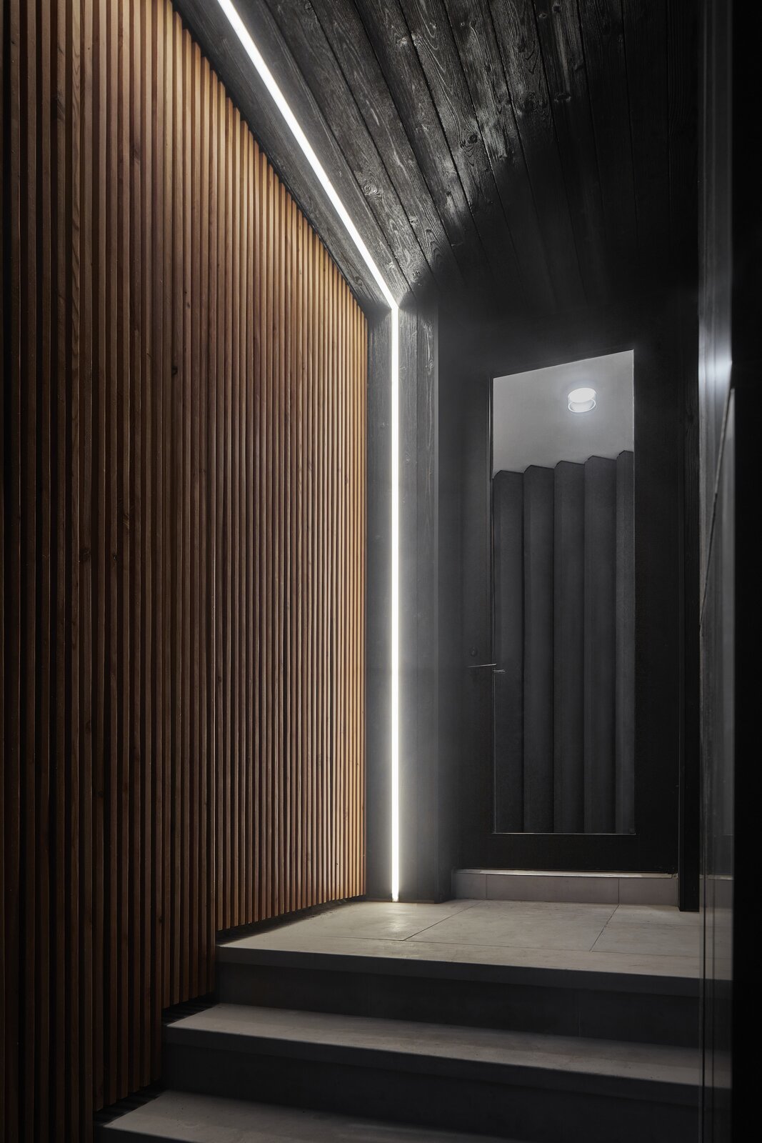
The main entrance is clad in dark timber treated using the Japanese technique of shou-sugi-ban. "We created this darker entry point and then introduced very contemporary lighting to illuminate that space and to denote that the renovation was speaking a very different language," says Wallace. "With any sort of entry into domestic design it's nice to have a moment of transition." 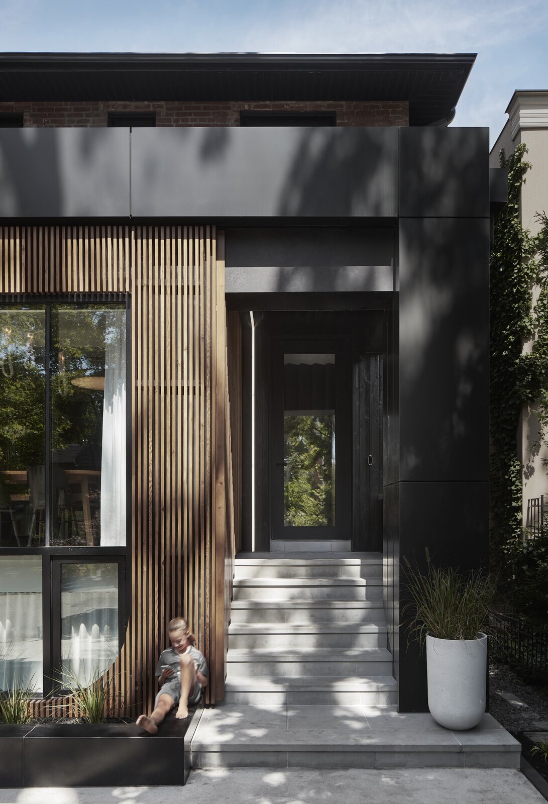
"One of the clients’ families has a history of being heavily involved in beautiful vintage wooden boats," says Wallace. "The timber screen plays off that idea and introduces a very warm, natural material to face the street." The timber screen wraps around the side window to offer added privacy from the main entrance.
The home has two entrances: A main front entrance for visitors, and a rear entrance that leads to a mud room that the family uses. The main entrance opens into a small entry foyer which leads to the open-plan living area. The dining and kitchen areas occupy the light-filled space at the front of the home, engaging with the streetscape through a large window. A smaller lounge area is located to one side. "This is the major public facing element of the house," says Wallace. "You can have guests over and not have them move any further into the house."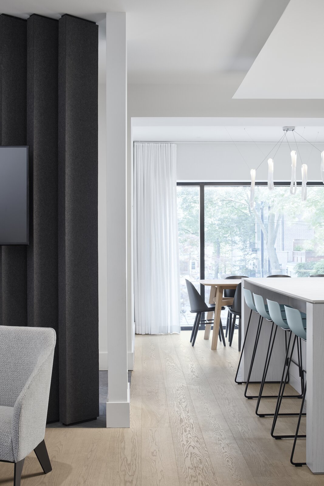
Felted louvres between the entrance and the living room provide acoustic insulation and warmth while still allowing light to penetrate the interior. 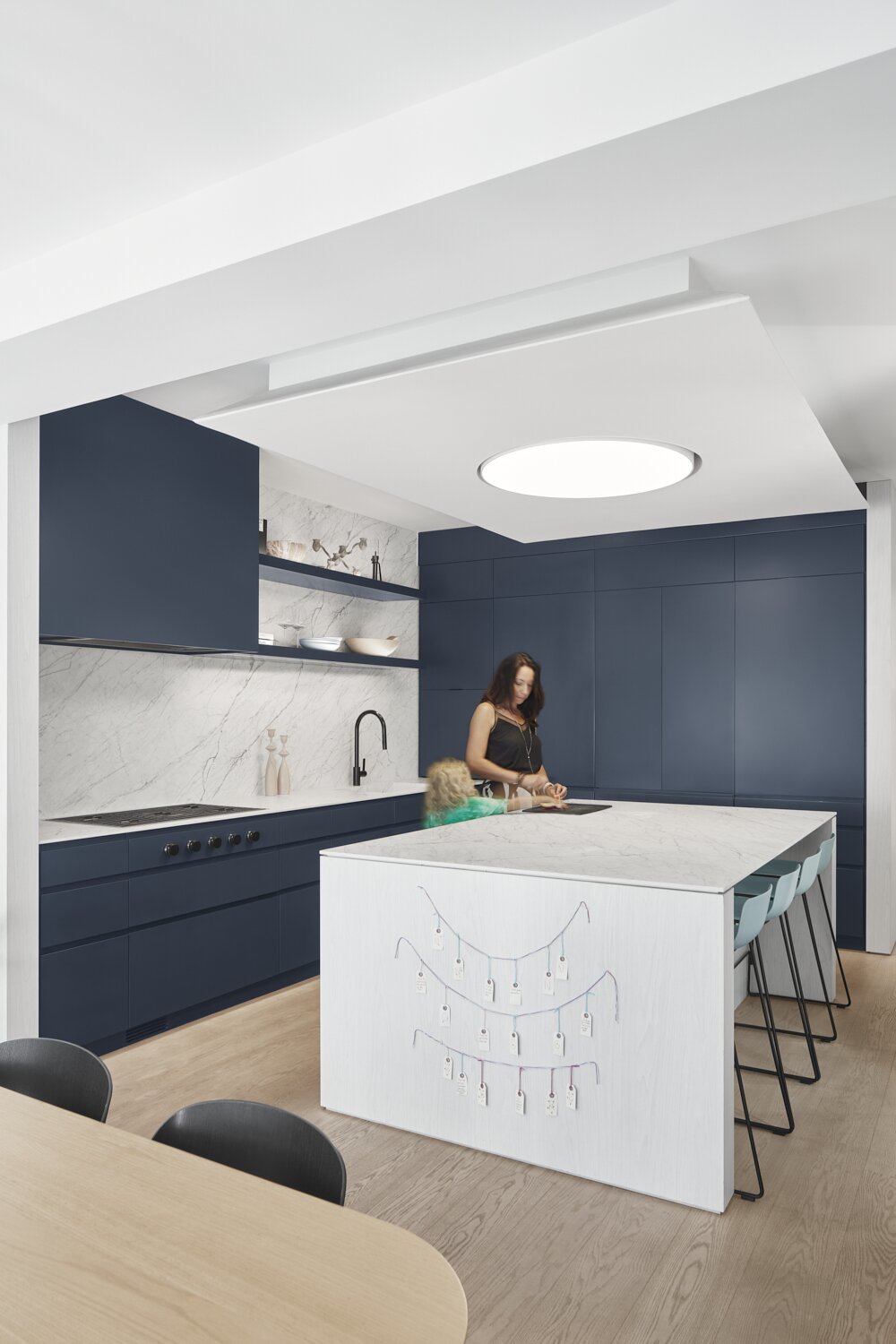
The large kitchen is a space for the family to come together, with a stone-look porcelain benchtop and splashback from Stone Tile. "The clients wanted the stone in the kitchen to feel natural rather than dramatic," says Wallace. "It's large format porcelain, though, as I don’t think they would have been able to handle the level of patina that would have developed on a natural stone when cooking with children!"
The access to the second floor apartment-an element that had to be worked around in the design-essentially divides the home into public and more private areas. Beyond this point, the floor has been cut away to create a dramatic double-height volume that floods the basement level with natural light. A long hallway, which feels more like a mezzanine, leads to the master bedroom and en suite, and an office that opens out to the backyard.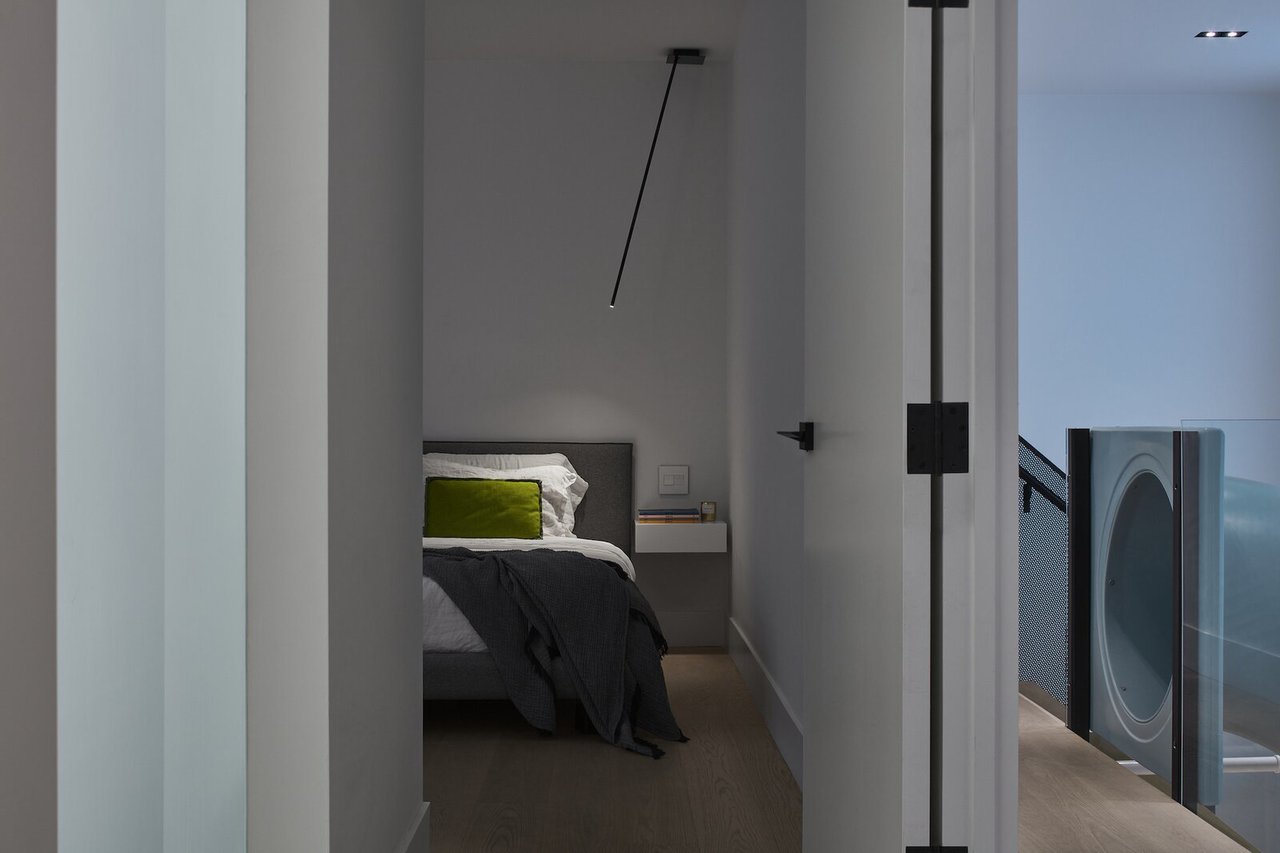
The master bedroom has been designed so that the doors can be left open for the children at night without compromising privacy. To facilitate this, a series of nightlights integrated into the hall lead the way from the children's bedrooms in the basement level to the master bedroom. In the bedroom Peled Soffitto lights from Viabizzuno make it easy for one of the couple to read while the other sleeps. 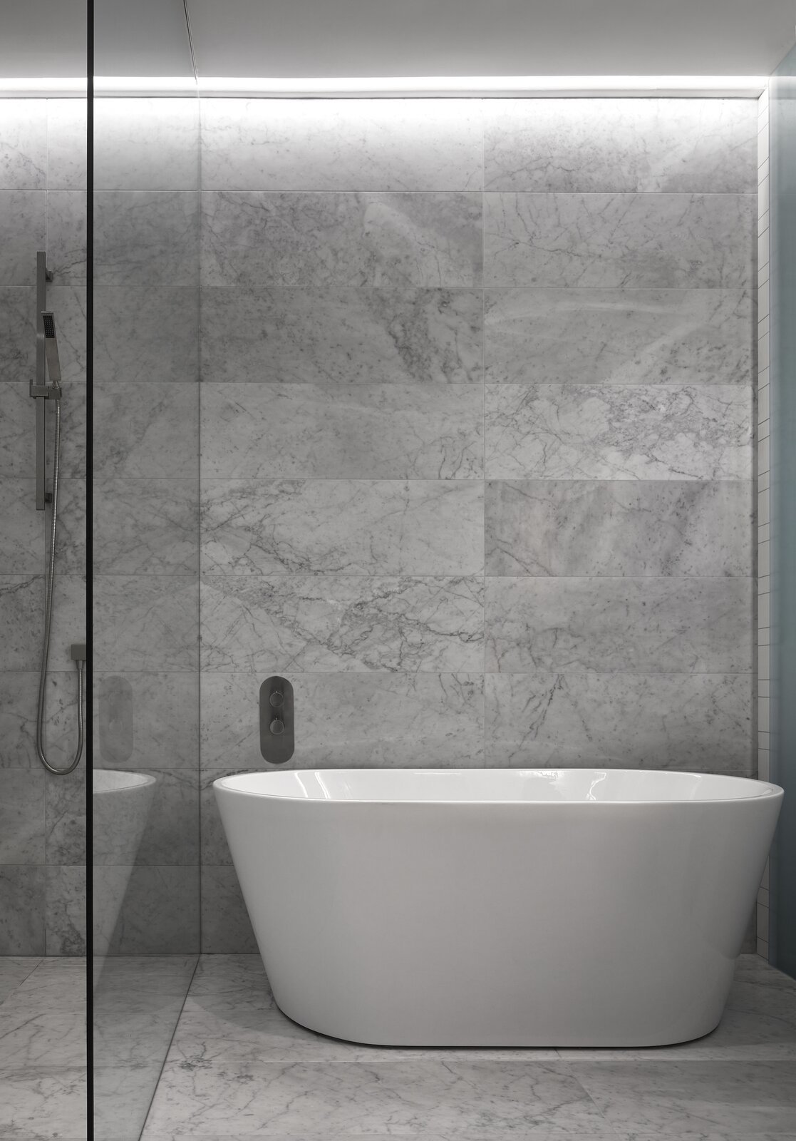
The bathtub in the master en suite sits beside the shower, which is separated from the hallway by frosted glass, allowing natural light to enter the space. 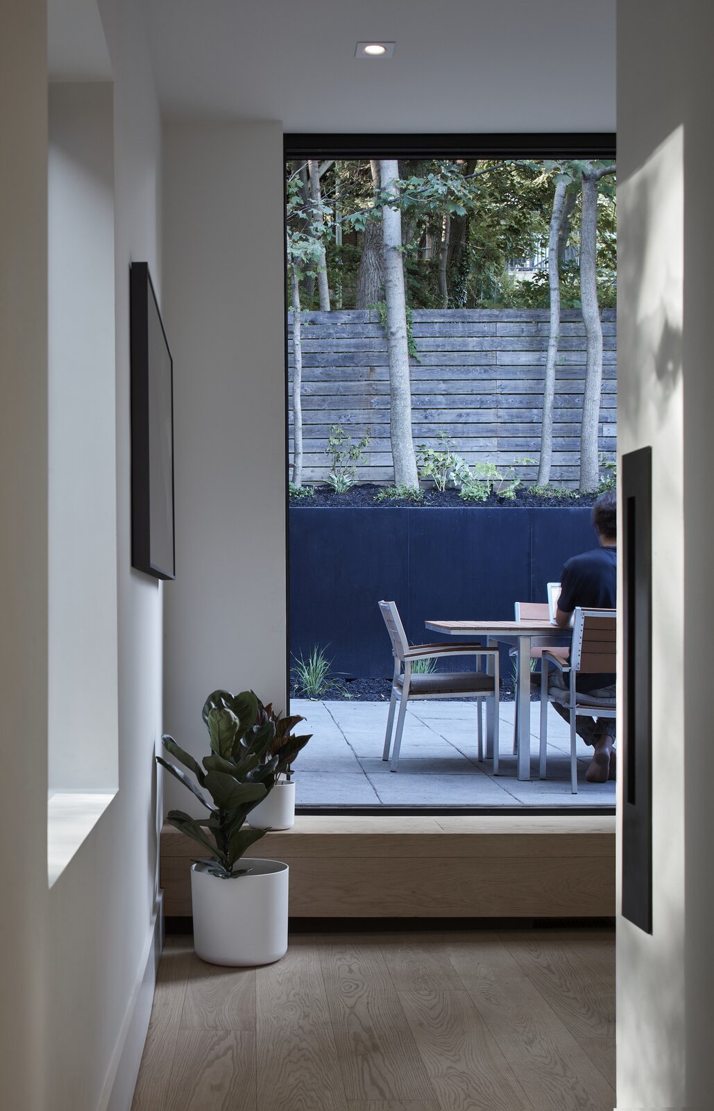
The clients both work from home in the office space, which opens out into the backyard and is located in the more private rear of the home. The entire space can be closed off by a door in the hallway to provide added privacy and acoustic isolation. "They work outside in the summer," says Wallace. "The backyard is an oasis-it goes up a ravine and there's tonnes of trees and it's really quiet."
The basement level is accessed via either a winding stair or a playful blue slide. "The slide is a huge central point in the home," says Wallace. "It was a very simple design directive-and actually didn’t come from the kids. The client had always wanted a slide in her home!"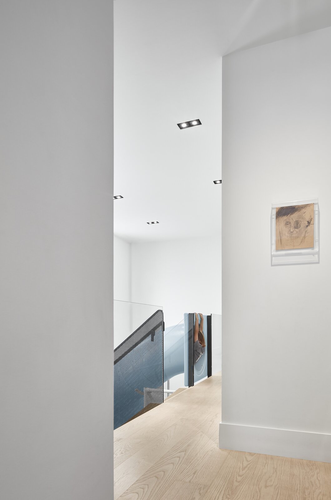
The long hallway runs past a double-height volume and overlooks the basement level. "Two big windows allow natural light to reach the basement from the ground floor," says Wallace. "Because of this, the experience of being in the basement feels as little like being in a basement as possible." 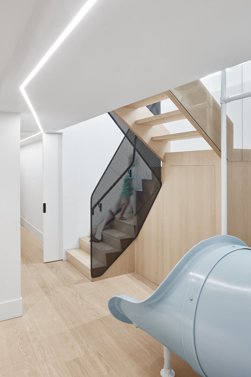
The HVAC has been carefully positioned around a structural beam which is the low point of the ceiling, allowing the rest of the basement level to benefit from higher ceilings. "It’s a classic Frank Lloyd Wright move," says Wallace. "You compress the hallway and then every room feels bigger at the end of it." The lighting in this space-which has been designed to drive movement down the hall-is a thin LED as there was only a few millimeters between the drywall and the HVAC.
Like the ground floor, the basement is also split into zones. The slide and stairs lead to an open central space, which can be used for various purposes. "There’s everything from a piano to a Peloton bike, and it changes weekly," says Wallace. To the front of the home are the three children's bedrooms-which can be completely closed off by a sliding door-and a shared bathroom and separate toilet.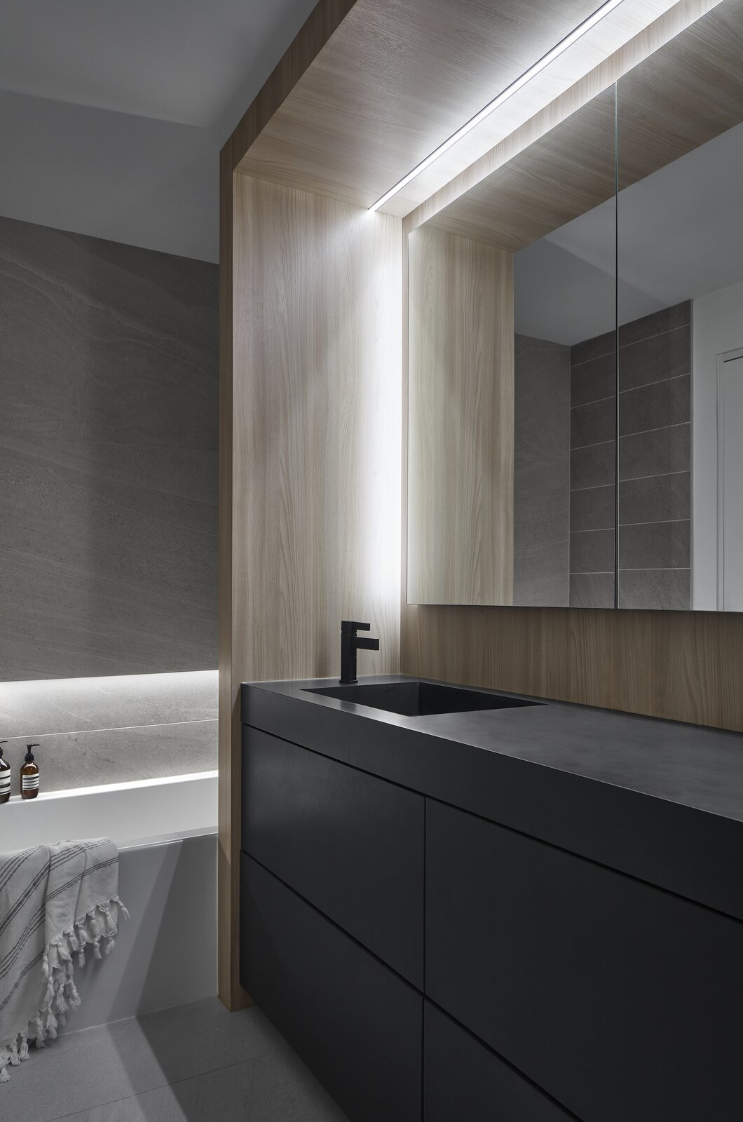
The ground floor bathroom has been designed with plenty of storage to cater for the three girls who share it.
"The client was very particular about there being tons of natural light in each of the kids bedrooms but was also adamant that they had access for emergency egress if there was a fire," says Wallace. "So, each of the tall windows can be tilted open and be safe from intruders, but if there’s ever an emergency they can swing the handle and open the windows outwards."
A more private guest room-which doubles as an acoustically insulated podcast studio where one of the clients produces a popular podcast-is located at the rear of the basement level, alongside a large laundry room. 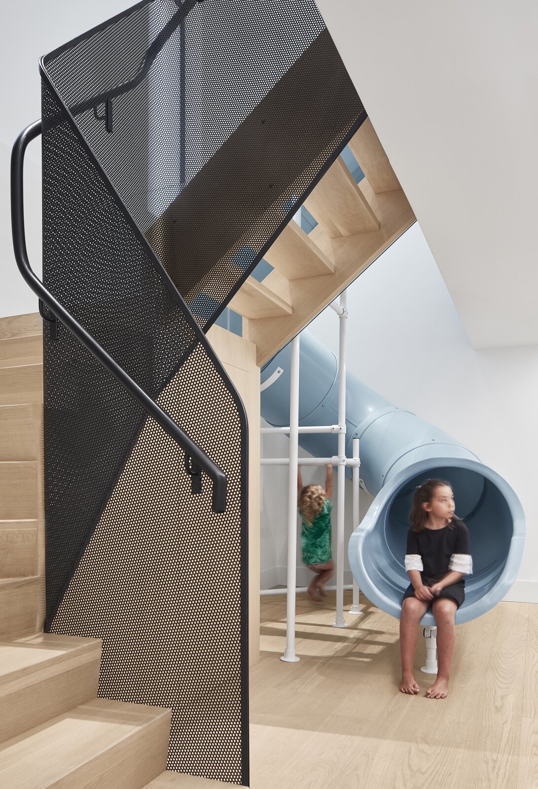
The wrapping of the stairs mirrors that of the slide-and allows the stairs to fit beneath the low-point of the basement ceiling. "We wanted to create a light balustrade that felt a bit like a ribbon," says Wallace. "The mesh was a nice way to integrate that movement."
Throughout the home, materials were chosen to create a light and bright interior. The timber floor-Superblanco knotless European Oak from Moncer Flooring-was one of the most important elements. "The clients wanted to feel the timber when they were barefoot in their home," says Wallace. "So, the wood is not sealed but just treated with oil. It feels like you’re connected to the environment rather than standing on something manufactured."
The rest of the material palette was kept similarly subdued and elegant, with white walls, porcelain stone tiles in the kitchen, and a pop of color in the teal kitchen cabinets.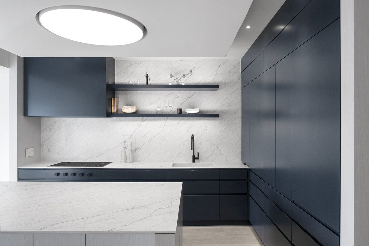
The light in the kitchen is Supernova by Delta. "We explored the historical idea of how traditional dwellings had a fire at the centre of the house around which everyone would gather," says Wallace. "The idea of an ‘oculus’ came from this and we thought it would be fun to play off that and provide this oculus-like light that is effectively the centre point of gathering within the home."
"We wanted to give the home a fresh new look and use that to drive thoughtfulness around how we laid the space out," says Wallace. "We tried to create a thoughtful answer to contemporary living. We wanted to bring in a clean aesthetic that creates a sense of calm, without forgetting that families play together, hang out together and they live together-and the cost of calm and clean doesn't come at the cost of families behaving naturally together in their homes." 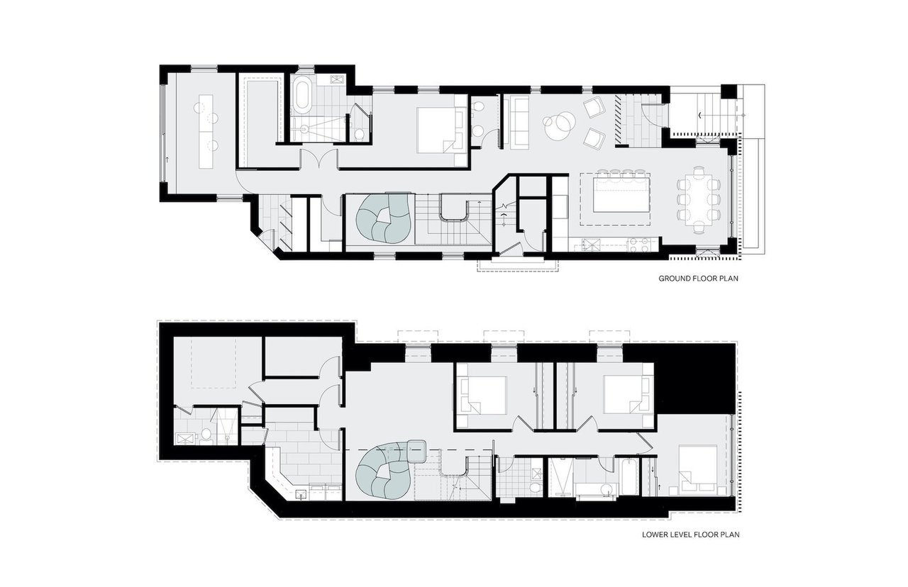
Ground floor and first floor plans of Walker Residence by Reflect Architecture

Tropical Boho Homes With Beautiful Vignettes & Vistas
Two tropical boho home designs, featuring swimming pools, cozy lighting schemes, interior archways, natural accents, and beautiful decor vignettes.

![A Tranquil Jungle House That Incorporates Japanese Ethos [Video]](https://asean2.ainewslabs.com/images/22/08/b-2ennetkmmnn_t.jpg)


