When it comes to crafting a home, the heart often knows what it wants-even if it makes for a challenging brief. This was the case for a married couple in Sydney, who fell in love with a 19th-century building that once held the Balmain Supply Store corner shop, and had since been adapted into a residence.
They moved into the heritage-listed home with their two adult daughters, who are both at university, but the family craved more open space and private sanctuaries for relaxing. They were unable to expand the heritage envelope, so they approached local design studio YSG to completely reimagine the 7,534-square-foot structure.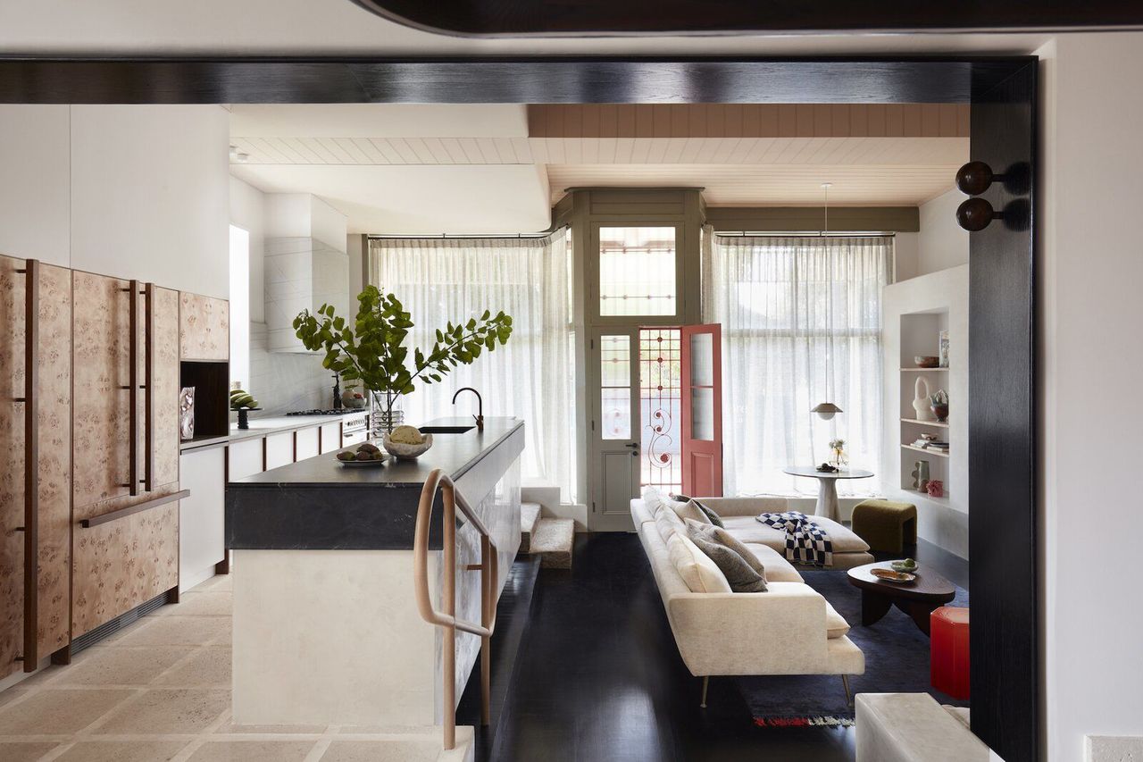
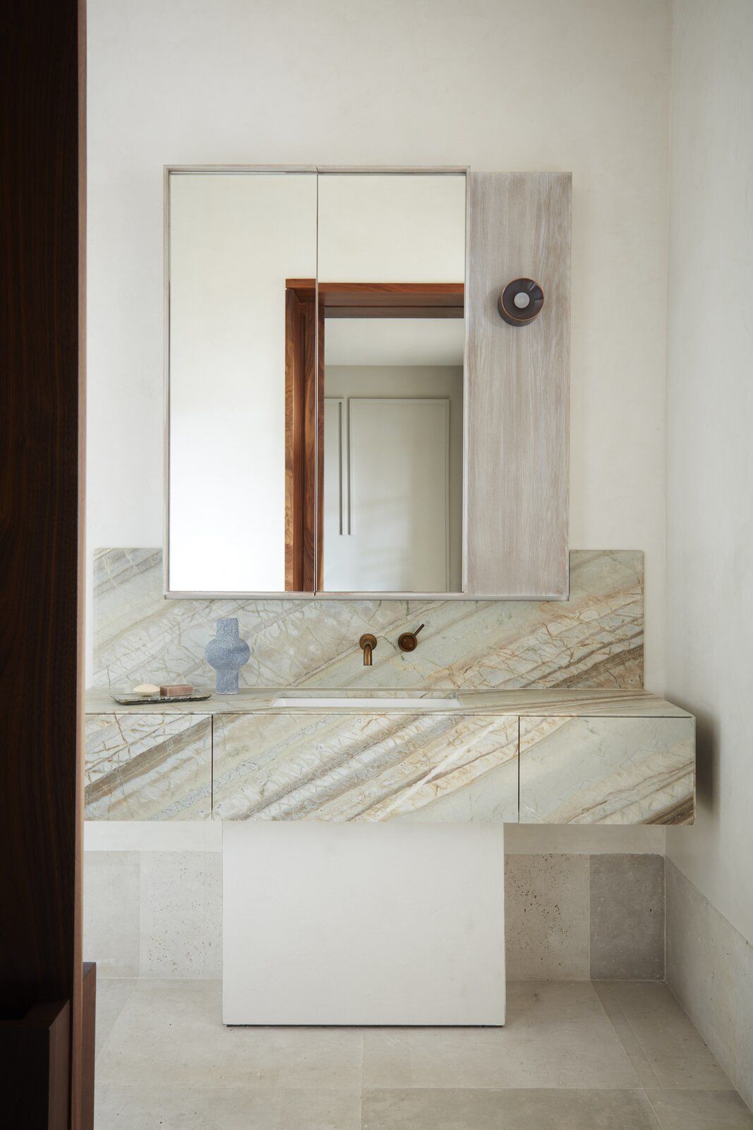
Key to the transformation was a dramatic alteration of the floor plan. An existing bathroom-the only one in the house-was relocated upstairs, which provided space for a private lounge near the daughters’ bedrooms and a shared en suite within the original master bedroom.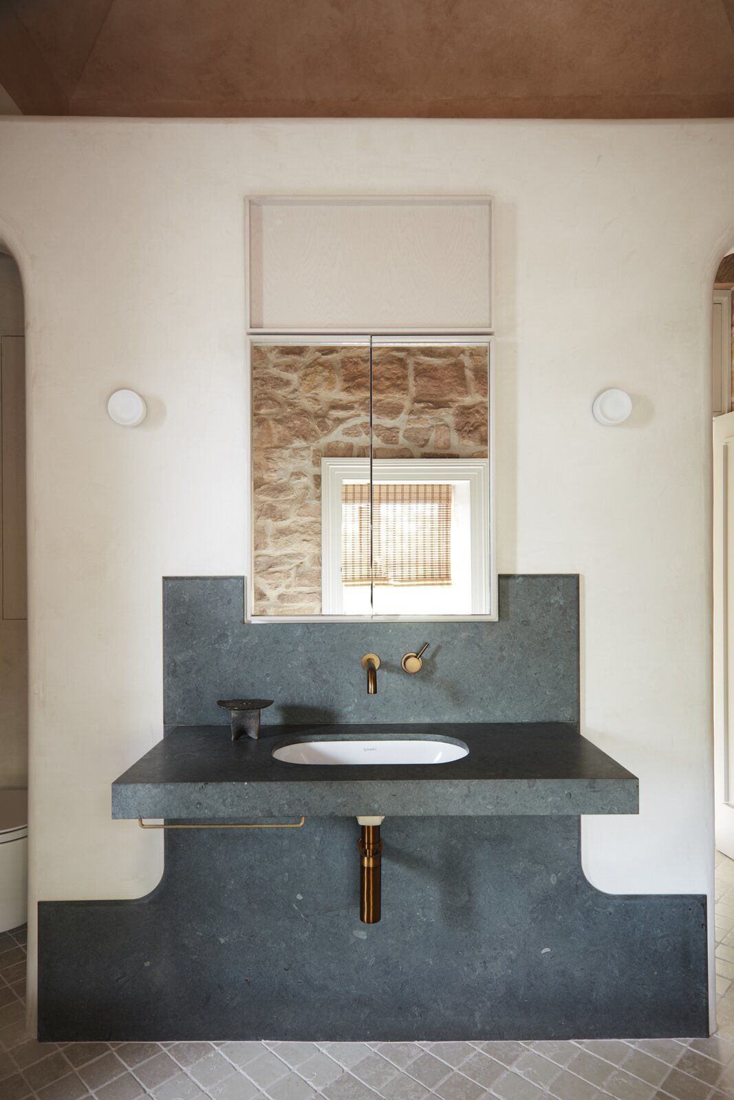
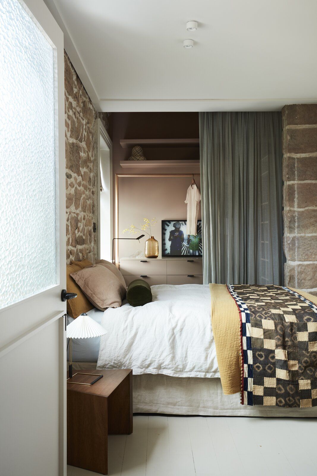
The new master bedroom occupies the former living room above the kitchen, and it features its own en suite bathroom and a private seating area. YSG also removed an internal sandstone wall between the kitchen and dining area to open up the downstairs living area.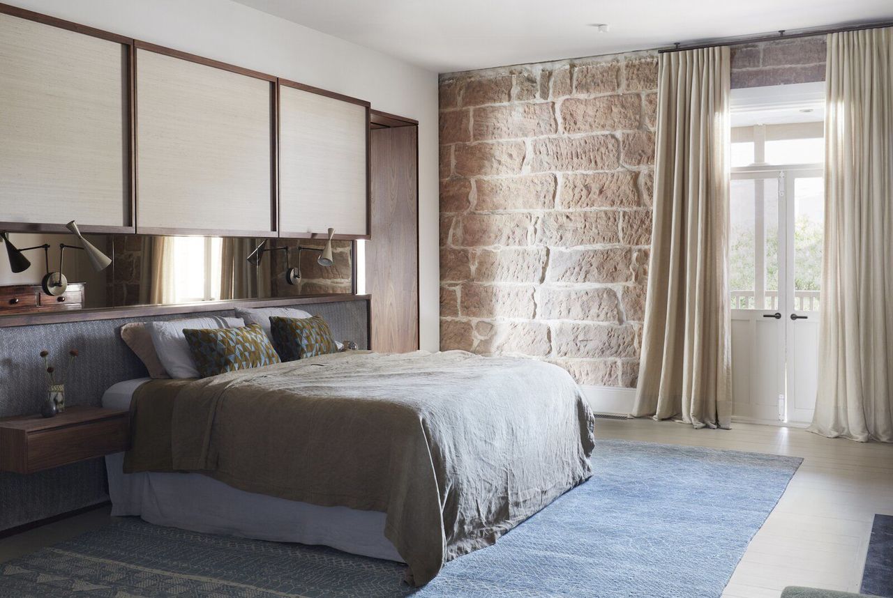
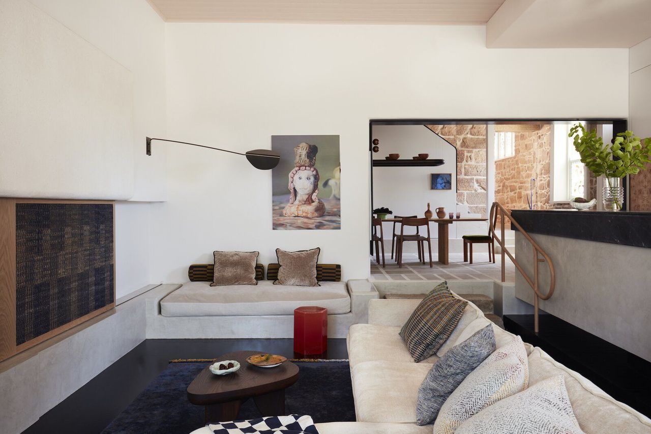
As a result of these changes, a cozy sunken lounge area with molded marmorino seating evolved to the left of the main entrance, protected from the street by a linen curtain. "The nook by the front windows is occupied all day," says architect and YSG founder, Yasmine Ghoniem. "The clients use it in the mornings over coffee-and their daughters, who love studying in natural light, use it during the day."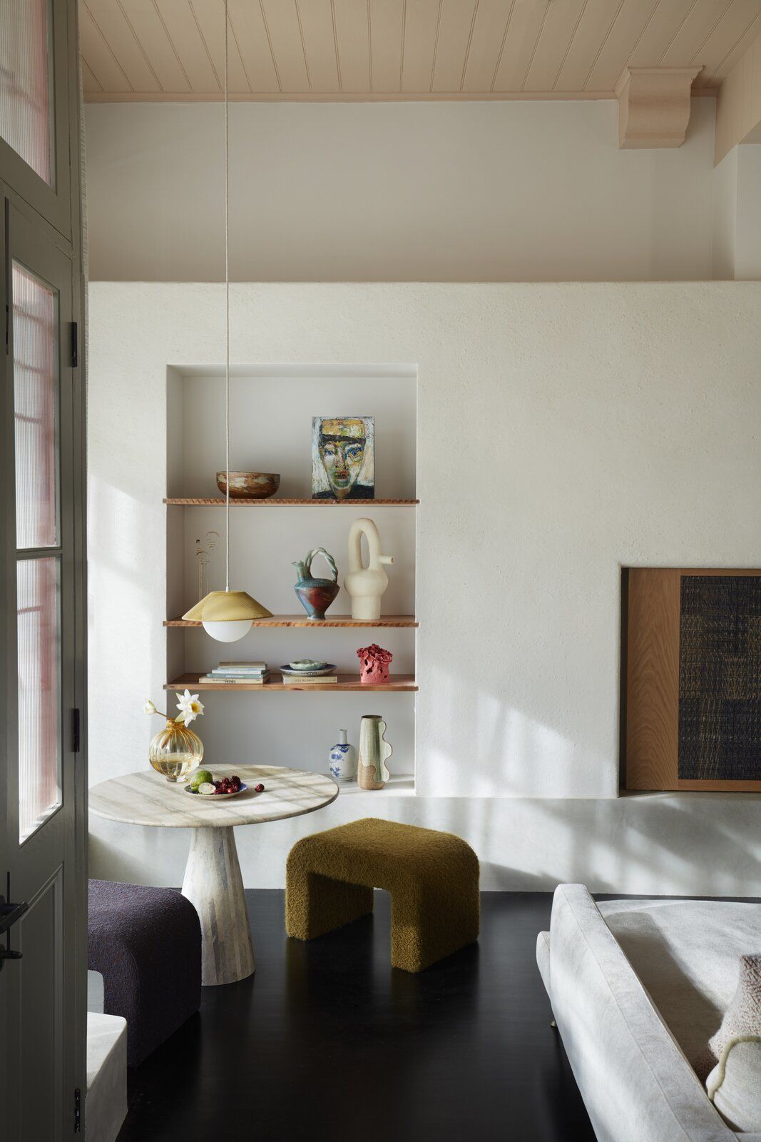
As the front door abuts the street-reflecting the building’s original purpose as a corner store-the rear courtyard is the primary outdoor space. Custom bifold doors extend the internal space outside, and a graphic purple curtain can be used as a screening device. "The courtyard has a very private, cocooned sense about it," says Ghoniem.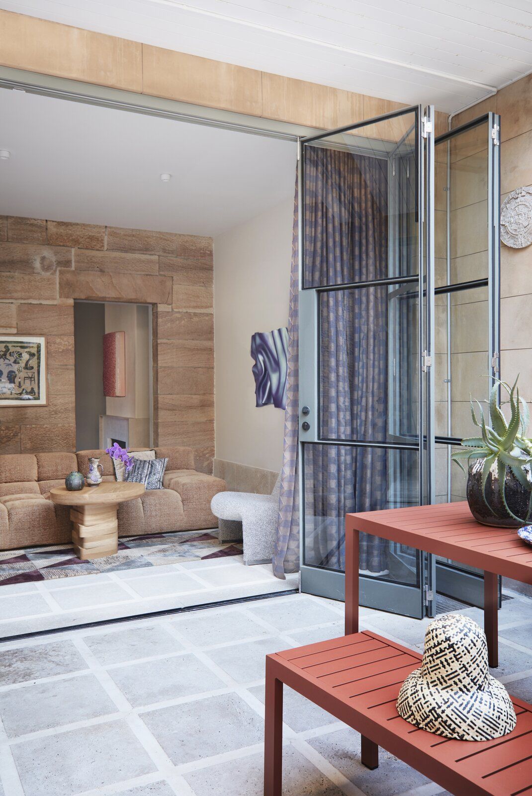
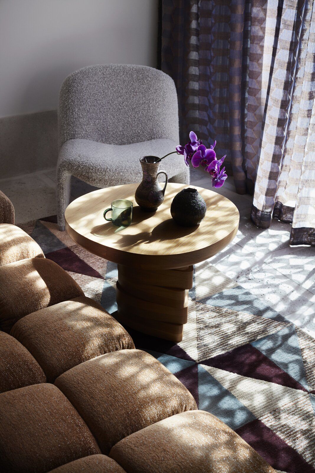
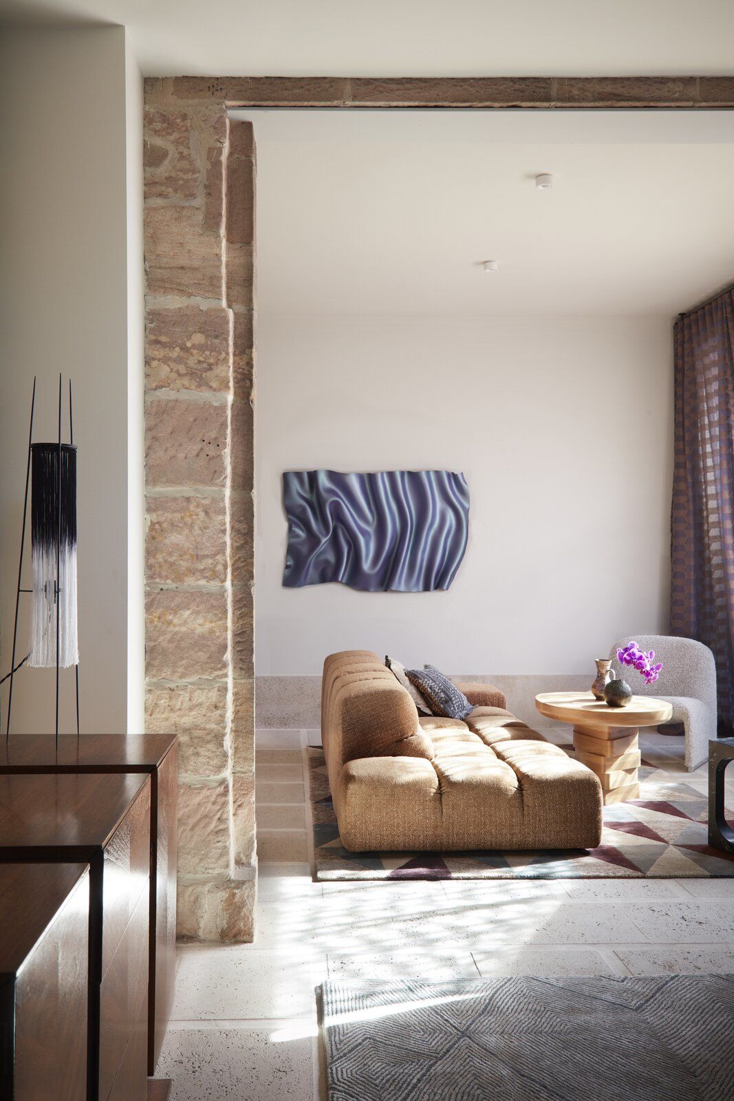
Despite the adjustments to the floor plan, the home’s vintage character still shines. The design team reinstated original timber moldings, restored the timber ceilings in the kitchen and lounge and painted them a blushing peach, and reintroduced mullions on the original shop front glass windows beside the entrance.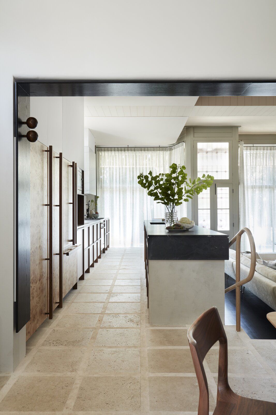
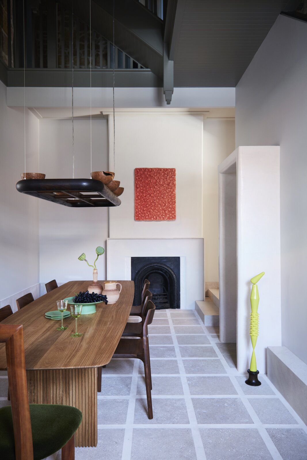
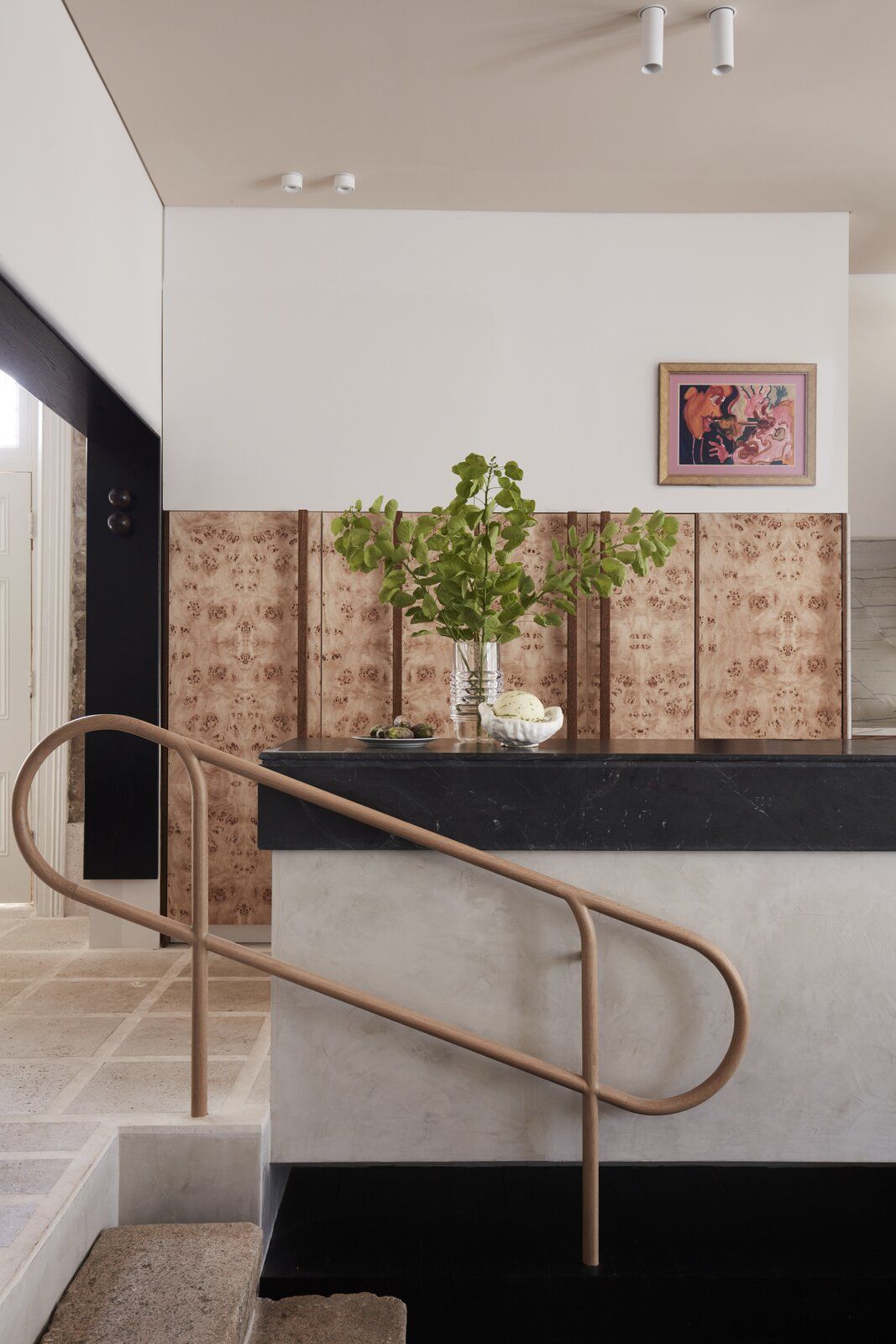
The home’s original elements also inspired the newer aspects of the renovation. When Ghoniem saw the decorative floral swirls on the steel-framed entry screen and the jewel-like tones of the stained-glass windows, she was reminded of the Art Nouveau flourishes of Scottish architect and artist Charles Rennie Mackintosh. She took inspiration from the renowned 19th-century creative to develop an elegant interior palette of aquamarine, citrine, and peridot realized through soft and hard furnishings.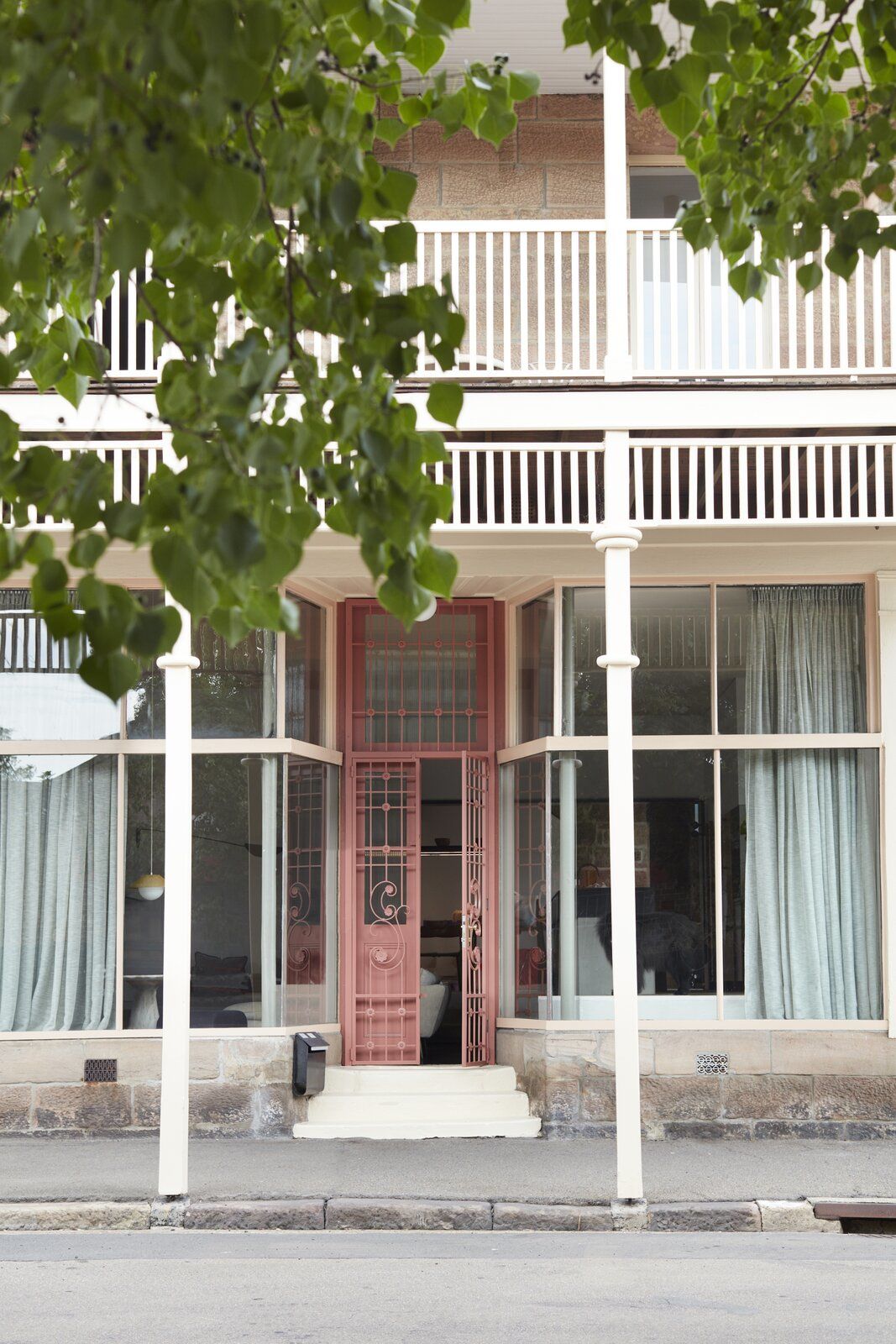
"I didn’t want the furnishings to all look brand new," says Ghoniem. "Many timber pieces were sourced from vintage and secondhand suppliers, including the chairs in the study orbiting the round table. I loved their elongated backrests, which reminded me of Mackintosh’s tapered chairs. I covered the seats in jewel-toned Kvadrat velvet, and they absolutely zing."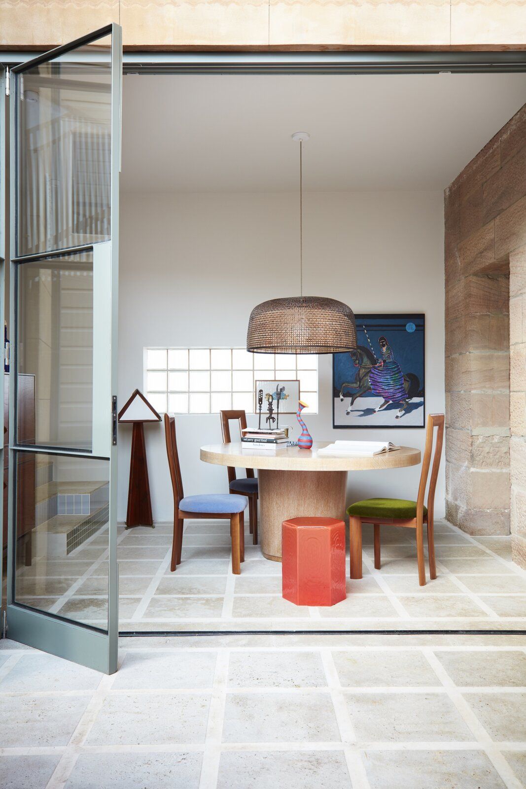
In keeping with YSG’s signature, the home celebrates unconventional colors and textures paired with a focus on natural materials, such as tactile timber and stone-and the texture of the existing sandstone walls was a major influence. Take, for example, the hemp render on the living room fireplace, or the 12 different marmorino plasters featured throughout the home.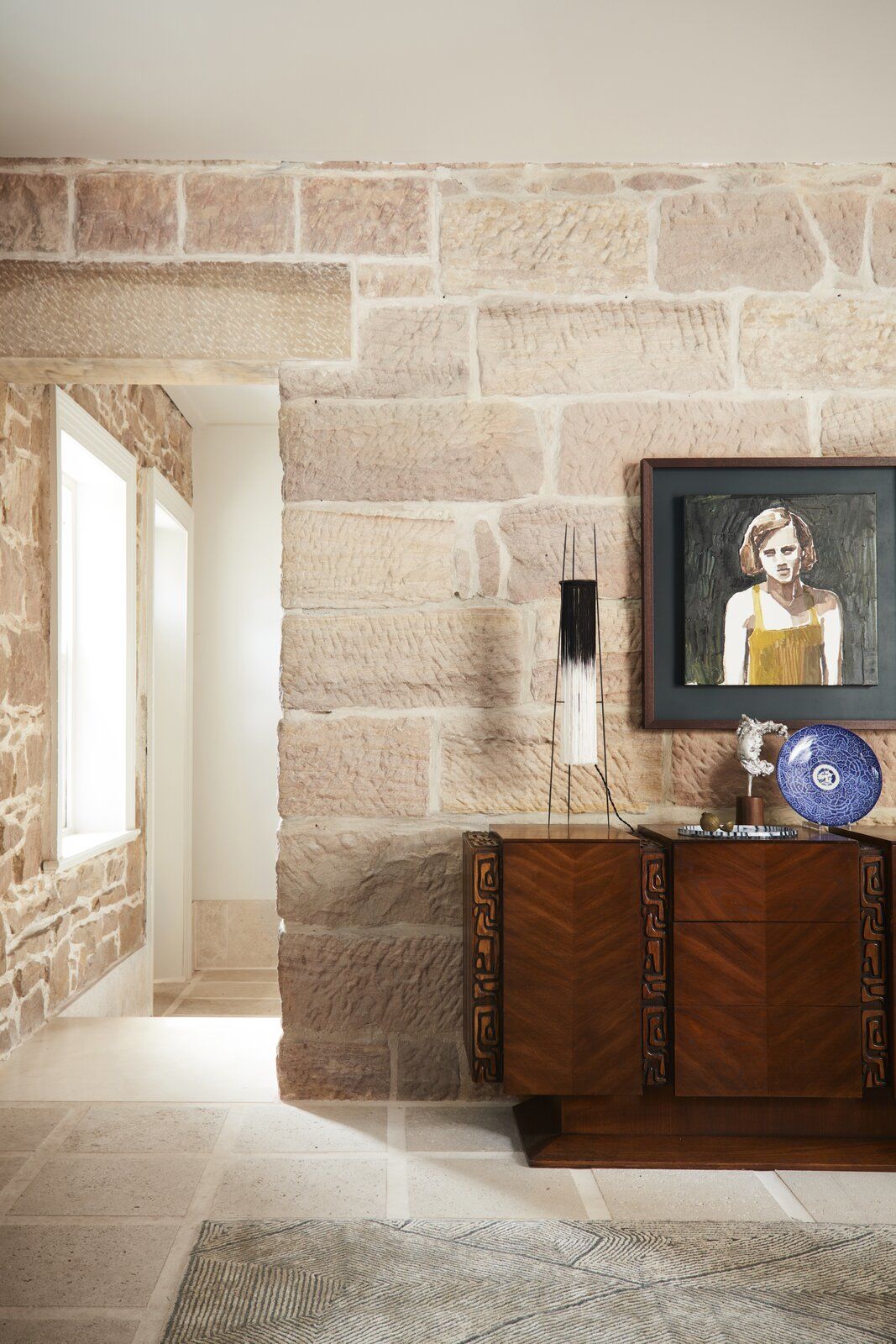
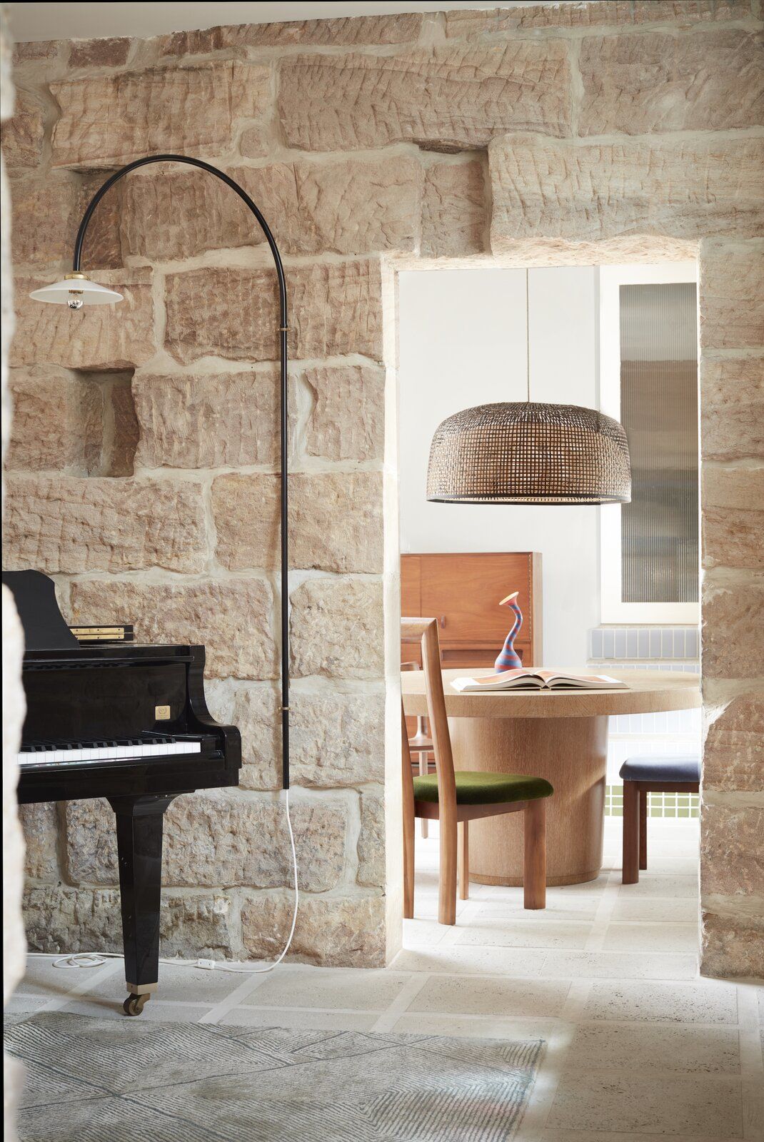
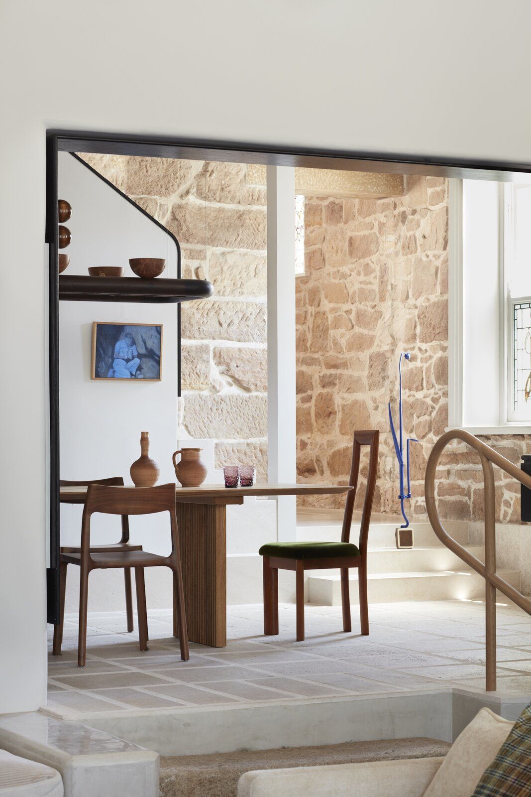
YSG also drew inspiration from traditional Japanese interiors, installing wooden frames that reference shōji and timber elements on the wardrobe and bed in the master bedroom that hint at the materiality of tatami mats.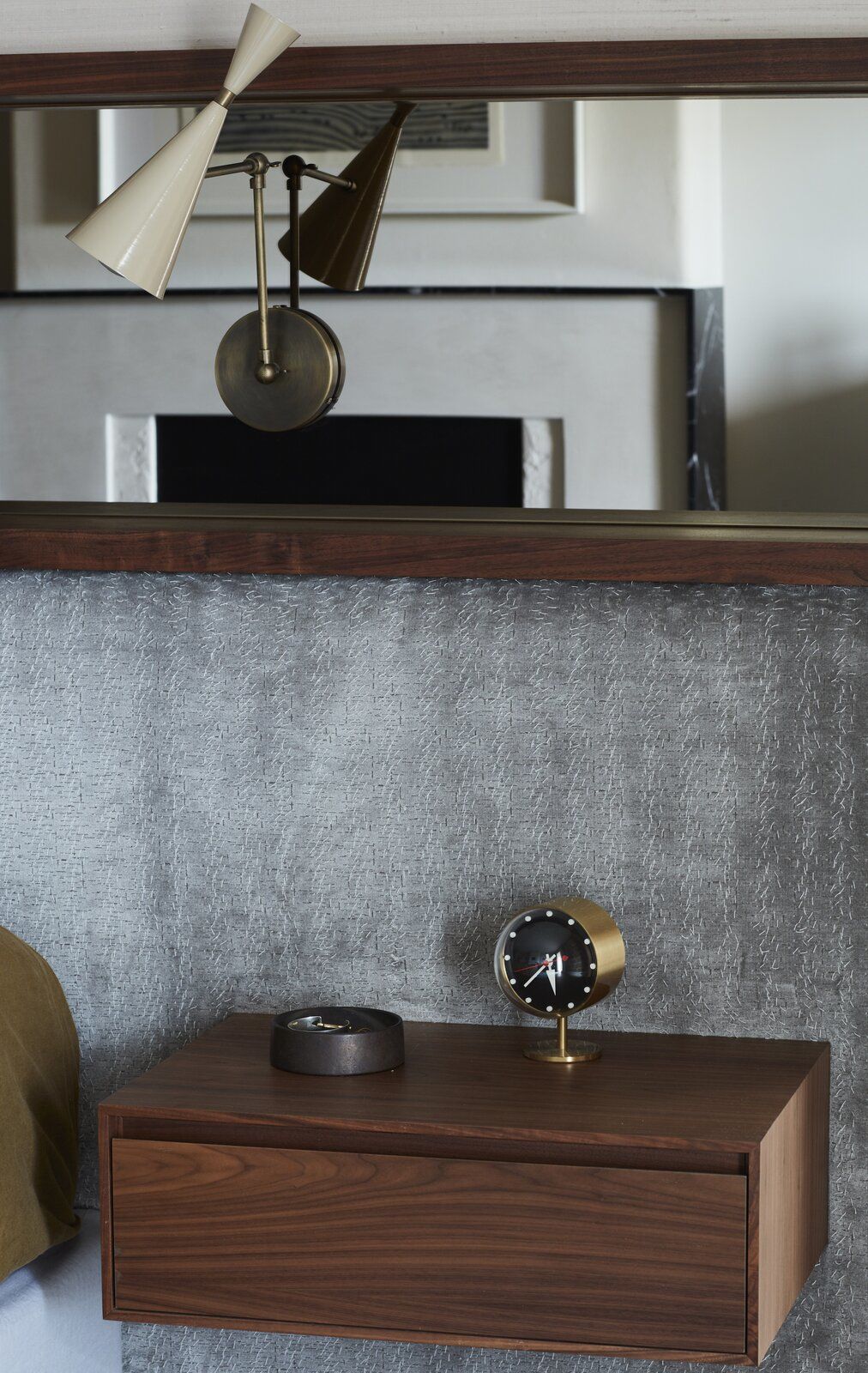
There’s also a pleasing repetition of pattern and texture at different scales, such as the oversized travertine floor pavers, which are echoed in miniature in the master en suite’s mother-of-pearl mosaic tiles and the salon’s lilac open-weave linen curtains.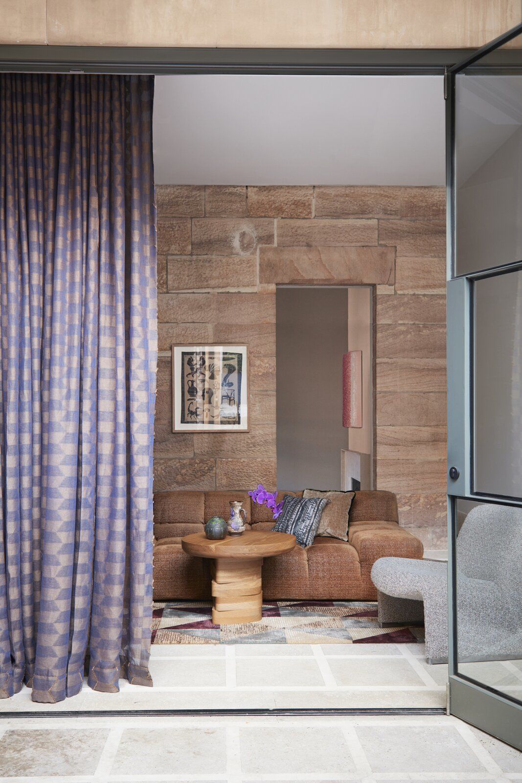
"Soft Serve is quite literally a gentler, more sensual version of my visual identity," reveals Ghoniem. "The natural sandstone walls of the home really set the tone, with everything seemingly feeling like it’s been carved into the dwelling. It really conveys this sense of a living entity that gently inhales and exhales-the spaces swell and expand through pattern integration, almost like a fresh breeze flowing throughout."


![A Tranquil Jungle House That Incorporates Japanese Ethos [Video]](https://asean2.ainewslabs.com/images/22/08/b-2ennetkmmnn_t.jpg)


