It's a common renovating goal: Turning a less-than-perfect house into a space you actually want to spend time. This was the situation that Brett and Kara Phillips of Texas's High Street Homes faced on a recent project, whose dated kitchen wasn't living up to modern living-or to the home's surroundings.
"We thought, 'how do we make this a kitchen worthy of the house?'" recalls Brett. "The house is beautiful; it sits up on a hill and overlooks this rolling landscape but the kitchen just looked kind of sad."
Before
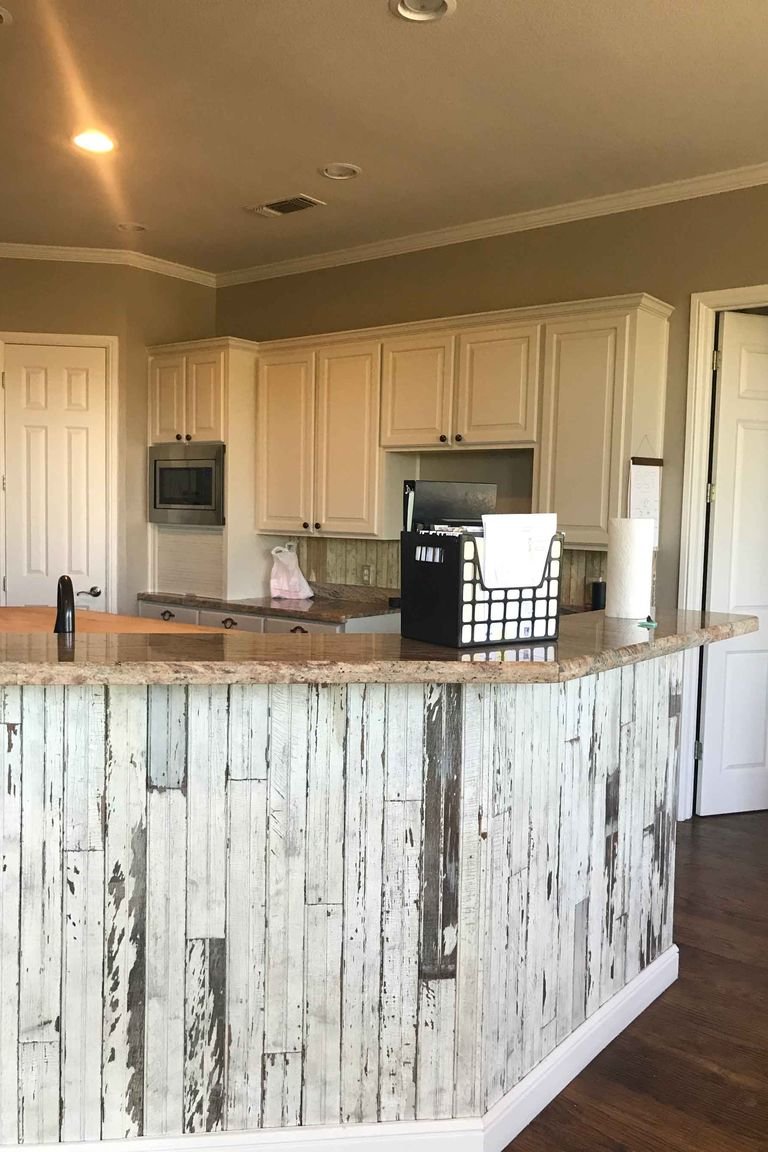
"It was a very '90s kitchen," Brett says bluntly of the design. "And very Texas. The owners were not really happy with this very country style." A rounded peninsula, faux-weathered wood paneling, and ornate decorative details made the space look overly dated-despite its good bones.
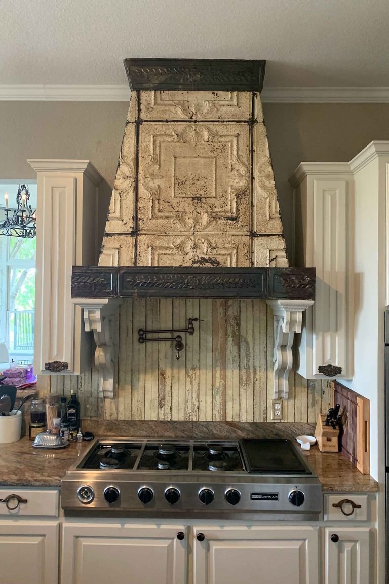
The solution? To completely reimagine the look and function of the kitchen to better suit the young, active family it housed-all without skimping on high-design details. Here's how the Phillips did it.
After
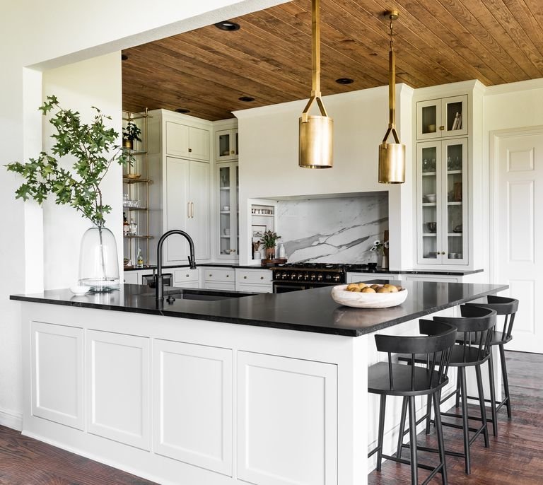
The room's transformation required some thinking outside the box-literally. "Early on, we decided to reimagine the use of the formal dining room and turn it into a moody lounge," says Kara. "This decision was the catalyst to think differently about how we experienced the home, our sight lines, and gave us opportunity to be creative with the space that was already laid out in front of us."
By opening the kitchen up into the richly-colored bar area, the couple was able to incorporate a certain level of elegance that's not always associated with one of the most utilitarian rooms of the house.
The biggest part of that? A ceiling-height brass shelving unit from the luxury custom fabricator Amuneal, which connects the kitchen to the bar in a way that keeps them visually joined, but functionally separated (and ties in with the kitchen hardware and Kelly Wearstler pendants from Circa lighting). "We wanted to play with the space and create a barrier without having a barrier," explains Brett.
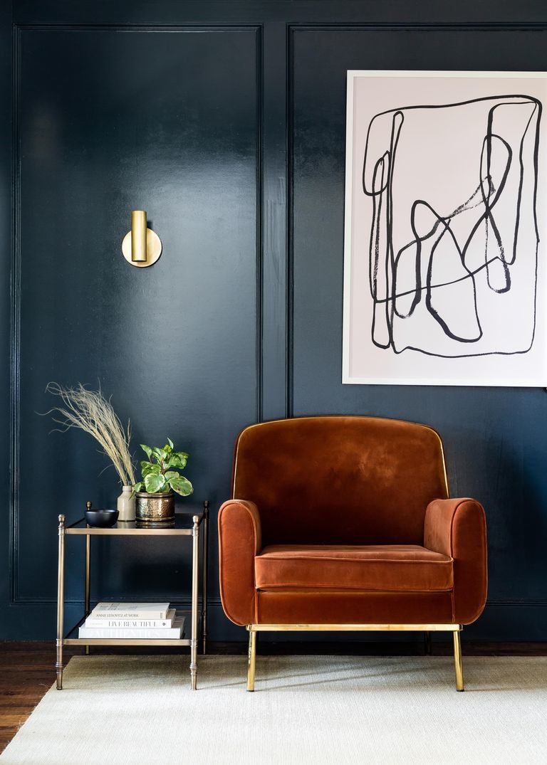
This approach to materiality carried over into the kitchen proper, too: "The objective was to elevate the classics," says Kara. "When you are working with a neutral color palette, there are endless options for application, so the most amount of time was spent determining how we wanted to establish contrast in the kitchen and mix metals. Ultimately, we fell in love with the timelessness of taupe cabinets and unlaquered hardware."
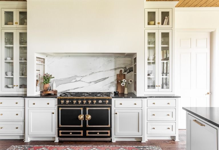
This balance of classic and modern plays throughout the kitchen: The traditional La Cornue stove is topped with a streamlined hood, whose neat lines keep the ceiling-height cabinets on either side of it from feeling too busy. Meanwhile, the Calacatta Borghini backsplash held special significance for the homeowners: "He's a geologist, so he really wanted the best stone ever," says Brett.
Black counters (and a coordinating black Waterstone faucet) are a more contemporary topper to the classic-inspired millwork on the reimagined peninsula, which was reformed from its dated, curved shape into a functional, single-tiered L-shape that fits a sink, prep space, and counter eating area. Plus, the honed granite "has a soapstone look, but it's super durable," says Brett, making it practical for the family's kids. Also super durable? The distressed hardwood floors, which have held up to the kids as well as two family dogs.
There's no shortage of storage, either: "By elongating the cabinetry we were able to reassign storage and layout, as well as, tuck away small appliances and everyday items," Kara reveals. The couple also relied on some clever hideaways, like shelves built into the stove surround to corral oils and spices ("she's a big cook, so we wanted her to have everything at her fingertips," says Brett) and drawers that hold chips and snacks within arms' reach of the kids.
The result is a space that finds a perfect balance-between dark and light, modern and classic, and-most importantly-beauty and function.


![A Tranquil Jungle House That Incorporates Japanese Ethos [Video]](https://asean2.ainewslabs.com/images/22/08/b-2ennetkmmnn_t.jpg)


