
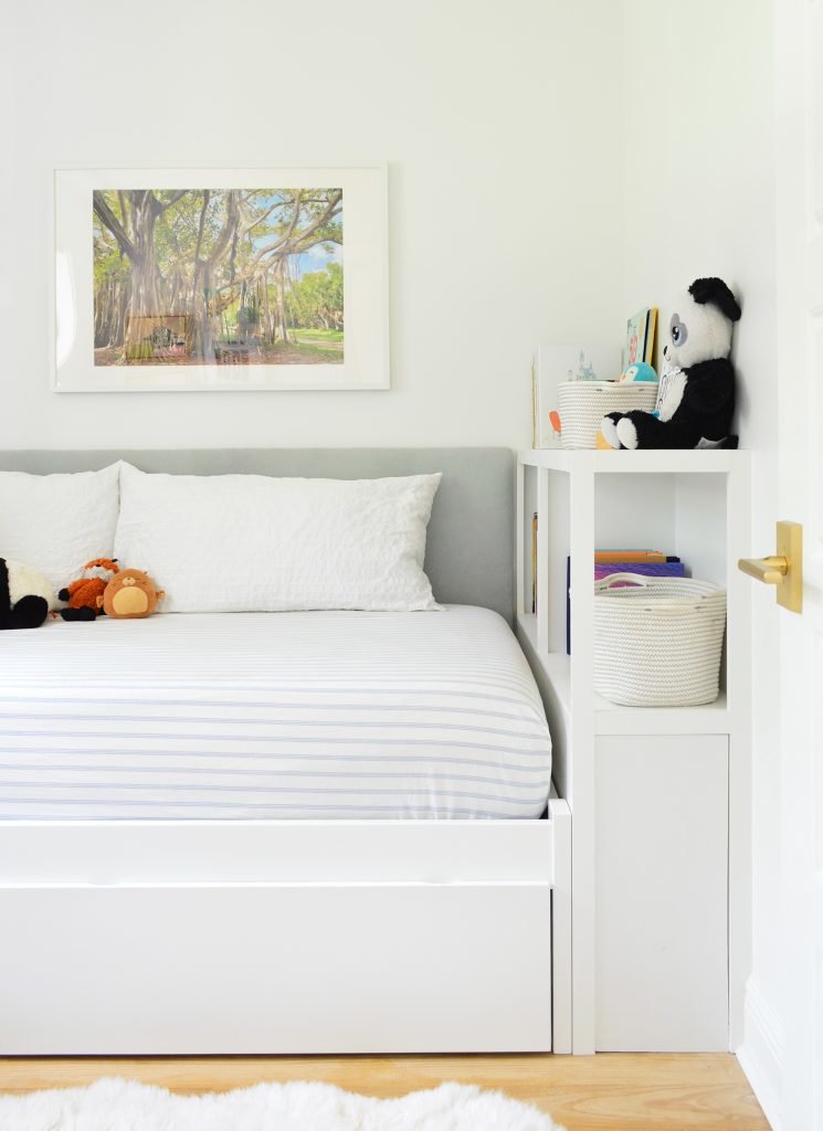
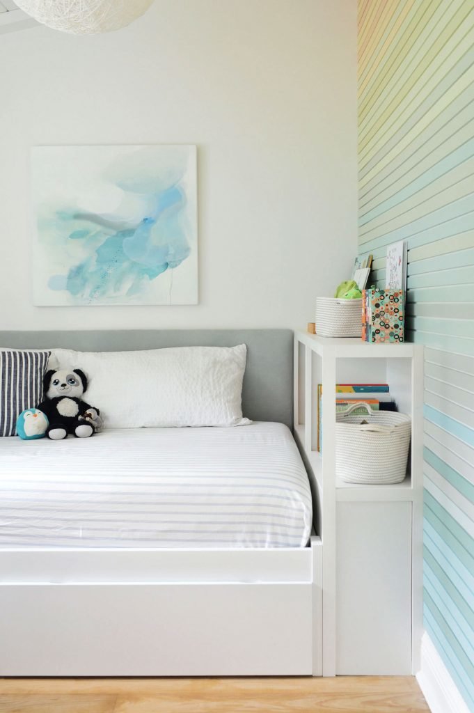
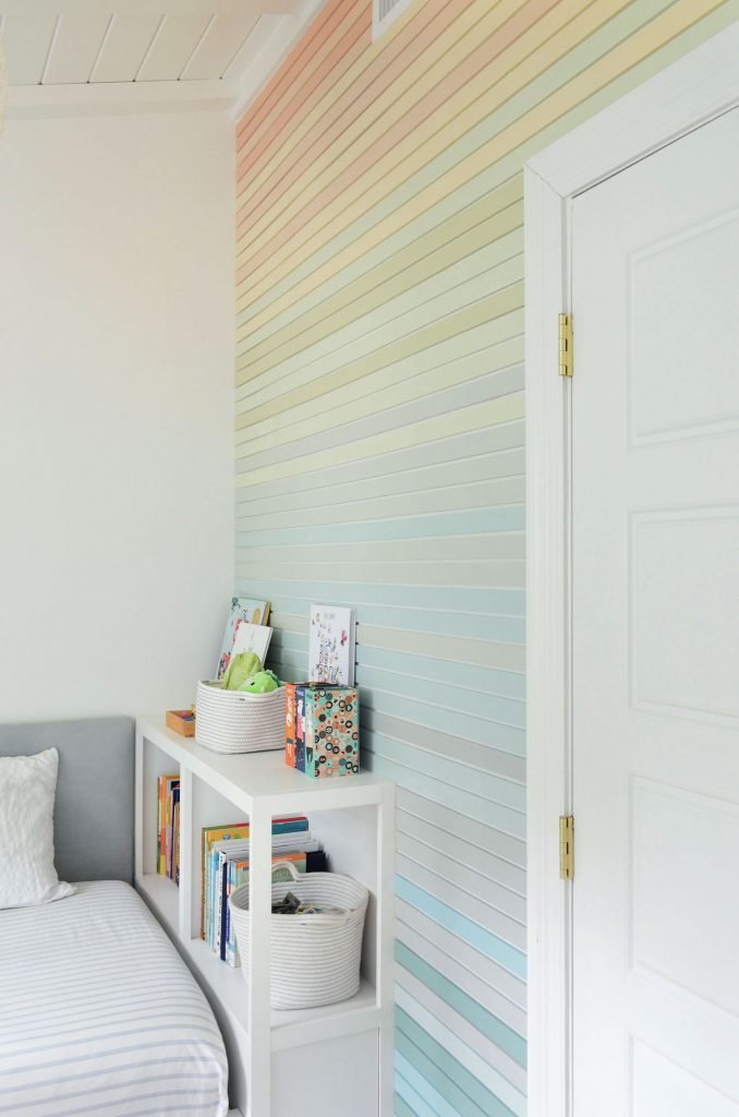
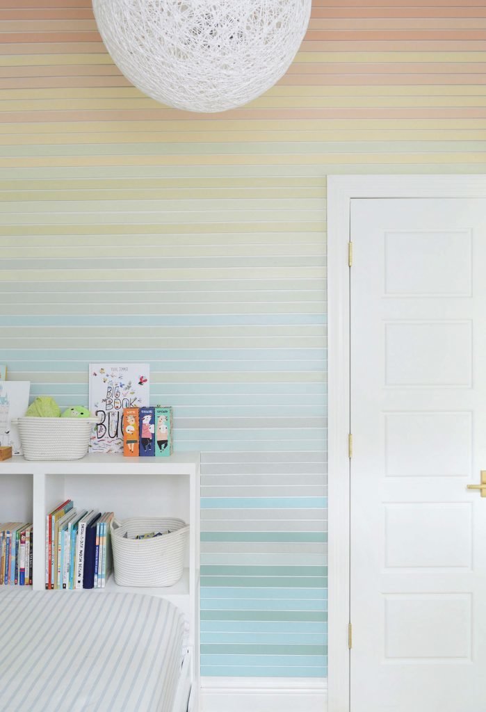
Last time you saw this room in July, we had installed this easy upholstered headboard and built-in bookshelf. It made his room so much more functional (and extra cozy), but we mentioned that we were all looking forward to adding some more color & personality in there for him over time – especially on that wall at the foot of his bed which, because we vaulted the ceilings in here, is over 9 feet tall.
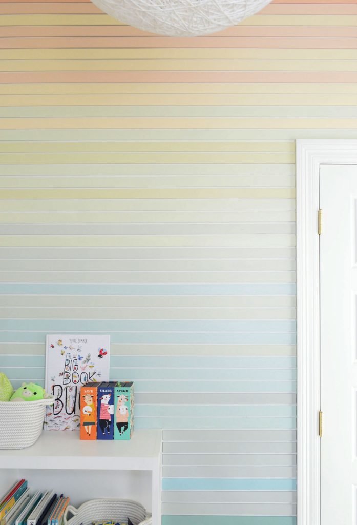
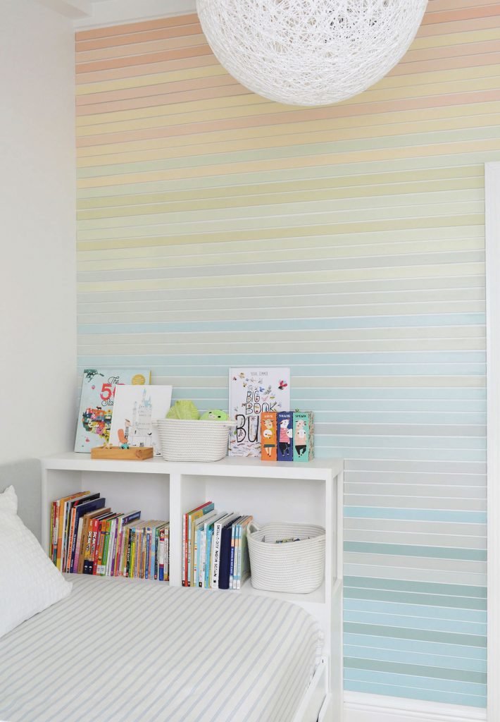
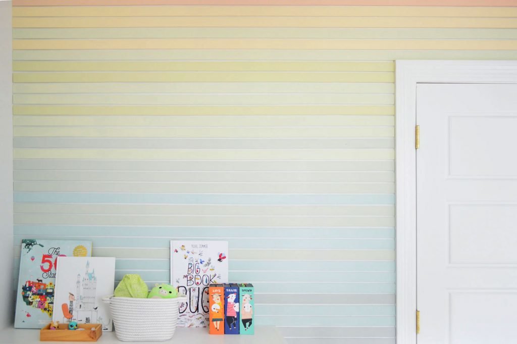
After we added this large colorful wall mural to our daughter’s tallest wall, our son became even more eager to have something bold and fun in his room too. And we all had such a good time with that project that we were excited by another chance to do something cheerful and interesting in here. But before I tell you how we made the colorful wall treatment that you see below (it’s not just paint – we actually applied wood strips so it has an awesome subtle texture in person!) let me tell you how we got here.
We debated everything from wallpaper or a decal wall treatment to some wainscotting or beadboard, but eventually landed on the concept of thin-ish horizontal planking in varying tones. We didn’t want it to look as thick as shiplap or wider horizontal planking, so we opted to use thinner lattice strips for a less expected result (no shade to the thicker shiplap/planked look – we did it to the duplex as a backsplash & it’s essentially what’s going on in the ceiling of our son’s room and our daughter’s room, seen below):
We just wanted something different and less bulky for the wall, that would complement but not directly match the scale of the ceiling planks (it seemed like something else in the same thickness could end up competing). Sort of like how designers recommend adding one large-scale print and another smaller-scale pattern to a room instead of two dueling things with the same large scale.
So with our horizontal lattice planking plan in place, next came our color palette decision. What colors should we use (and how many?)… that was the question.
Choosing The Colors
We thought it could be cool to vaguely allude to the colors of a beach sunset, just because our son loves spending time at the beach and also gravitates towards blue, green, yellow, and orange more than the other colors in the paint deck (and those four colors tend to be present in a beach sunset).
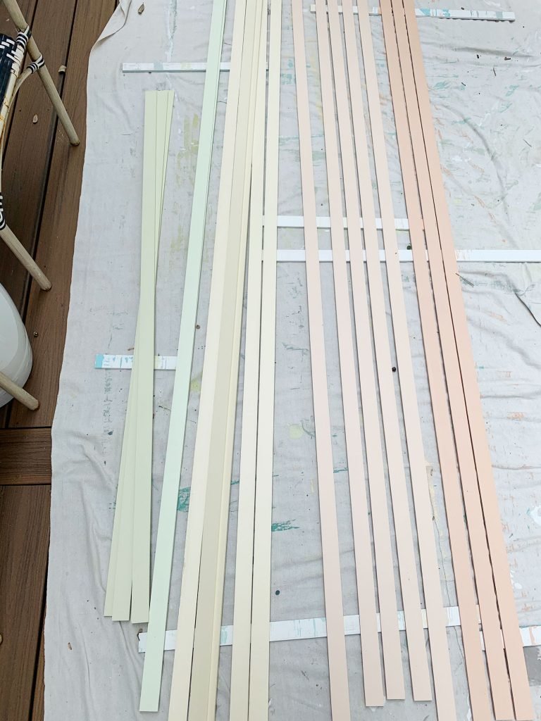
After playing with a few paint decks with our son, he had some pretty great arguments for why we should choose certain ones (like voting for Jersey Cream since Mom is from New Jersey, and Sweet Orange and Sumptuous Peach because he likes those fruits). When we had ten colors that we thought would look good selected from the paint deck, we turned to Photoshop to try to picture how things might look on the wall if we did some randomized stripes of each color in sort of an imperfect gradient pattern down the wall. And that’s how we landed on this arrangement:
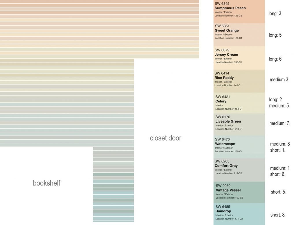
It gave us sort of an “ocean-at-dusk meets modern-rainbow-gradient” result, and it involved the following 10 colors (all by Sherwin-Williams):
* Sumptuous Peach (SW-6345)
* Sweet Orange (SW-6351)
* Jersey Cream (SW-6379)
* Rice Paddy (SW-6414)
* Celery (SW-6421)
* Liveable Green (SW-6176)
* Waterscape (SW-6470)
* Comfort Gray (SW-6205)
* Vintage Vessel (SW-9050)
* Raindrop (SW-6495)
Now, if all of this digital planning seems overwrought to you (like it did to my wife, AHEM!), I’ll just say this: I was aiming to minimize wasted time and wasted materials by being as precise as we could with how much wood we needed to buy, as well as how many cuts of each size and color we’d need. I felt a little Type A doing it, but in the end, it made the execution of the idea go extremely smoothly. So… sorrynotsorry.
Painting & Prep
The material we’d be using for our strips was primed lattice molding, which we like because it’s thin (only 1/4″ thick) and still has some visible wood texture to it, even when it’s painted. Using precut strips that are only 1.5″ wide would allow us to incorporate a lot of strips into our design (60 in fact!) which we knew would make our gradient more subtle than if we’d used fewer wider boards (which again, were present on the ceiling, and we didn’t want to compete with that same scale).
Our first step was cutting our lattice roughly to size. Since we were installing it around a built-in bookcase and a closet door, we had three different lengths we were cutting. It’s also a good idea to leave them a little bit long at this point to account for walls that aren’t perfectly square. You can always trim them more precisely as you install them.
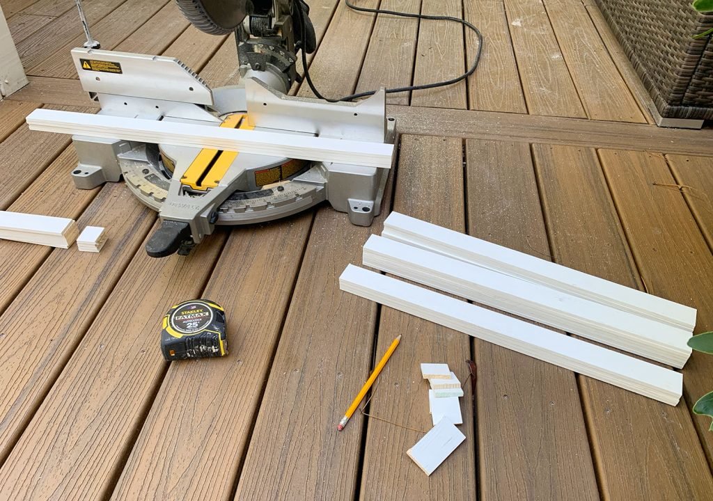
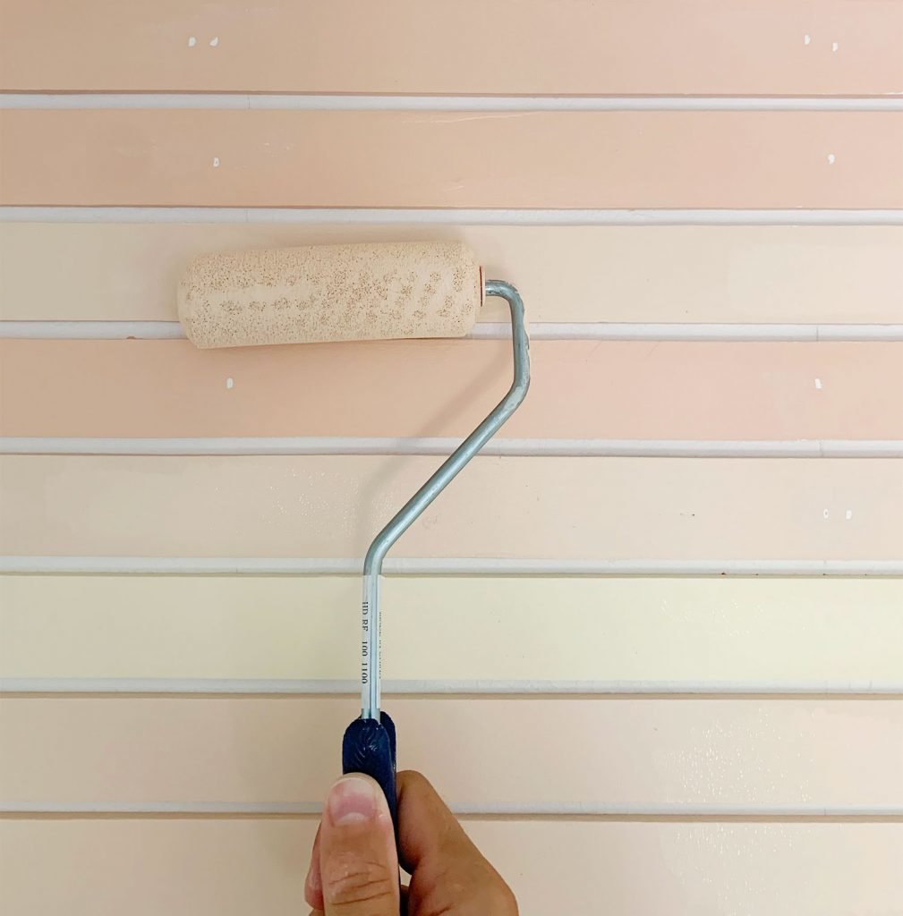
Once we had the lattice cut, we got to painting. Maybe there was a more high tech or efficient way to do this, but with so many colors and limited space to paint, we went with the old school foam roller over a dropcloth method. And by we, I mean that our six-year-old got in on the action too (involving your kids in their own room design is such a great way to make them extra proud of the finished result).
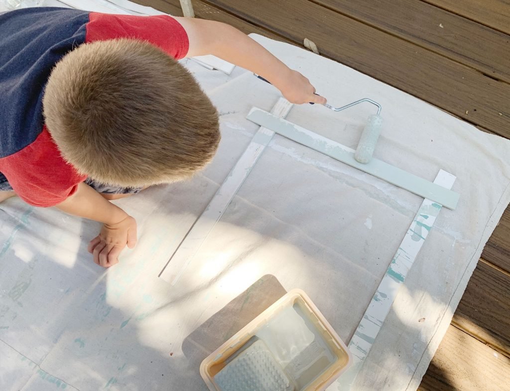
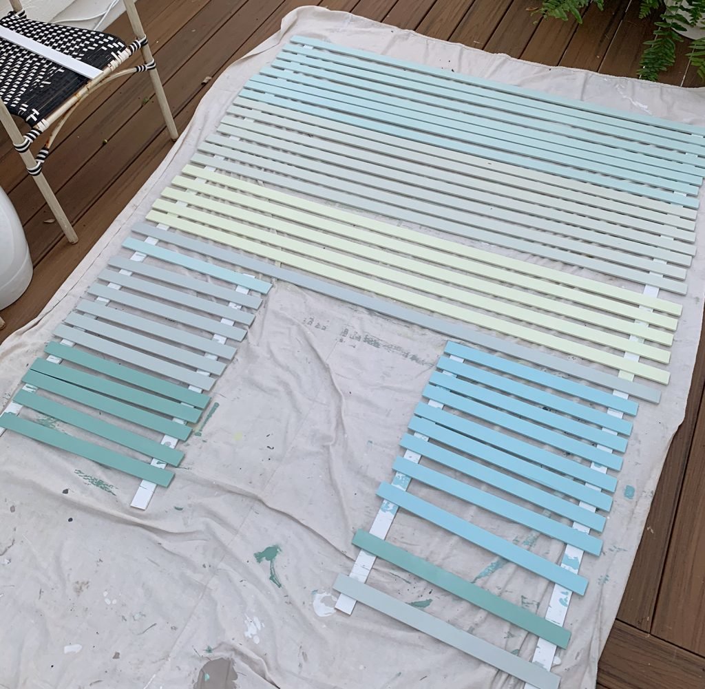
We didn’t really have a good spot to spread out all of the wood at once, so we did it in two batches. Below you can see about 2/3 of it, which was batch one.
Installing The Painted Wood Strips
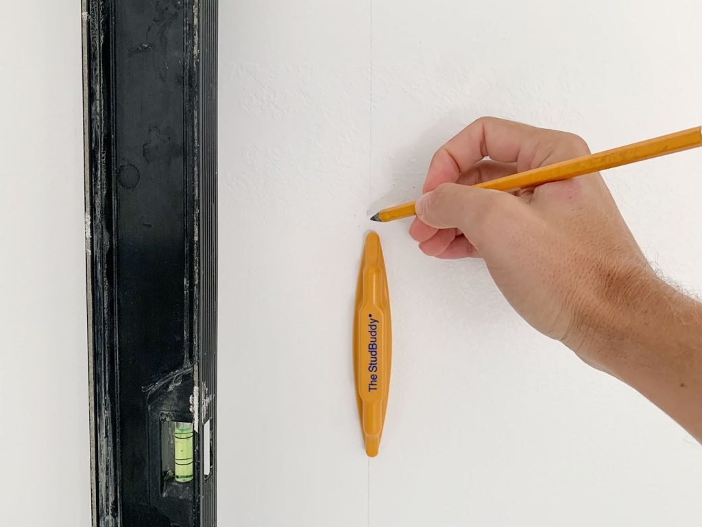
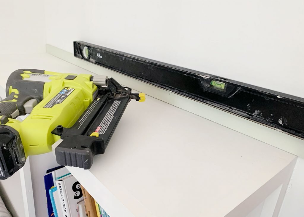
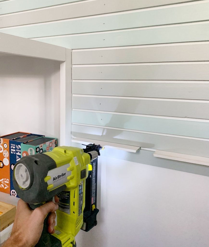
Before nailing anything to the wall, we marked the studs using our favorite stud finder that conveniently floats on the wall so it’s hands free – and then we drew light vertical pencil marks up the wall using a level along that line. These would act as a guide to make sure we were nailing our wood securely into the wall stud as opposed to just drywall, which makes for a nice strong hold.
We started by installing a full strip across the top of the bookshelf, using 1 1/4″ finish nails in our go-to nail gun. If you don’t have an obstruction like a bookcase, you’d probably just want to start at the baseboard and work your way up – but it was important to us that we have a full piece here, and not some weird sliver, so we chose this as our first piece and worked both up and down the wall from there. Again, the level helped us make sure we were starting off without anything that would end up slanting up or down as we went.
We used scrap pieces of lattice as spacers between each board. Not only was this convenient because we had lots of little scrap pieces around, but it also gave us the not-too-big and not-too-small gap that we wanted. Almost like a slightly more “bolded” horizontal beadboard effect.
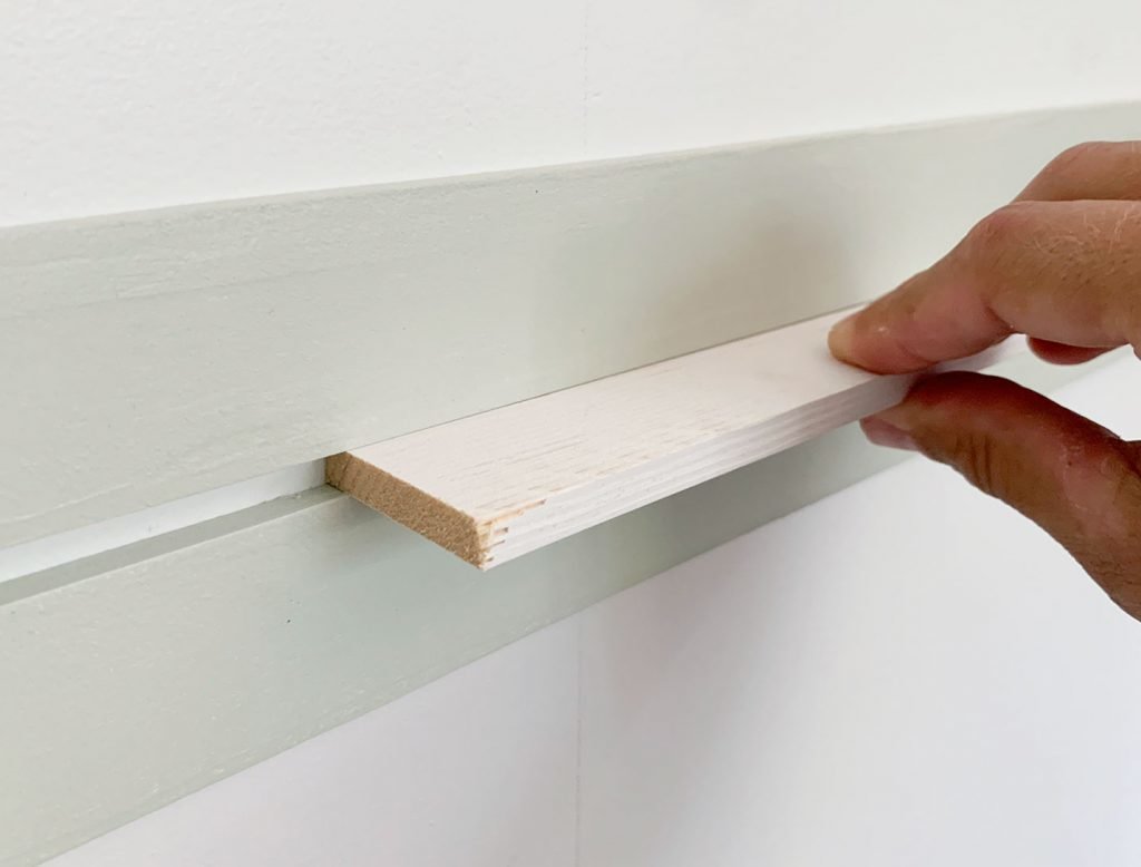
The gap looks more exaggerated in the photo above, but remember that this lattice is 1/4″ thick – so it’s a very subtle look in when you step back and take it in as a whole. Let’s fast forward for a second so you can see what I mean:
Ok, but back to the process. This whole part of the project was actually pretty fast, especially since I had printed out my mock-up to help us keep the pattern straight (although it didn’t prevent us from accidentally starting off with the wrong color at first – oops!).
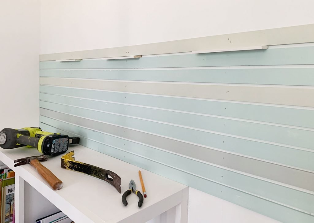
Once we worked our way up the wall with all of the medium-length strips we had painted, we worked down towards the bottom using the shorter-length strips.
After we had installed all of our lower strips, we did a second round of painting for the upper pieces that are where the gradient gets into the more “sunset-y” colors (versus the lower “watery” ones).
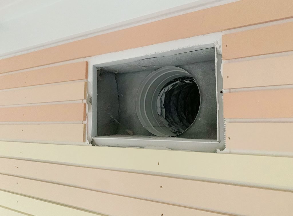
Once everything was dry, installing those was the exact same process (use a spacer, nail into a stud, check that they’re level every so often). The only change here was that we had an HVAC vent toward the upper part of the wall that we needed to work around. So just like we would do with an outlet or a light switch, we removed the cover and cut the pieces around it. Once the cover was reinstalled, it looked seamless (you’ll see that in a few more photos).
We lucked out that we didn’t really need to cut any slivers for the top or the bottom of our pattern. The spaces on the top and bottom against the existing molding are a little bit wider than the spacing between the painted boards, but your eye doesn’t really detect it so we didn’t bother trying to fill them (a skinny strip of color might draw more attention to itself than a slightly larger white gap, which blends into the white baseboard and top header board that it touches).
Finishing Touches
The cutting, painting, and installing process took us about two hours over the course of two days (for a total of four hours spent on the project to this point). The only reason it was spread over two days was the whole waiting-for-the-paint-to-dry thing. And by the third day, we got to the extra fun part: patching nail holes!
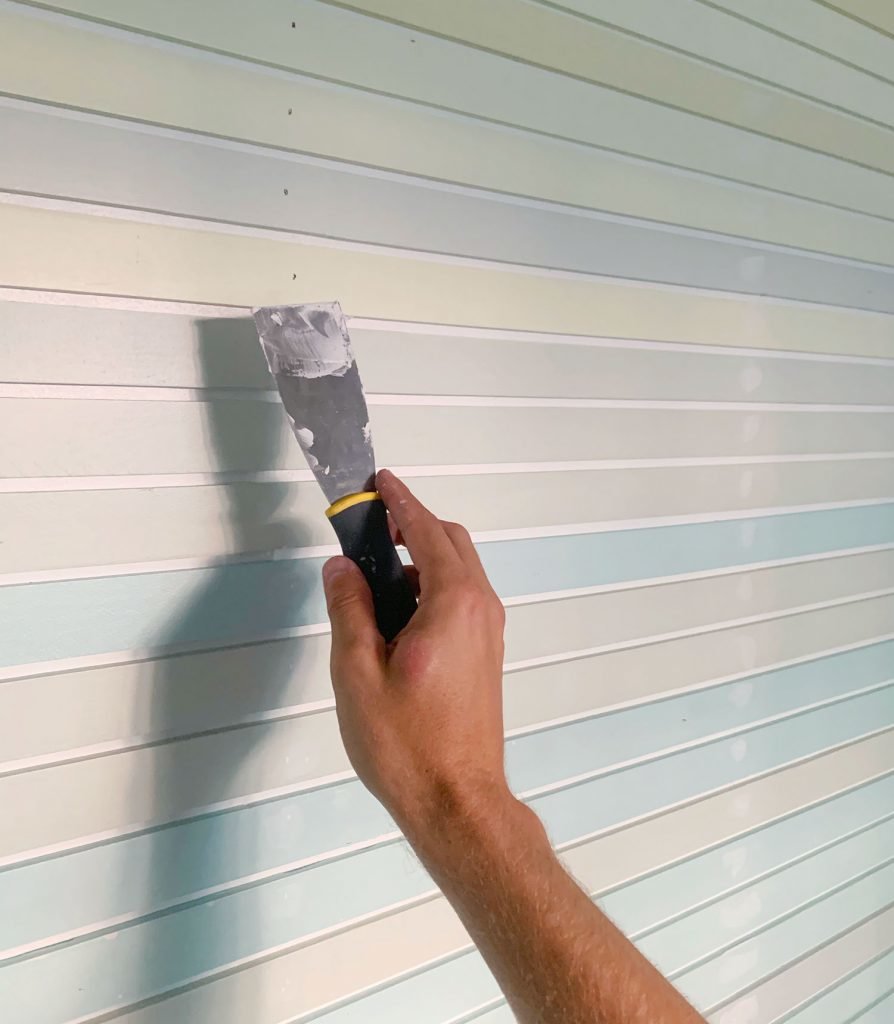
Yes, this was tedious, but it made such a huge impact on how polished the final look was that I stan this hour-long step. We used spackle and a small putty knife to carefully fill all of the nail holes, and then the next morning we sanded them all smooth with a sanding block.
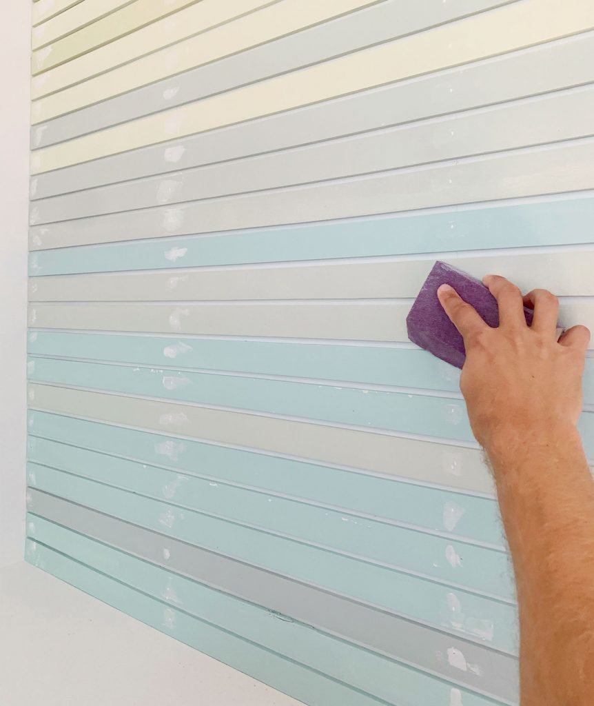
Then we touched up the spackle dots using the same foam rollers (which we had saved in plastic sandwich bags, knowing this step was in our future). Again, it was pretty tedious, but this entire “much more finished result” step at the end only took about an hour.
And that, my friends, is how we got to where we are today.
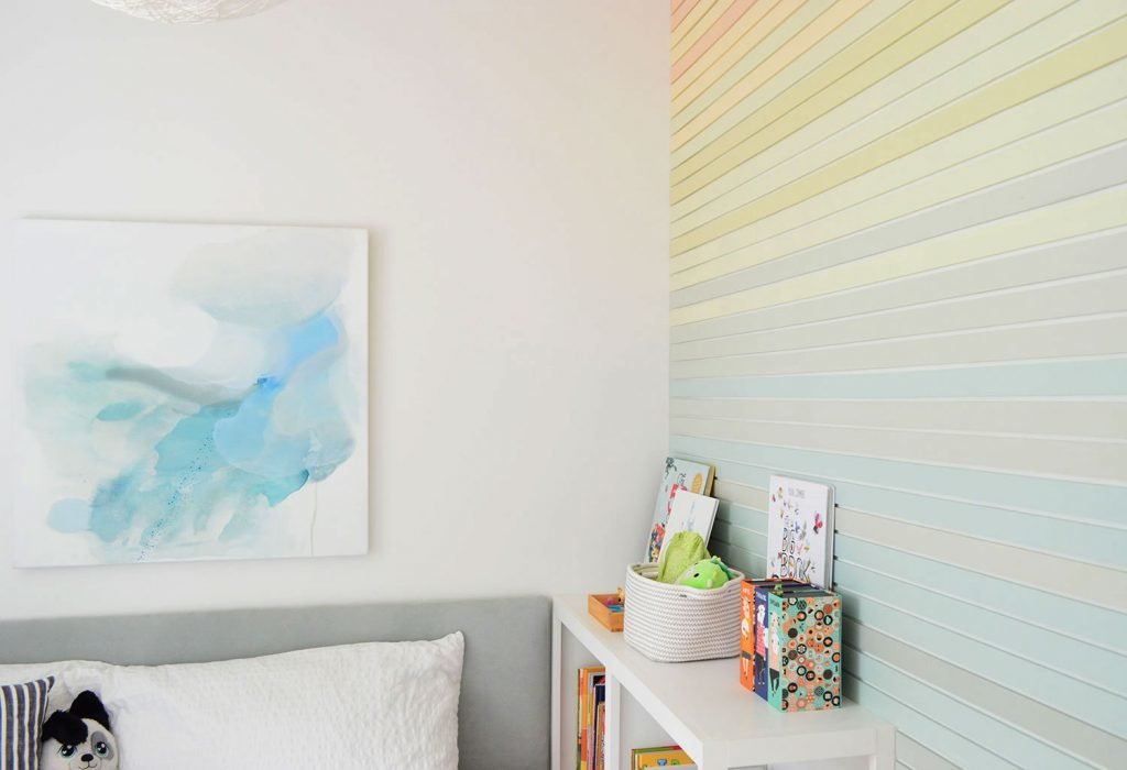
I think we’ll probably end up hanging some artwork or maybe a shelf at some point, but for now we’re just enjoying how much cheerier it has made his entire room. It’s the first thing he sees in the morning and the last thing before lights out at night, which makes me kind of envious. This is a small room, but man is it cozy and full of charm.
I think you could achieve a similar look by just taping off and painting stripes, rather than going through the trouble of nailing up wood strips, but I’ll say that I’m glad we ended up doing it this way because the extra dimension of having the colors actually raised off the wall is really nice in person. I’m bummed it doesn’t translate better in photos, but Sherry’s going to share a boomerang in her IG Stories that’ll show you what I mean (it’ll be saved in the “FL House7” circle on our IG profile page if you’re reading this later & want to go see it).
You may have also noticed that we swapped out the art above his bed. The family photo that hung there originally was kind of dark (we kept meaning to get it reprinted lighter) but then we got this painting from Sherry’s longtime friend & extremely talented painter Michelle Armas and it felt like it was meant to be here. Our son affectionately calls it “his jellyfish.” (Michelle is offering prints & canvas rolls of it here).
So that’s how a whole lot of lattice and ten test pots of paint came together to make a linear little abstract sunset for our son. Maybe we should call it a “son-set” – or did I just enter bad Dad-joke territory? I think I did.
This isn’t our first rodeo when it comes to adding wood planks to the wall for a fun treatment, here’s an old post about how to use lattice to create $57 board & batten treatment from way back in 2013! We also shared how to make fancier molding in our last house and how we added thicker horizontal planking for just $31 as the duplex backsplashes.
If you’re looking for other colorful wall treatment ideas, check out this awesome detail that Angela added to the top of her closet (you can also see another amazing Angela project here!). We’re also loving this colorful planked ceiling, this rainbow planked wall, this wood wall art, and this cool multi-toned vertical design! Basically there are a whole lot of ways to grab some wood, pick your paint colors, choose your pattern / placement / spacing and make a really fun wall treatment.
And if you missed last week’s post all about our second floor deck & how that huge “outdoor room” is coming along – here’s the link to get you all caught up. The week before that we shared how our upstairs family room is shaping up, so that can be found right here. And for any other update about our Florida house, here’s an archive of posts that can get you caught up pretty quickly. We’ve covered a lot of ground in the last 4.5 months of living here!


![A Tranquil Jungle House That Incorporates Japanese Ethos [Video]](https://asean2.ainewslabs.com/images/22/08/b-2ennetkmmnn_t.jpg)


