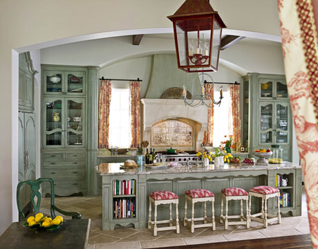


CHRISTINE PITTEL: This is so pretty! I love the colors. What's that moody green on the cabinets?
: We started with Benjamin Moore's November Rain and then added layer upon layer of pigment and glaze to build up this crusty finish. My client loves color and was very involved in mixing this. Some days it looks a little more gray. On others it's more greenish. The granite we chose had a greenish hue and this color seemed to make sense with it. We wanted the cabinets to look like old worn pieces of furniture, the sort of thing you'd find in France.
Toile takes me straight to Paris. There's something luxurious about all that fabric.
It really softens a large room. We even made portieres for the doorways. My client knew she wanted a red toile, but this is not a fire engine red. It's a pinkish cranberry. And the ground is not white, but cream, so the effect is more subtle. We looked at many different toiles because we wanted not only the right color, but an appropriate subject. This one happens to be a country scene, which is perfect for a kitchen. It's amazing how many people don't even notice what's actually portrayed on the fabric.
The cabinetry is beautiful, with all those French country curves. I notice you've camouflaged everything but the stove.
The kitchen functions like a family room, so we didn't want people to feel like they were sitting next to an appliance. And we built the cabinets high to lift your eye. We don't want you to miss the 12-foot ceiling. As you walk into the room, you focus on the stove and the windows. So that's where we put the cabinets with glass doors, to show off her collections of china and stemware. Even the sides of those cabinets are made of glass. She really enjoys looking at her things, and the glass makes that area feel even more open. The whole kitchen is very light and airy.
The stove looks like a fireplace in a château. Is that an old mantel?
No, it's new, carved out of limestone. We stuccoed the top of the hood to look like a chimneypiece.
I like what you did with the wall behind the stove, which always seems to cry out for something.
Those are hand-painted tiles. You pick your images and your colors and they make them for you. It almost looks like a painting. You have to plan it out so the images fit. You don't want to end up with half a pagoda somewhere. Tile works well behind a stove because it's easy to wipe down. When you turn around, there's the sink on the island. My client wanted it there, rather than under the window, because she spends a lot of time at the sink and wanted to look out into the room where the kids could be doing their homework or watching TV.
That's one of the longest islands I've ever seen. How did you keep it from looking like a boat?
I broke it up with wraparound bookcases at each end, and made space for four stools in the middle. You've got to create some interest and variety in the base, or it would have been way too boring at 12 feet. We also cut the granite countertop into a curve at both ends, to soften the edges and echo the arches in the room.
Did you agonize over the color of those chairs around the breakfast table?
My client already had those chairs and we talked about redoing the finish, since it's a very strong green. But then I went through her stacks of dishes and pulled out those majolica plates in the same deep green. When I put them on the wall, it pulled the whole room together. After so many white, utilitarian kitchens, this is a surprise, as if you've left Texas and been transported to a whole new place. I feel very French in this room.
![A Tranquil Jungle House That Incorporates Japanese Ethos [Video]](/images/22/08/b-2ennetkmmnn_t.jpg)